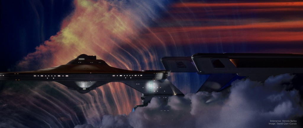
This picture was inspired by a shot in early season 3 of Battlestar Galactica, where Galactica emerges from behind a cloud in a nebula, looking for all the world like a seaship emerging from a fogbank. I decided some time ago that the movie-era Enterprise would be a perfect ship for my own take on the shot, given that it’s my favorite spaceship and that it’s long, sleek profile means it’d fit well in the aspect ratio I normally use.
The nebula background (and foreground) was a composite of four photos of clouds I’ve taken over the years (and anyone who’s ever seen me while I’m holding a camera can tell you that I photograph a lot of clouds), colored, mixed, and generally fussed with in Photoshop. I did a good deal of fiddling with the bloom and fog depth effects on the ship as well, until I was happy with them. I quite like the colors in this picture, and it’s one of my new favorites. And any day I can look at a picture and think “new favorite” is a good day.
As for the narrative of the image, all I can say is, it’s not from The Wrath of Khan. It’s a nice, peaceful image of the starship Enterprise exploring another, completely unrelated nebula. I know it looks like the nebula from The Wrath of Khan but, well, it’s not. Because I said so.
—
Added July 11, 2008
In light of the interest this picture has gotten, I’m putting up a quarter-sized version of the final Photoshop file, as well as the source files I used to create it, for others to examine for self-educational purposes.
On the nebula effects:
The first thing I did was put in the foreground cloud. I cut it out using a layer mask that I made from selecting the color of the sky, because there was a pretty clean division and I’m far, far too lazy to matte by hand when I don’t absolutely have to. I used an adjustment layer to give it it’s color, and then another photo of a sunset to break up its color a little. I used the same layer mask to block out these two layers, as well as the bloom layer for the ship.
For the bottom layer of the background nebula, I started with a light, whispy photo of clouds, with the opacity turned down a smidge so the black background layer would darken it up a little. Then came an adjustment layer the same color as the one for the foreground cloud, with this one set to “Linear Burn” in the blending mode to darken it up, and the “Blend if” box in the blending options being set to reduce the blending as the underlying layer got brighter. This set off the clouds in that picture more from the sky. I used the same sunset again to alter the color of this part of the clouds in the next layer up, this one set to “Vivid Light.” The topmost layer was another sunset photo, with smooth bands of red clouds, that I placed in the upper right to help justify the red light on the top of the ship. That one was matted in with a layer mask as well, with much tweaking of its levels so the red part would show up but not the sky behind it.
After I’d done all this, I still didn’t feel like it was quite done. Eventually, I realized what was missing and ran back to Lightwave to render out a depth pass of the ship using the Render Buffer Export. I used that as a layer mask on the ship layer, which helped sell that it was traveling through a gaseous medium (it’s most apparent where you can see the foreground warp engine overlap the background one, but it affected the whole ship.) The topmost layer was a merged version of the image, with a filmgrain-and-blur applied, and then darkened substantially with levels, and set to about 50% opacity.
—–
It took some doing to matte in the cloud without getting a black edge of what used to be sky. Even once I’d pulled that out, I found that the thick, full feel of the cloud completely broke with the thin, wispy clouds I used in the background. I didn’t really have a more suitable cloud, and didn’t want to render a 3D one for time and aesthetic reasons, and the composition didn’t work if I took it out all together, so I made it fit more with the background by giving it some of the same color variation. It still wasn’t perfect, but it served its purpose of framing the ship.
———-
On the appearance of the ship:
I think that feeling of solidity came out in Photoshop. The lighting was pretty basic, all told. The model’s rig, along with a small white area light at about ten o’clock for the rim light, a large red area light high and past the model, and a bluish area light behind and below the camera. (I also rendered the image with “Final Gather” radiosity enabled.)
Turning layers on and off, it seems that the CGI went away with the top layer, which was duplicate of the merged image, with film grain applied and the levels adjusted so the whole ship was almost entirely black, and then reduced it to 50% opacity.

