This article will discuss three related designs; the versions seen in the original 1994 movie, as well as the two TV shows Stargate SG-1 and Stargate Atlantis. The design seen in Stargate Universe is entirely original, so it’s out of my scope. I want to go over not only the key features of the design, but also subtle differences that are sometimes missed when artists create the different variations.
The TL;DR is that the SG-1 stargate is a modification of the film stargate, so if you’re building either of those versions, you can source them both for reference material. The Atlantis stargate was built from scratch, so if you reference the SG-1 stargate while building that one (or vice-versa), you’ll run into confusing contradictions in terms of exact shapes and details. Despite how similar the Atlantis version looks to its predecessors, you can’t assume it matches them.
I’ll be illustrating this article with a mixture of screencaps, production documents, and photos of the original setpieces. The latter two groups are sourced from behind the scenes posts by production personnel, auction listings, and individual collectors, most notably, Les Enfants de MacGyver. If you’re collecting reference material for your own movie- or SG-1-style stargate, there are countless photos of their original stargate components, disassembled and close-up, on their Facebook page.
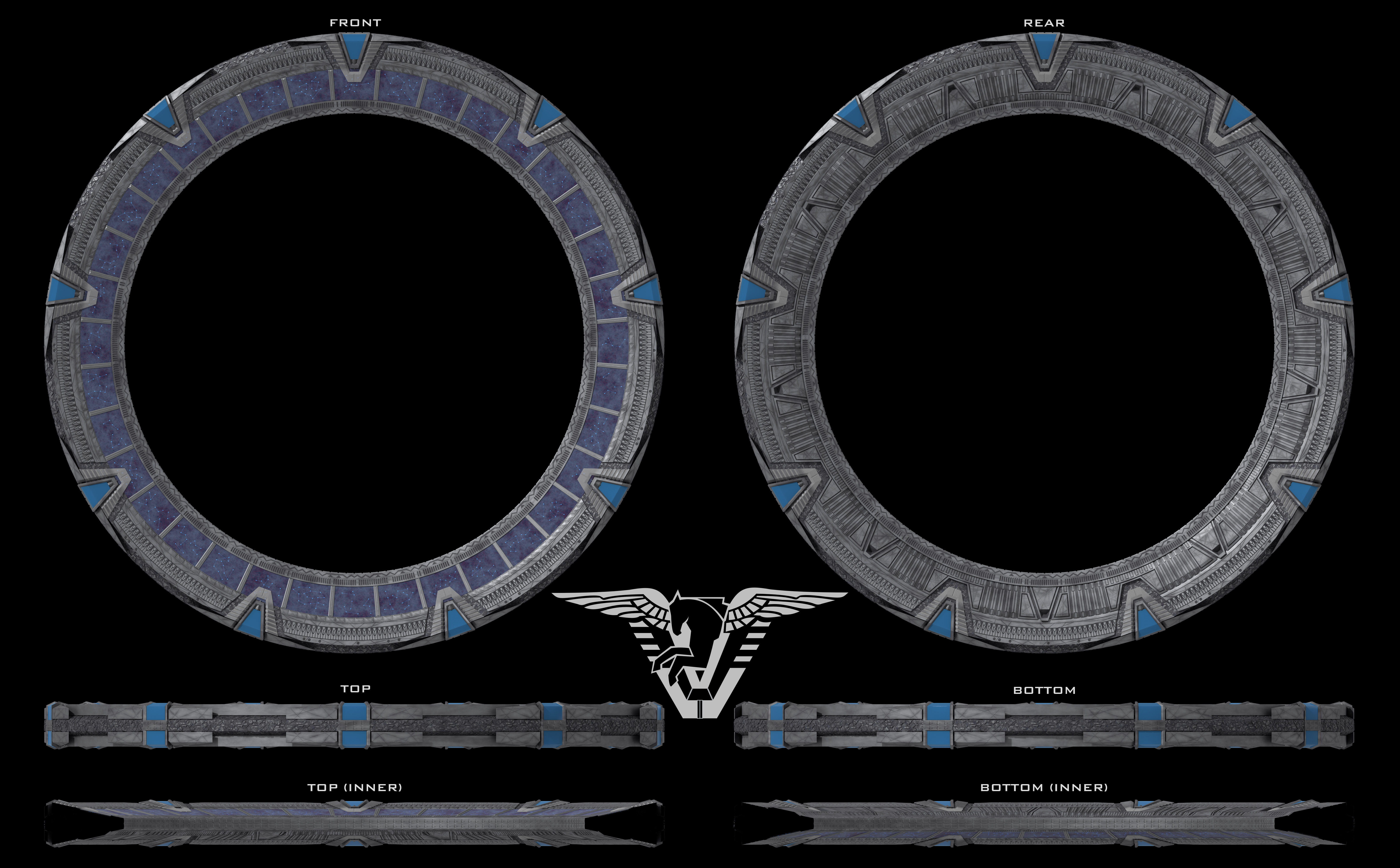
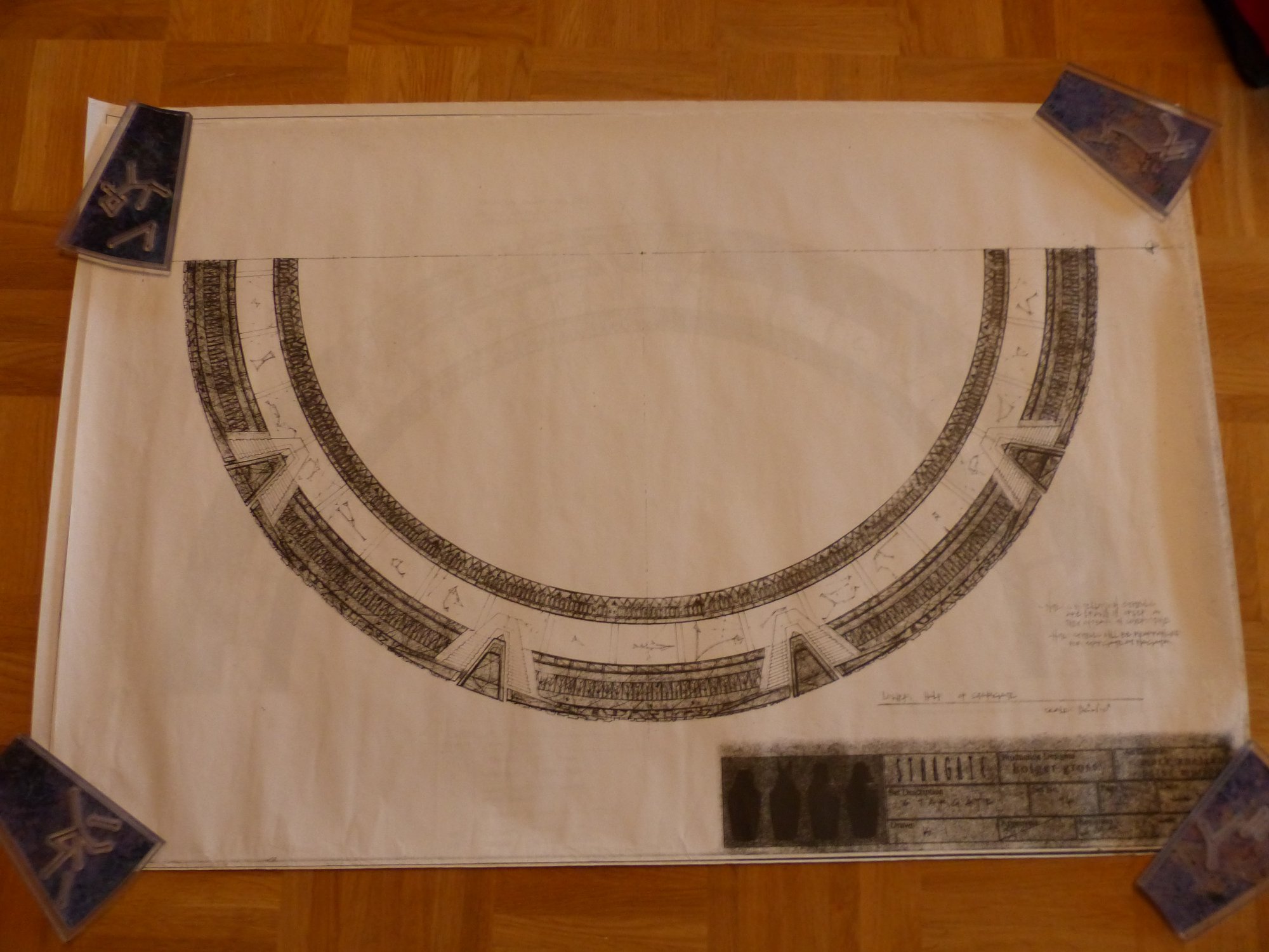
The first thing to know is that all these stargates are made of nine identical segments which join together in the middle of each of the nine chevrons. There’s also an animated inner ring that contains some number of symbols which move within the stargate when a destination address is being entered.
The front face has several sets of repeating details. At the top are six irregularly spaced “buttons.” Immediately below that is a track of “arches.” There’s a series of blocks below them, just above the inner ring. Each block has two interlocking segments with an S-shaped seam between them. On the movie and SG-1 gates, there’s a set of smaller blocks on the bottom edge of the inner ring.
Below that are three tracks of engraved details. The top is a series of pill-shapes in clusters separated by circular dividers. Below that is a simple set of engraved rectangles, and below those are a pair of engraved lines that go around the inner rim in a zig-zag pattern, offset with occasional horizontal segments.
The inner rim has regularly spaced “emitters” which consist of three long greebles.
The rear face is similar to the front face, but omits the S-blocks, and the inner ring is replaced with a sort of conduit. The outer rim has an extension around the middle which is covered in an elaborate mosaic pattern.
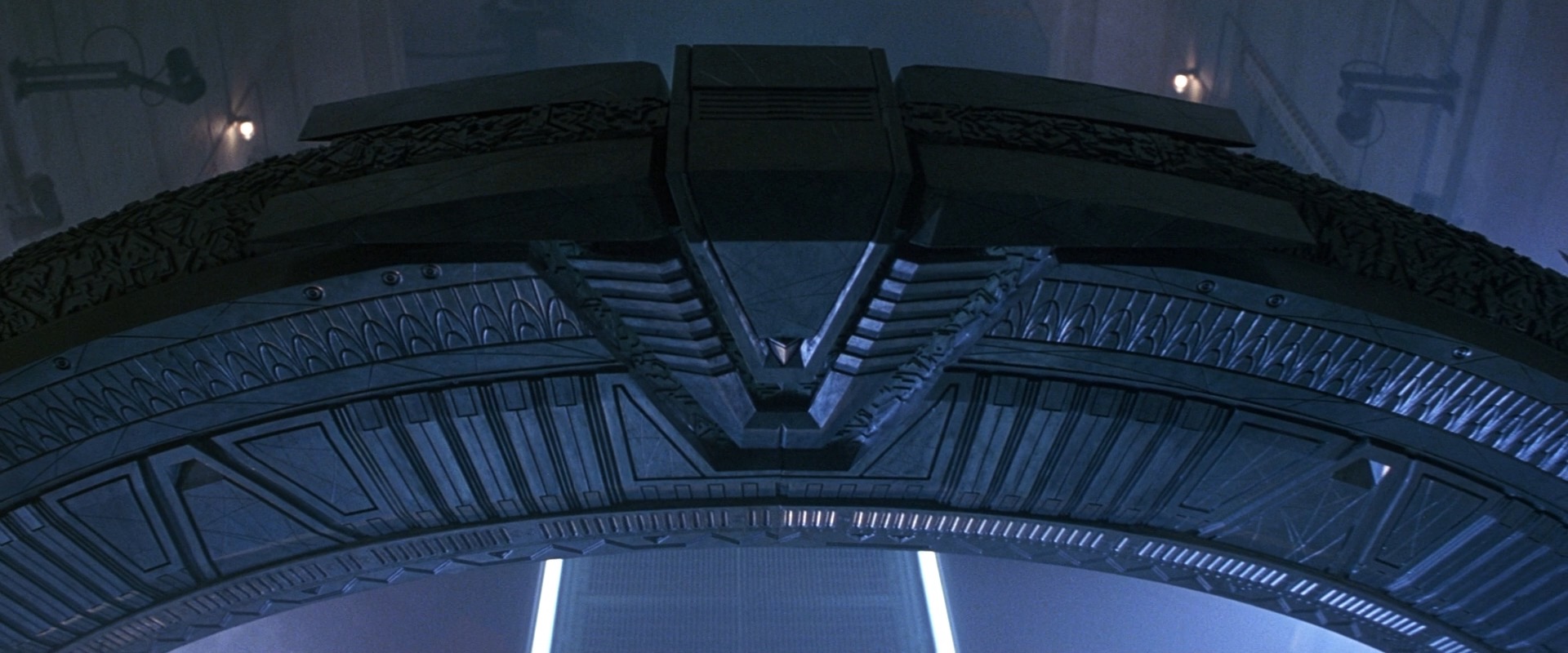
There are nine chevrons equidistantly positioned around the ring. Each chevron consists of a clamp which is set inside a slot. The slot also has a mosaic pattern inside it. Above the chevron is a jewel1I call to the jewel the “Chevron Block” in my models, and the clamp simply the “Chevron,” but I’m using terminology from the production of the film for clarity in this article, rather than having the words “chevron” and “block” refer to multiple objects. Above the jewel, level with the rim, are four “wings.”
The stargate’s outer diameter is exactly 20 feet. The ring itself is 2.5 feet thick, making the inner diameter 15 feet. Since you’ll probably be building out from the centerpoint using lathe and array tools in a 3D program, here are those figures as radii:
Outer radius: 10 feet / 3.048 meters
Inner radius: 7.5 feet / 2.286 meters
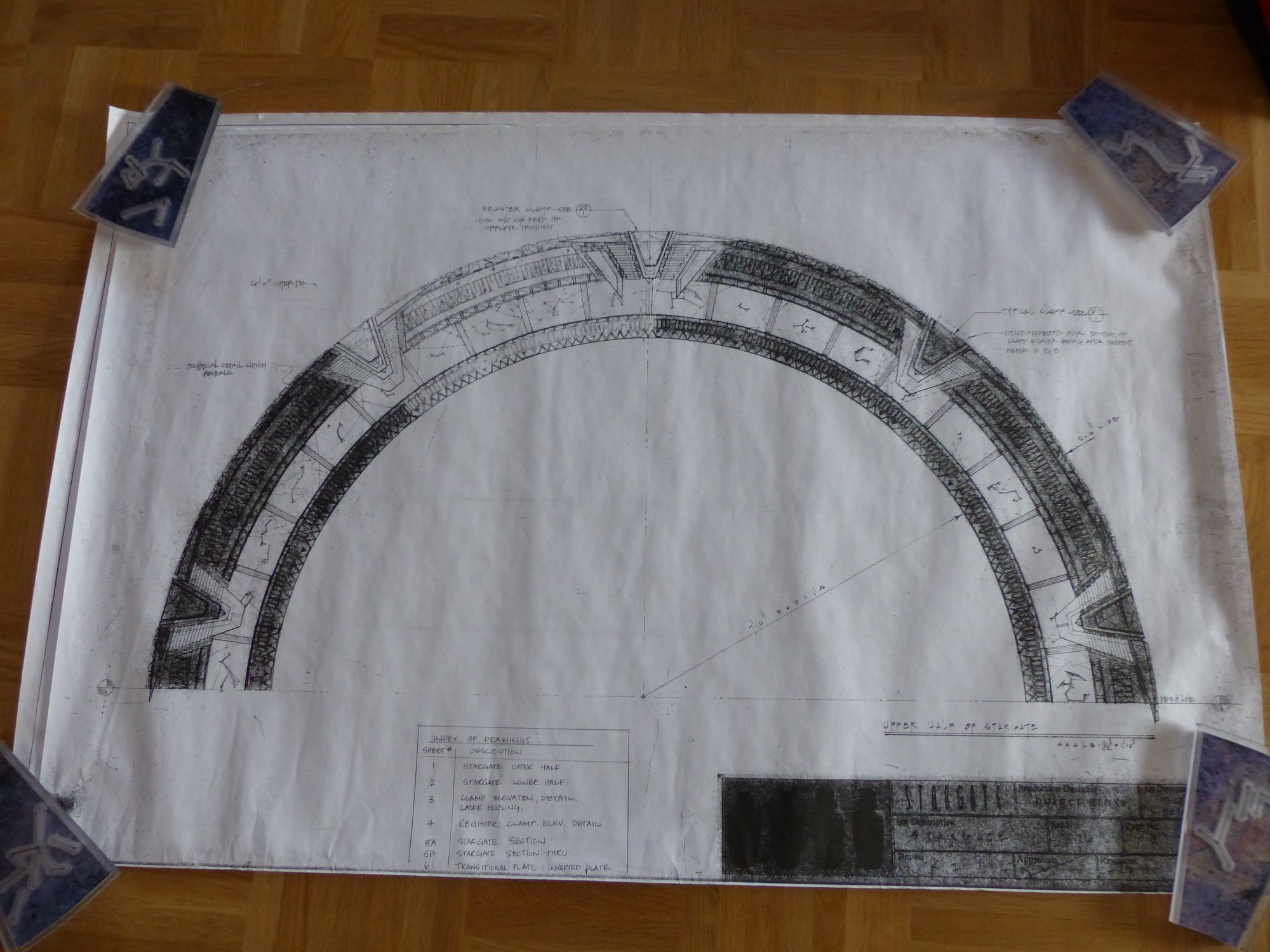
The first two stargates were ultimately hand-constructed, and may not exactly match the designed measurements, so I’m going to avoid any further figures, and explain the sizes of all the elements in relative terms.
Continue reading
| ↑1 | I call to the jewel the “Chevron Block” in my models, and the clamp simply the “Chevron,” but I’m using terminology from the production of the film for clarity in this article, rather than having the words “chevron” and “block” refer to multiple objects. |
|---|