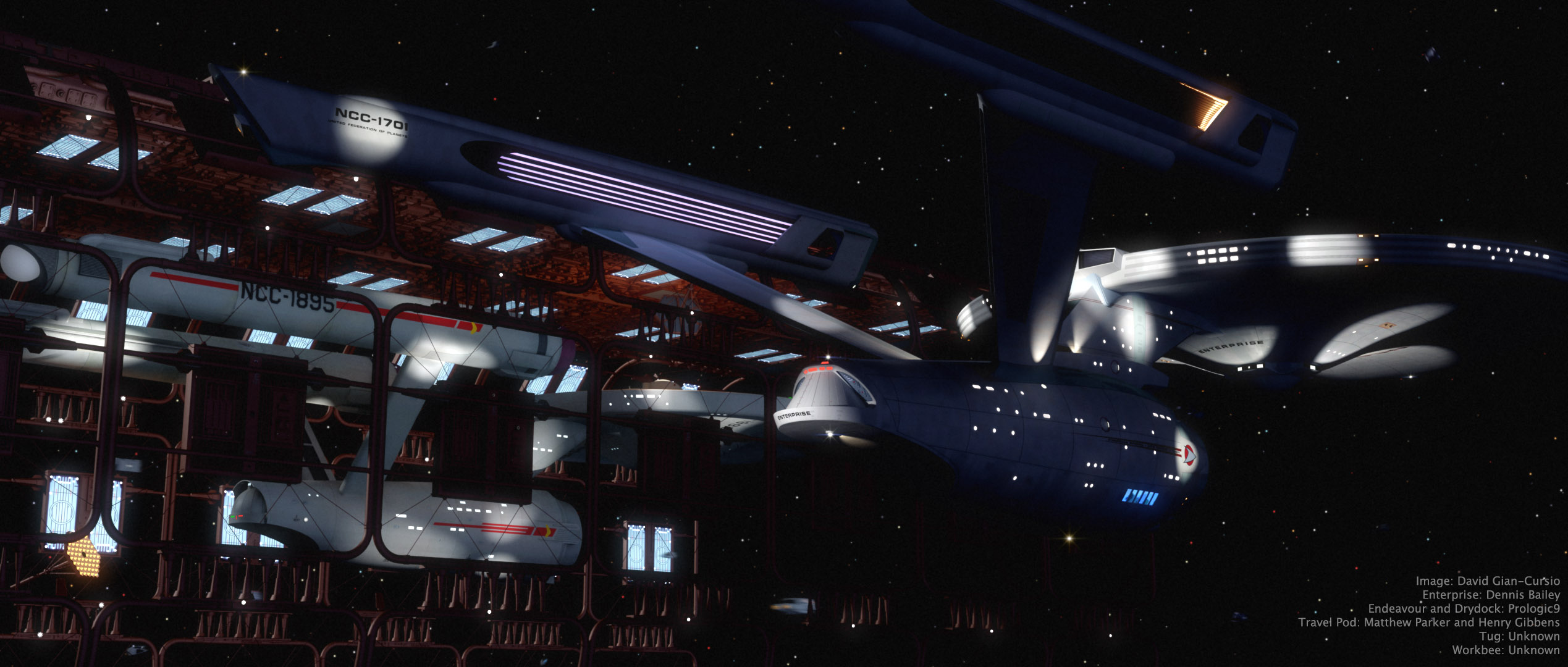
“Comparing Notes” was one of three favorite Trek images I submitted for consideration in the 2016 Ships of the Line Calendar contest (The others were “Charting the Crucible” and “Quiet Night at the Office,” if you’re curious). This one was a winner! I’d hoped to have a chance to gussy up the render for the calendar, but I ended up only having time to make a couple small tweaks when I re-rendered it at print resolution. I adjusted the lighting so the blue and yellow banding in the shadows that I mention was less apparent, corrected a minor lighting problem on the Enterprise’s neck that made a harsh shadow, and added some very subtle window boxes to the Endeavour. I didn’t finish the window boxes for the Enterprise, though I have been working on them in the meantime. I also opened up the frame vertically since the aspect ratio of the calendar is taller than I usually make my pictures.
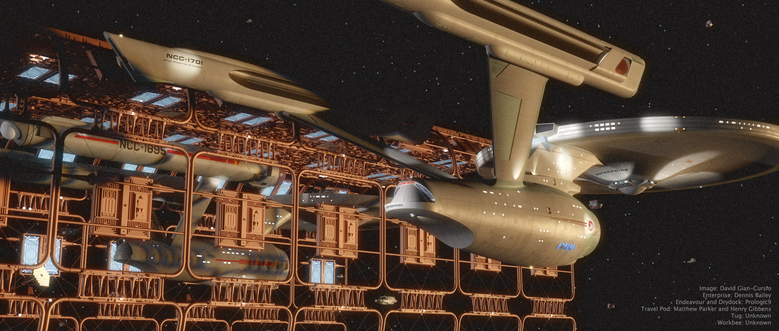
Having some time to return to Lightwave and a truly spiffy model of the TMP drydock, I decided to address an image bunny which had been itching me for a while. Namely, I’d wanted to do a take on this Andrew Probert painting with the Enterprise reflected pre- and post-refit. I ultimately remembered a photo from 1912 of the Titanic and her sister ship Olympic side-by-side at the repair yard and decided to do something similar.
In this case, the newly-upgraded Enterprise has returned to Earth so the engineers of the U.S.S. Endeavour can get some practical experience with the new designs as they begin to refit their own ship.
I colored the main light as if the sun had just set at that moment. It gives the picture a bit of a sepia tone. It also explains why the image is so grainy, because the photo had to be taken at a very high ISO since there was no more direct sunlight. I pulled the colors from this photo. In retrospect, I botched the lighting a little, as you can see banded shadows because I used two lights, one blue to represent the upper sky, and one red to represent the sky at the horizon. I am, however, very happy with the coherence (for want of a better term) of the image. A lot of times, the different eras of Star Trek can end up looking like totally different universes, and I feel like I avoided that in this one. There doesn’t seem anything at all odd about the original series and movie era sitting side-by-side.
I’m actually thinking I might be able to get a little more milage out of this picture. I may try out some alternate lighting setups.