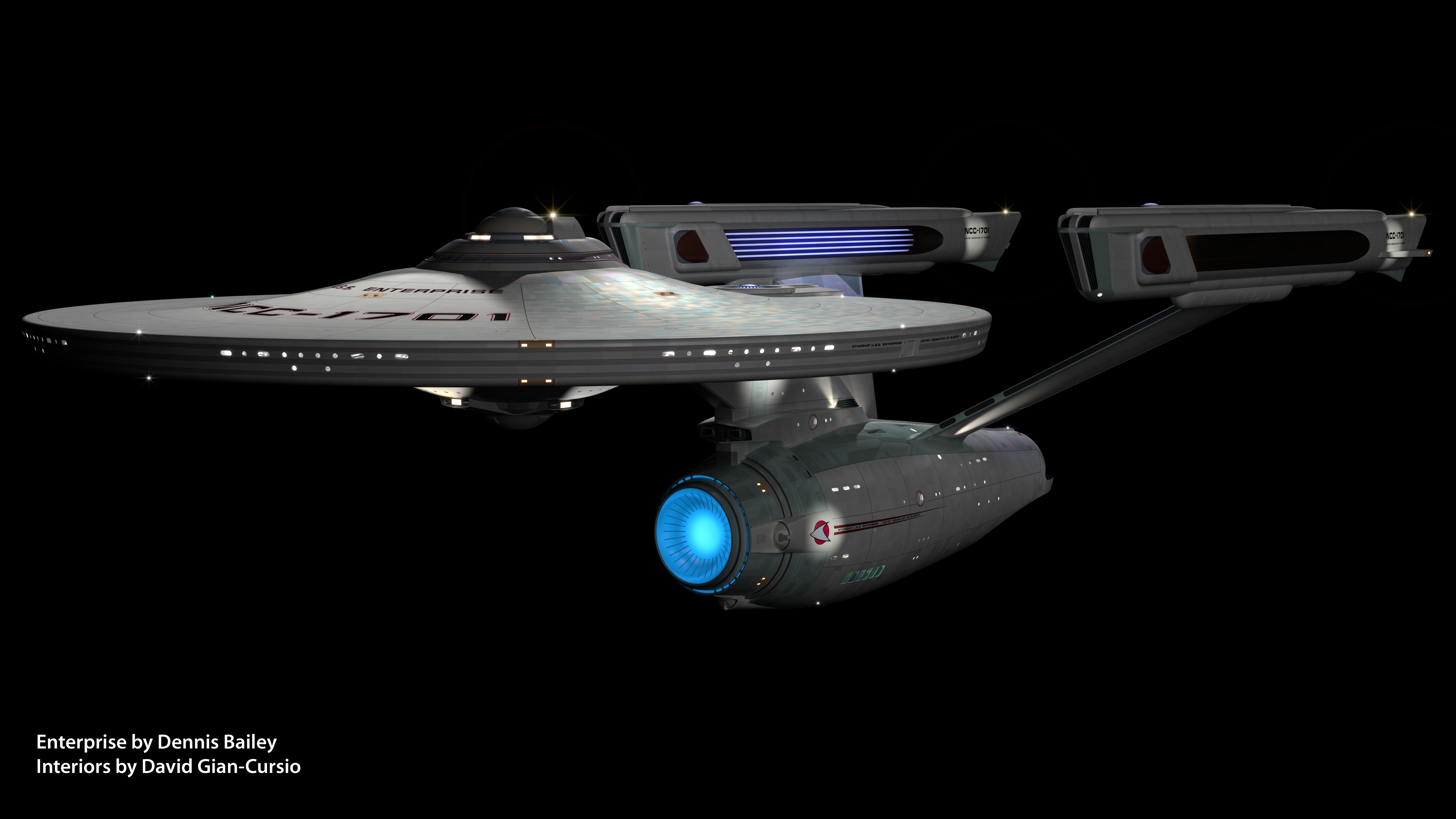
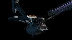
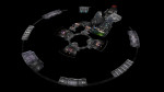
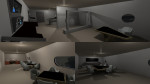
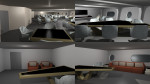
Last year, around the time the 5K iMac and 2016 Ships of the Line calendar contest were announced, I got the idea of making window boxes for Dennis Bailey’s refit-Enterprise model so as to show more detail in the high-resolution images of the future. This has been my favorite science fiction design for as long as I can remember, so simple textured boxes were right out. I wanted to have furniture, even crew people visible through the windows. It took a while but, the results were worth it.
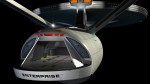
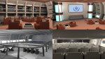
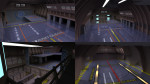
The layout of the rooms is based more-or-less on the Strategic Designs blueprint set, with some details from Mr. Scott’s Guide to the Enterprise and my own interpretations.
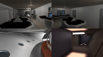
The model includes three swappable objects, based on locations that changed between the original Enterprise and the A. The officer’s lounge under the bridge can be replaced with a dining room, the large shuttlebay from TMP can be swapped for the enclosed version from TFF, and the swirling, gaseous warp core from the early movies can exchanged for the pulsing TNG model. The idea is that I could easily mix-and-match to represent other Constitution-class ships of varying configurations. I’m a big fan of the idea that sister-ships shouldn’t be perfectly identical except for the name painted on the front.
The whole configuration also comes in two versions, one in smooth earth-tones as the original Enterprise appeared in the first three movies, and one with more greeblies and silver and blue-gray coloring as the Enterprise-A appeared in The Undiscovered Country.
The crew people are very low-detail, little more than stick figures, but come in male and female, and have various skin tones and hair colors. I also set them up so it was simple to change the style of their uniforms, from the movie-era all the way to the various TNG-era uniforms.
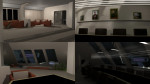
The only drawback is that the lighting for the windows is a little dim compared to the official model, but I’ve been rendering in passes for years anyway, so it isn’t any trouble to brighten up the windows after the fact.
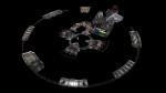
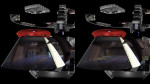
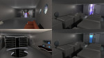
I included some small shots from inside the rooms but, to be clear, this is an exterior-only model. It’s no secret that interiors and exteriors for buildings and vehicles in film rarely match up perfectly, and these are no exception, with compromises made for the Recreation Deck, the Cargo Bay, and the height of all the rooms along the saucer’s edge, especially. Anyone building a model of the interiors of the movie-era Enterprise would have to ignore the outer shape of the ship to get those to look correct. The shuttlebay observation galleries being a half-deck below the window line on the exterior ship could be argued to be a feature of the “real” ship, but I’m not sure I like it.
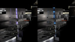
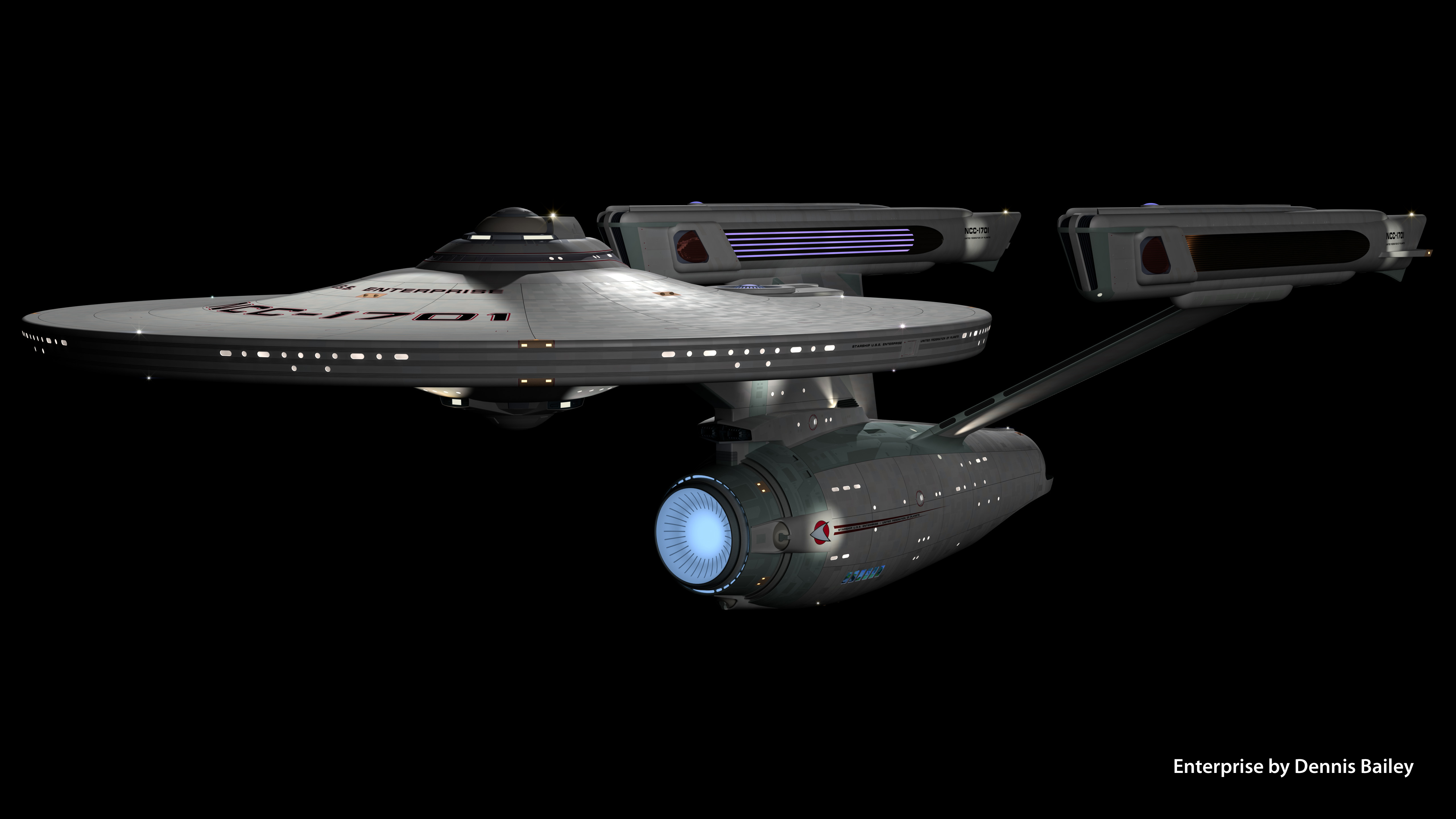
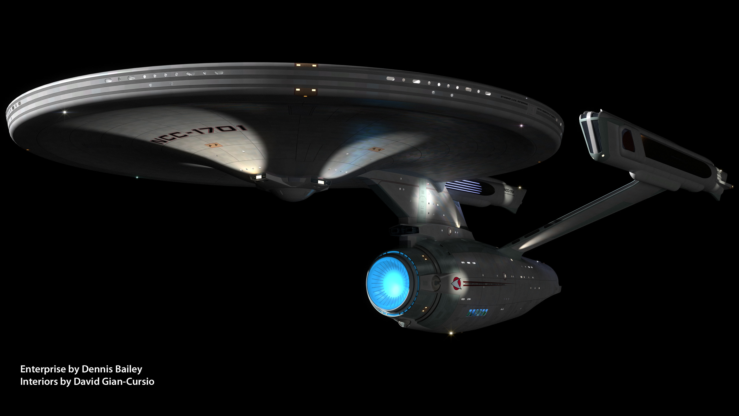
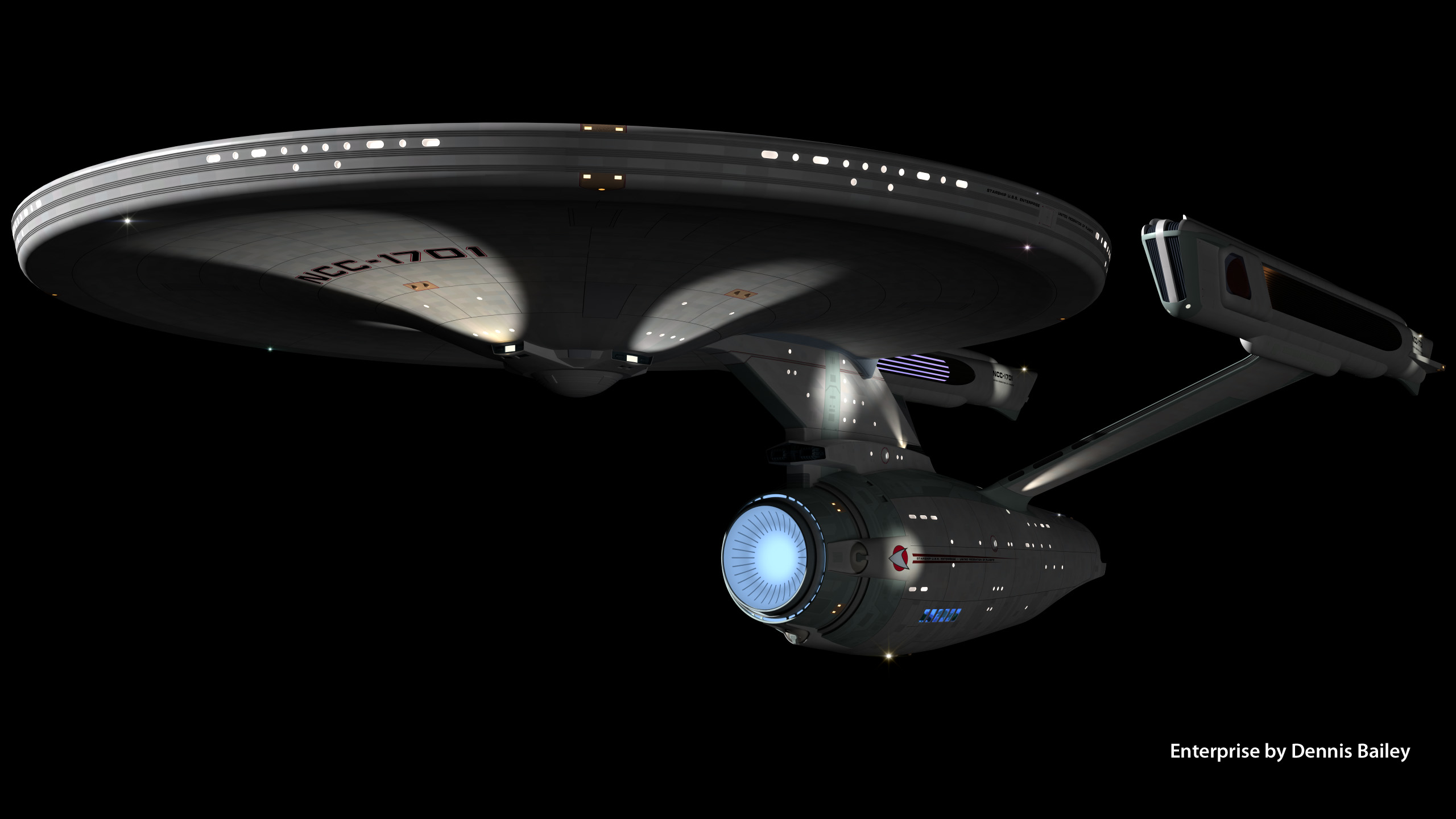
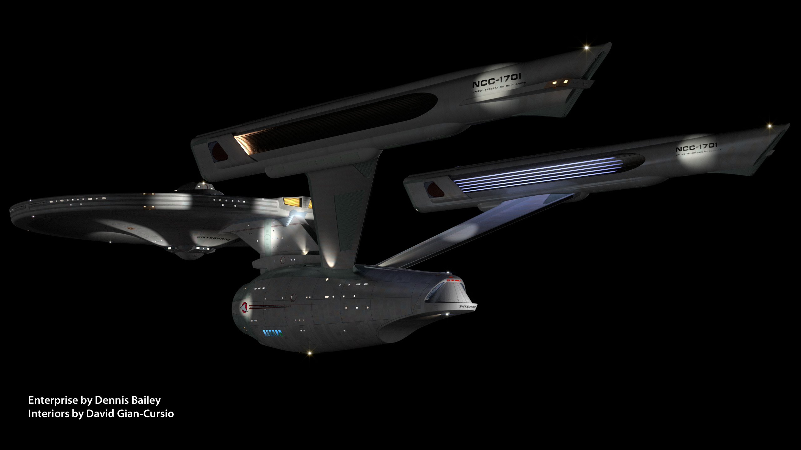
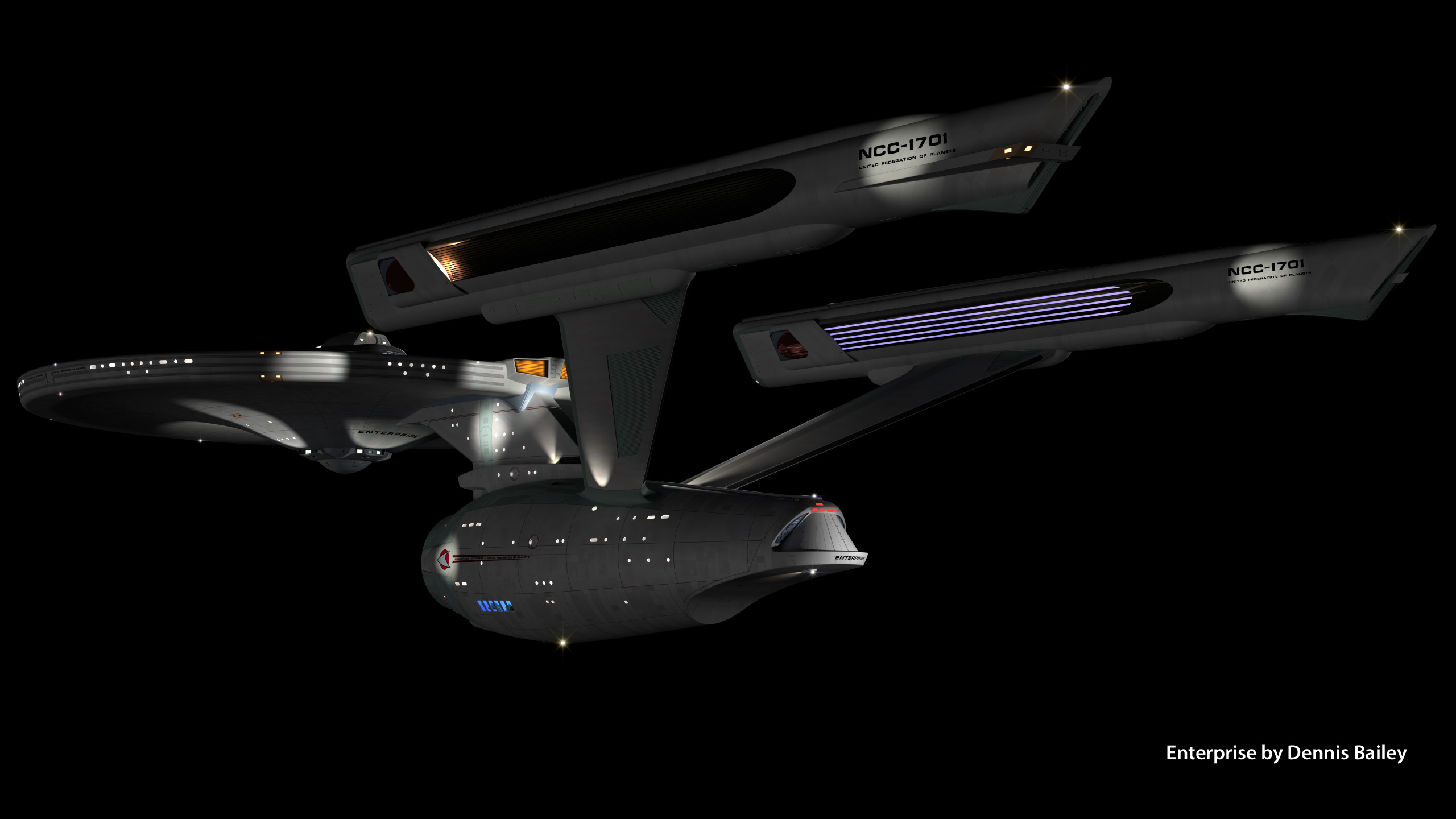
After I finished the interior, I decided to gussy up the texturing on the main model, as well. I’ve been fiddling with the textures and lighting setup since I first downloaded it, but this time I set out to match the reflective, pearlescent paint job the studio model had for the first Star Trek movie. It ended up being surprisingly straightforward to get multi-colored highlights out of the model’s original textures, and adding reflectivity to the surfaces also required only a little trial-and-error to nail down.
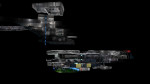
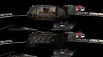
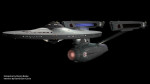
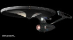
I’ve rendered off shots from three angles so you compare Dennis’s original model to all the stuff I’ve done to it.
My version is on the left, the original on the right.
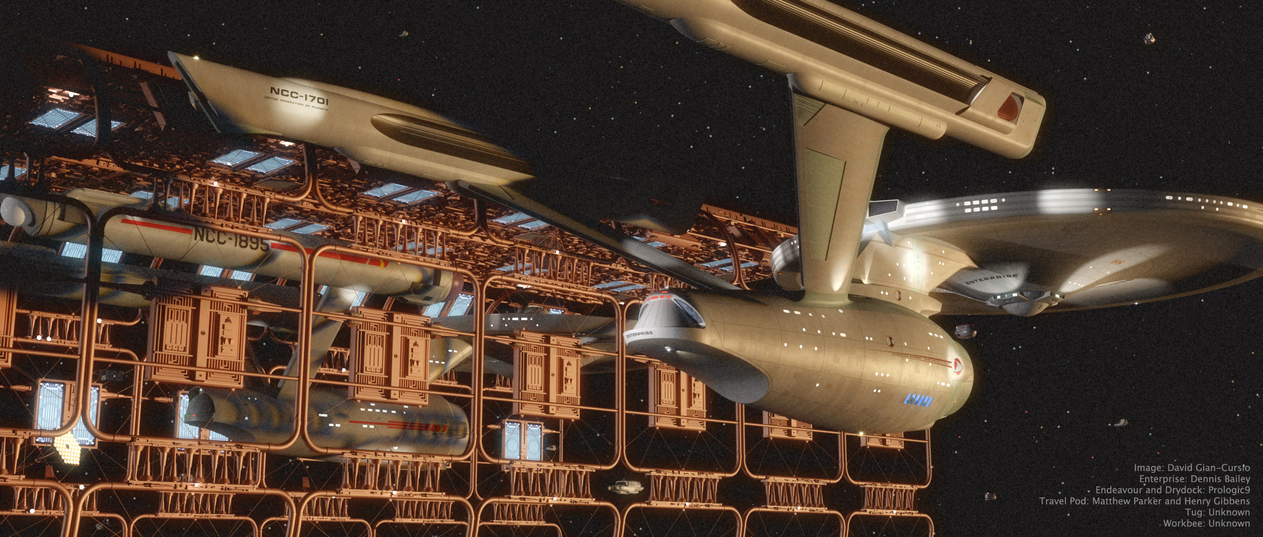
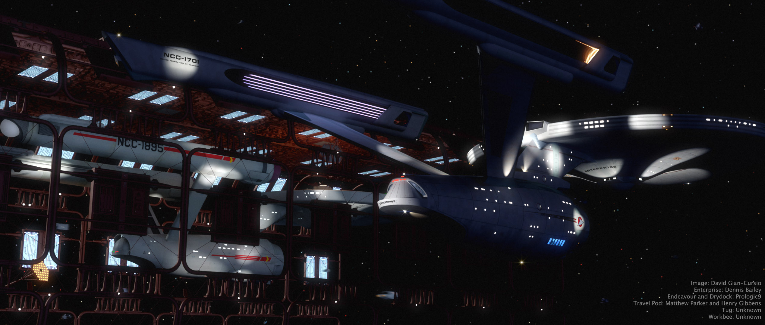
And here are some full-sized versions of my revamp for you.
You can see more work-in-progress images and read more details about the creation of model in this thread at Foundation3D. The model itself, along with an FBX conversion, and just the crew figures, is also available for download there. You’ll have to modify Dennis’s model to use them, which is why they’re in the “unfinished” section of F3D, but the Read Me explains what you need to look for.
You can also download them here:
Interiors (LWO)
Interiors (FBX)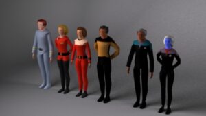
Crew (LWO & FBX)


