Serenity Liftoff

Now, this picture was an interesting one for me to make, since I tried a few new things. The contrails were a first for me, and I’m happy with how they turned out. The heat ripples coming out of Serenity’s engines also worked well. After a little polishing in Photoshop so the rendered elements blended in with the photographed stuff, I’m ready to call it done.

…For as Long as This Place Remains

From humble beginnings…

Seriously, I did this picture because I was frustrated with another project and felt like making something I could call finished, but I didn’t have any images in my head. So I decided, what the hell, I’ll duplicate a professionally made picture and call it a lighting exercise (and, hey, good lighting is important, and being able to figure out whatever the lighting setup was used at a glance is danged useful). So I picked the first (and so far, only) CGI still from the new Babylon 5 direct-to-DVD anthology series, “The Lost Tales.” This particular shot is from the opening sequence, and is itself a redo of a shot from the final episode of Babylon 5.

As with most of my recent pictures, the magic happened in Photoshop, where I began my customary bloom effect. Also, rather than just reducing the saturation of the picture, I duplicated the image on a new layer, made the duplicate grayscale in the channel mixer with a bias toward the blue channel, and then reduced the opacity of that layer. Finally, I applied a slight gaussian blur so that the Photoshop grain didn’t look so perfectly pixeled.

Screencap from “The Lost Tales” that this picture is based on.

Damn the Torpedos, Full Speed Ahead!

Admiral Kirk and the Enterprise lead an assault on a Klingon base in this, my latest render.

I’m really starting to get a sense for how less can be more with detail. Part of me hates to go into Photoshop and cover up that hard-won clarity with light blooms and film grain when it took 30-odd hours to render it all out (admittedly, that’s because I was doing other things with the computer at the same time, Lightwave is running under Rosetta, and antialiasing levels are like crack to me). However, it just looks really pretty with the sort of soft glow, and the grain helps sell it, especially up close.

DRADIS Contact!

A little side project over the last few days has been recreating the icons of the DRADIS displays from Battlestar Galactica.

A couple notes: The small Unknown icon is conjectural. In “Resurrection Ship Part I” a small ship was represented with the large Unknown icon, and in “Hero,” they used the Cylon Raider icon for a small Unknown, but whited it out when they bleached the flashback scenes, so it was hard to tell. So I made is a combination of the large Unknown and the Raider icons.

Also, the Resurrection Ship icon was only seen once, from a distance, where it appeared to be a modified version of the large Unknown icon, though it was difficult to confirm any details. In “A Measure of Salvation,” the Resurrection Ship II: Son Of Resurrection Ship was represented by the Basestar icon, which was unhelpful. However, the fact that the civilian ships were all made of pieces of the Viper and Raptor icons was very helpful, so I have no ill will.

I’m not sure how or when I’m going to release them. I’m thinking a zip of Photoshop files with the arrow for each icon on a separate layer. I’m also thinking about making them into a set of Mac OS X icons, but I’m not quite sure about that yet.

Final note, thanks to TrekBBS poster backstept for pointing me to the almost-perfect DRADIS display font, “Visitor.” And after drawing out text pixel-by-pixel, “almost” perfect is perfect.

“Approaching Star”

Not too much to tell about this image, really. Originally, I wanted to try to get the raw, high-contrast look that the early Babylon 5 publicity renders had, so I made a fairly boring image with intent to brighten it up later in Photoshop. Well, that didn’t work out.

About a week later, I was looking at some photography websites, and decided that I needed to experiment with more techniques, not just someday, but that right then. So I pulled up the image from my harddrive, and thought back to a magazine article on making better-looking black and white photos by using the “Channel Mixer” in Photoshop instead of just de-saturating the image. A few minutes of balancing red, green, and blue, adding a little light bloom, and some film grain to complete the effect, and I had a much better image. It’s now become one of my favorites.

Rising Star (Black and White)


If you’re curious, here’s the original color image.


Also, as a bonus, here’s another render from a while ago that I didn’t bother posting on it’s own, because it was a remake of an older image that was so flat and boring that I, apparently, never bothered to post it on-line. Admittedly, this one got a bit more of a makeover than my HD rerenders normally get (usually it’s just swapping in some area lights for planet and nebulae fill lights).

Strange New Worlds in Collision

A special treat today, considering I rarely render Star Trek pictures, owing mainly to how their greed for light doesn’t really mesh with my own style of lighting. After seeing the cover of James Blish’s “Star Trek 4,” I decided to make a picture based on it. Since I don’t have a model of the TOS Enterprise handy, I used Vektor’s Constitution. And then after I finished rendering out all the elements, I decided for the sheer unadulterated hell of it to make a second version with Dennis Bailey’s refit-Enterprise

So, without further ado…

The Constitution version:

The Enterprise version:

Stargate Yard Redux

Since I have a new, better Stargate model, I decided to do a new, better version of the only real picture I made with my first Stargate model, namely the ‘gate in my backyard. I also added a little something to allow the inner ring to spin freely. I’m not 100% happy with where the rendered concrete meets the real concrete, and something seems off about the scale and/or perspective of it, but I don’t know how to deal with that.


The 2006 Gates Are Here

…and it’s about danged time, too!

Well, I’ve been lazy about putting everything together, and I didn’t want to advertise the model until it was ready to go out, but now it is. Anyway, I’ve remodeled my Stargate from scratch, and I do believe it is far superior now in accuracy, detail, and general prettiness.

First, to refresh your memory check out the old version.

Now, get a load of the new version, in all its glory.

This uses the lighting setup and cove object from the LWG, by Jason T and Lightwave7871. And, after using it, it’s the only way to show off your models. Well, if you’re me, at least. Gad, it just brings everything right out on the modeled details and textures.

There are three versions of the main model, a low, medium, and high-detail version.

Low
Medium
High

Now, some of these next images were made while the model was still being fined tuned, so there may be minor details that are different.

Top of the Atlantis gate
Back of the SG-1 gate
Front of the SG-1 gate
Front of the Atlantis gate
Earth Origin Symbol
Abydos Origin Symbol
Antarctica Origin Symbol
P7J-989 Origin Symbol

And, don’t forget it’s animatable. You’ll need an up-to-date version of Quicktime to view these.

Chevron 1 Locks using a movie-style animation setup
The beginning of the Atlantis Stargate’s outgoing dialing sequence
The Atlantis Stargate’s incoming dialing sequence
The puddle effect (with lighting!)


Go here to download it.

“I am a Leaf on the Wind…”

Well, it had been a while since I did anything but model rigging in Layout, and once I saw Serenity, this picture just sorta popped into my head. I’d been saving the basic composition for another idea, but I decided that this was as good a use as any of the “Ship flying towards camera left over an ocean sunset” concept. Plus, it gave me a chance to try out Skytracer and a tutorial landscape and ocean plain that I hadn’t made use of yet. Anyway, here’s the picture.

You don’t even want to know what the installation cost was for this thing

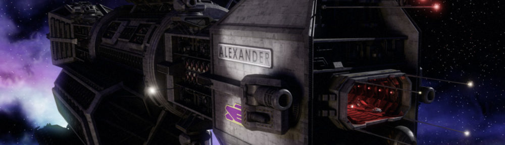
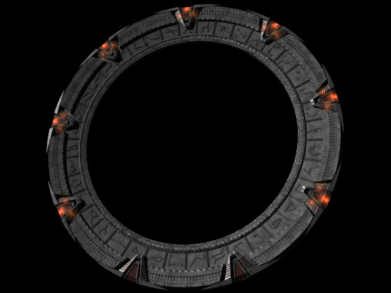
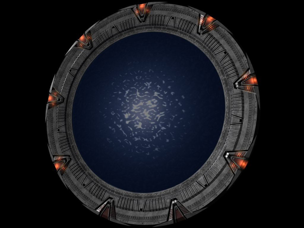
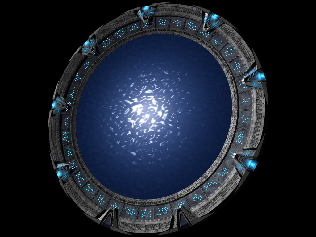
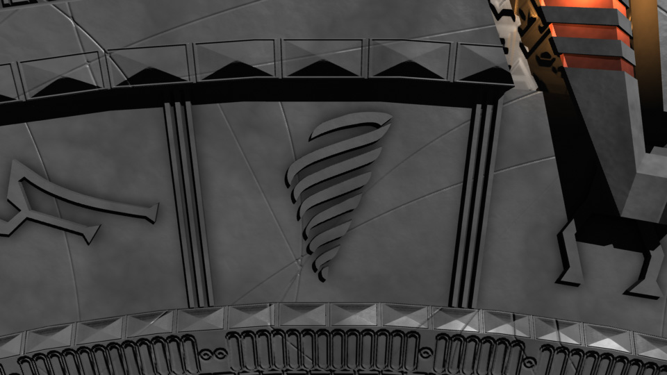
While I have done a few experiments with compositing, this is probably my most ambitious effor. In case you’re wondering, that is my back yard (currently, and delightfully, hurricane free), with my new Stargate model placed in it. Perhaps SG-1 could come through that ‘gate some time. A nice, (if slightly overdeveloped) piece of the subtropics would certainly relieve the monotony of all those pine-tree planets.

Now all I need is a real one to put back there, to see how close I was to reality.

I did the compositing in Lightwave. I set it up to do that thing where it makes an alpha map for the ground stand-in based on the amount of shadows, just in case. I only have Photoshop Elements (which happens to be missing the Element of alpha channels), but I was able to use a copy on one of the computers at school to make a transparent image of the ring and its shadow, so all that remains is to reintegrate it into my original background and tweak it up a bit.

Another thing I noticed was that on the school PC’s monitor, the blue cast (caused by the light I used to simulate the glow of the sky) on the ground object (and the devision between it and the real background) was a lot more noticeable, and the shadow of the ring was a lot lighter. So while I’m most concerned with getting it to look right on my Mac, I may have to see if I can steal some more time at school to find a happy medium.

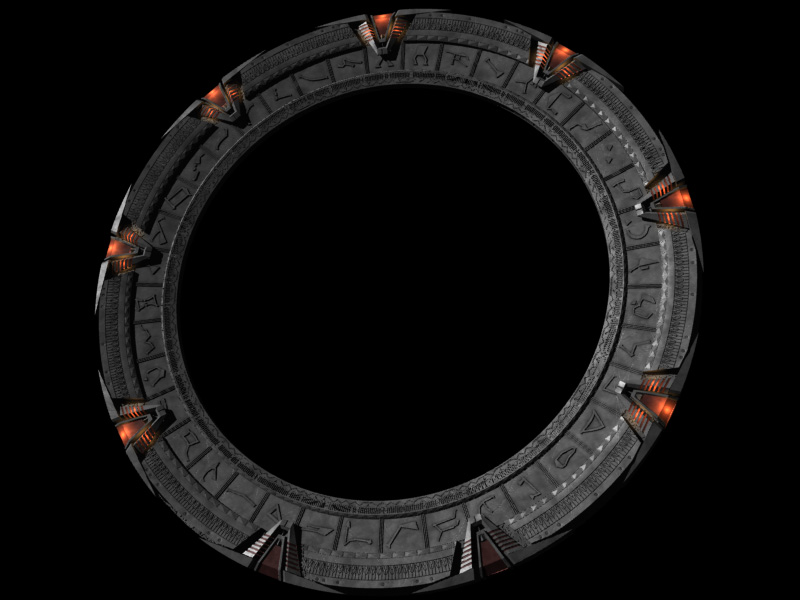
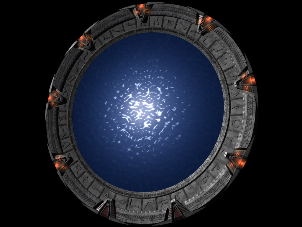
I rerendered the scene with a slightly modified ‘gate model (fixing a spot of missing detail on the back and adding a more accurate bit of detail to the inside surface, where the event horizon sits), and a slightly modified lighting scheme (I tried throwing a little more specular on it from the sun, but found the only way to get even a little to show was to have the light point straight down, which wouldn’t have fit in with the shadows all that well). I then recomposited the ‘gate in Photoshop, getting rid of the blue cast on my front-projection polygon. Only problem that remains is that the bump mapping in the chevron wells is having some kind of difficulty, causing the background to shine through as if it were partially transparent there. I’ve no idea how or why, and it doesn’t show up on the alpha map of the image.

In summery, I think it would’ve been far easier to go to Canada, steal the prop, and instal it in my driveway, then say it was a comp-job when I posted the pictures of it. It would also be endless fun at parties.