Quiet Night at the Office

I got another bite of the render bug the other day. I’m going to need that to start coming a bit more consistently again.

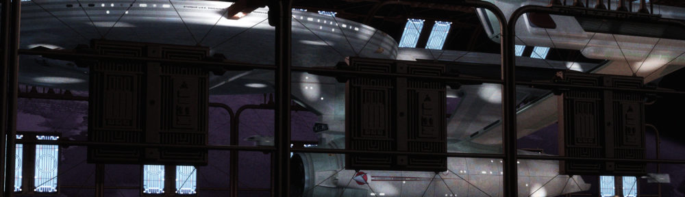
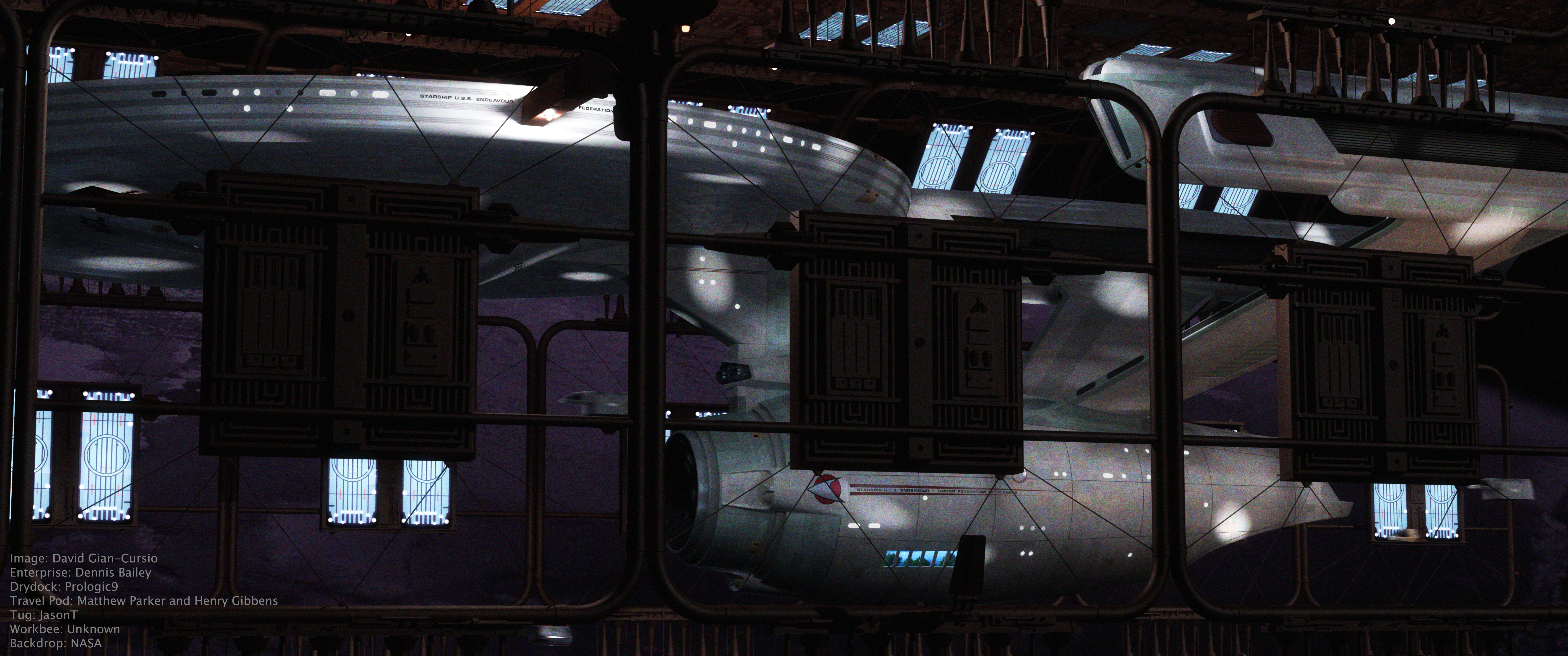
I originally visualized this angle with a Miranda-class ship, but I don’t have a modern Miranda that’ll hold up to this kind of proximity and detail. While I was assembling the scene, I found I’d already had one from an earlier attempt to make a nighttime drydock render, but I hadn’t been able to settle on a good angle. So I loaded in the old scene, aligned it to fit the picture in my head, added a bunch more spotlights, and rendered it.

I think this works much better as a night shot than my prior attempts have. My initial inspiration for the shot, lighting and mood-wise, was this photo of a cruise ship docked at night:
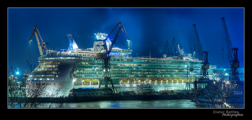
The background is from NASA’s library of astronaut photos of Earth. It’s actually a shot of the terminator. I desaturated it and then recolored it dark blue to represent a barely-visible nightside. Also, since I figured a night shot would require a longer exposure, I cranked up the motion blur well past 100%, so the various shuttlecraft that are buzzing around are barely-defined blurs.

Updated 2015-09-03:
Quiet Night at the Office 5K

I’ve re-rendered “Quiet Night” in 5K. There are a couple of deliberate changes in this one compared to the original version of “Quiet Night at the Office.” The most obvious is probably that I repositioned all the travel pods and work bees because I set up the scene to animate and wanted more visually interesting flight-paths. I dialed back the motion blur a bit, as well.

A little more subtle touch is that I changed the ship from the Enterprise to the Endeavour, after a tedious evening of aligning and stenciling text. I wonder if there’s a script or something that you could write to do that.

I brightened up the windows considerably on this image, possibly too much. It’s more like my original aim for them, where they still look a lot like the featureless white of the studio model, but have just the subtlest suggestion of depth. You can just barely see a person in the first long window to the left of the gangway. I also think I might’ve been a bit too heavy on the grain, but I’d like to see it on a retina/hiDPI/5K screen before I make a final judgement.

Updated 2016-02-14:

And here’s an animated version.
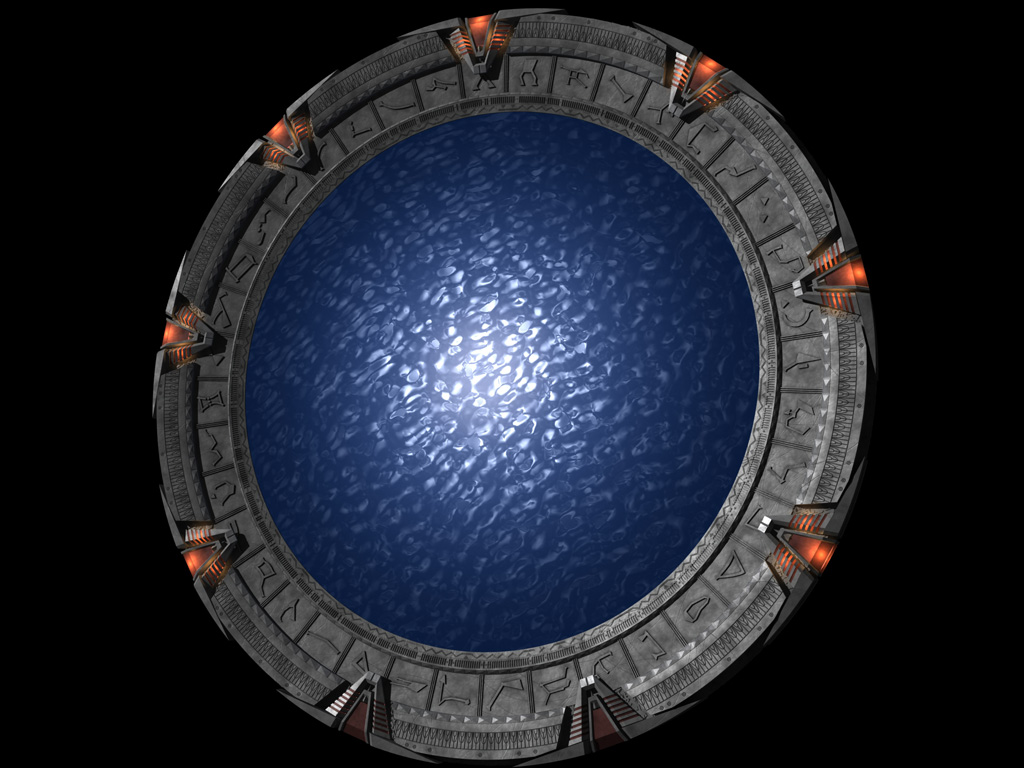
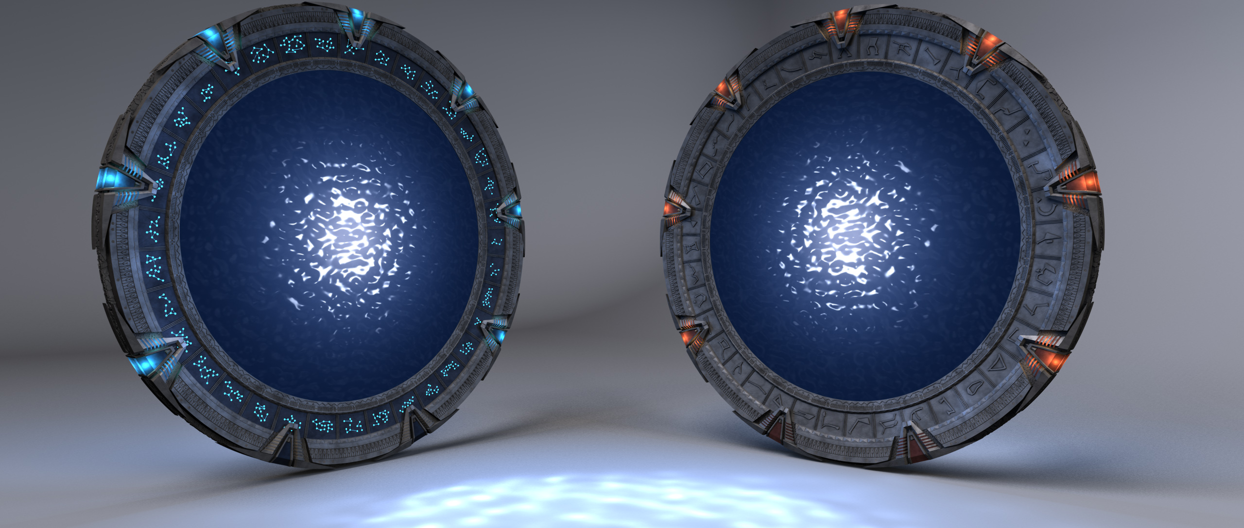
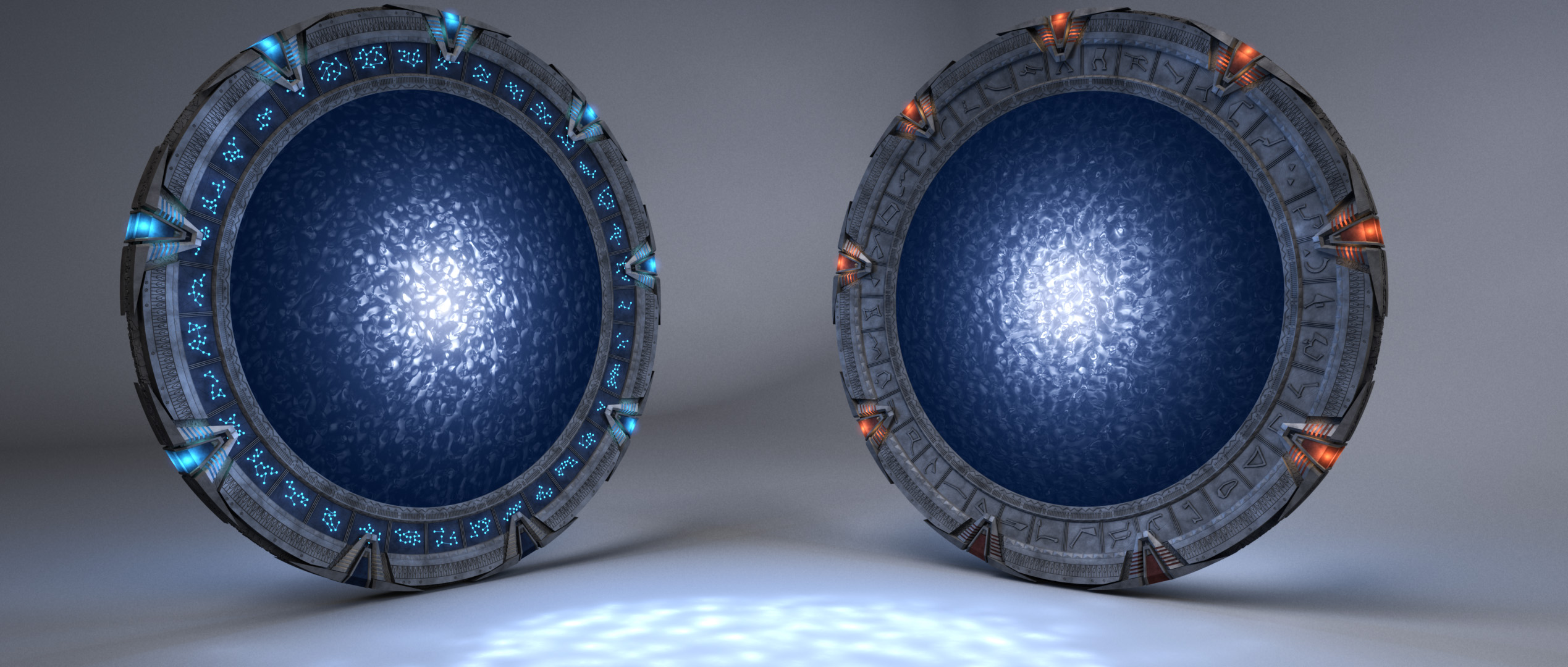
Stargate puddle effect: Now with quality!

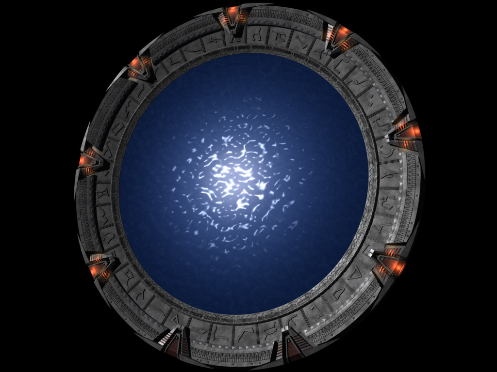
I don’t even remember what prompted it, but I started fiddling with my four or five year old Lightwave Stargate model this past weekend, and decided to take another shot at something that had heretofore frustrated me, the “puddle” effect.

Originally on my model, I did the highlights in the middle with a specular hit. The trouble is, that only looked right from a head-on view, with the spec coming from a head-on light, with all the scene lights deacivated. I ended up pre-rendering a loop of it, and then applying it to a plane for actual scene work. It took a lot of space, and meant a separate pre-render if you wanted to show another set of ripples form something passing through the stargate. It also tended to look flat from oblique angles. Huge pain, and I always wanted to figure out some way to do it procedurally in-camera.

A couple years ago, it occurred to me that I could help reduce the fakeness of the effect by just pre-rendering the highlights, and having the reflection map I used to break up the ripples be rendered in-camera. This helped, but not really that much.

So, that brings us back to now. I started looking at it, and suddenly realized I could just use a gradient to ramp up the reflectivity closer to the center of the object. The reflections would blow out to white as it got closer to the center, it’d be totally independent of the scene lighting, and it’d shift subtly with the angle of the camera.

It’s just. That. Easy.

Old Effect:


New Effect:

Anyway, I fiddled around with it further to perfect it, all the while kicking myself that this perfectly obvious solution hadn’t occurred to me five years ago when I started trying to nail this.

Also, if I’d figured it out then, my interactive lighting solution would still work. Apparently, something in Lightwave has changed in regards to caustics and refractions, breaking my old solution, leaving me stymied.

From the rear, the stargate effect looks the same as the front, except semitransparent, and occasionally with a ripply refraction effect, if the VFX people think it’s worth it this week. Simple enough, right? And so it was. Just the same texture as the front, slightly transparent, and with an appropriate refraction index.

The stargate also vomits light out of the front, like sunlight reflecting off water onto a building. I replicated this with a spotlight shining through the back, with caustics enabled (and rediculously cranked up), through a dummy puddle hidden from the camera with a higher refraction index so it would look right. And look right it did!

Now, though, the transparent back doesn’t work properly, apparently catching a reflection of the front despite the fact that the front side of the puddle is one-sided polygons in every way it’s possible for polygons to be one-sided. Now that I’m talking about it, I think I remember something about caustics or refraction being altered in Lightwave 9 to remove the nessessity of “air polys.” That could have something to do with it.

Well, that’s not too bad. I just live without the refractive back. No big. Unfortunately, the caustics are just wrong. They move very slowly in one direction, and flicker like it’s going out of style. It looks like nothing so much as a helicopter’s blades on film, a wide blur slowly moving around and around.

I backtracked to the versions I did my old test renders with, and made sure the problems weren’t the result of something I changed (which it seems to be in one other case, where the spot I used for the caustics ignored the caustics object and went through the proper puddle, despite having exactly the opposite set in the “exclude object from light” settings. That’ll be a fun one to track down). I’ll continue fiddling with it in the coming days to see if I can figure some new workarounds for it. I’m also thinking about trying to do a kawoosh now that I’m looking at it again, having seen some spiffy CG ones on youtube (including one that used my gate model).

At the moment, though, my gate looks fine from the front, and the lighting looks fine in a still.

Old Effect:

New Effect:


Updated January 30, 2015

I’ve rendered a 5K version of the showcase image.


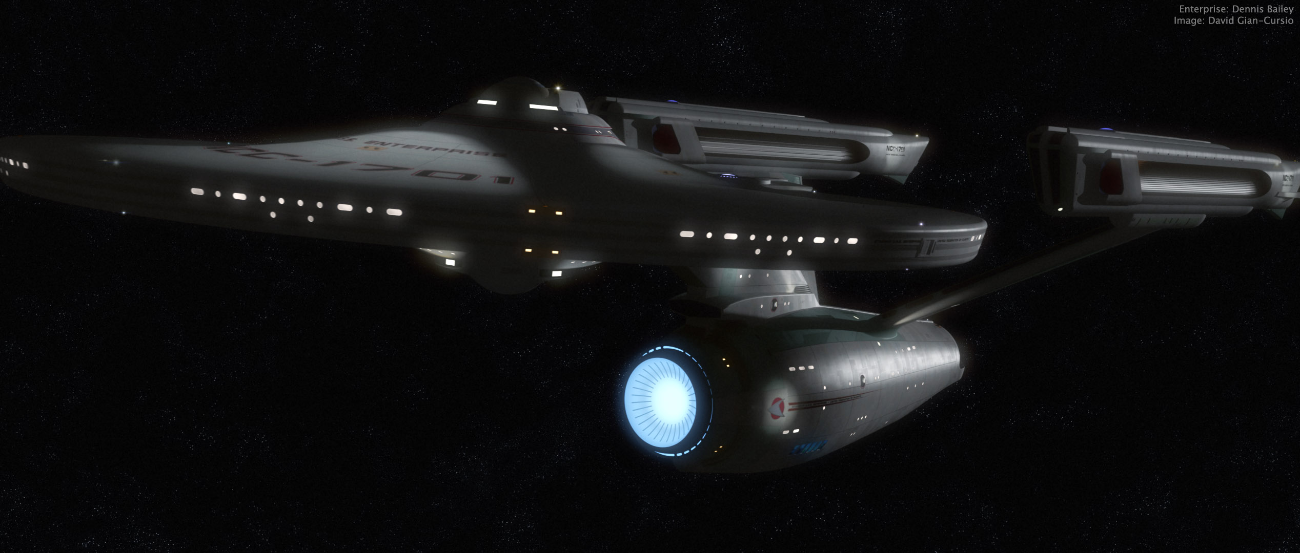
Just a quick refit-Enterprise beauty shot

(I just realized writing the topic, I really can’t call this ship “the movie Enterprise” anymore)


I suddenly felt the spirt move me today waiting for class to begin, and fired up Lightwave for a quick pic. I couldn’t have spent more than ten minutes setting up the camera and the key light (and most of that was fine-tuning the light to get a spec hit I liked). Since it was just me doing a quick little thing, I didn’t do a proper multi-file breakdown, but instead manually turned on and off each set of lights and glows to render out six layers (ambient occlusion, key diffusion, key spec, model glows, the model’s self-light rig, and the model’s lighting-rig’s lens flares), all saved as HDR .exr files.

I felt like trying something new, so rather than using my trusty old BetterSpace star field (first thing I ever made in Lightwave!) I gave Greg Martin’s photoshop star field a shot. It’s definitely different. More painterly than usual. Also, while I was looking it up, I saw Greg Martin’s doing a cool eight-planets multi-artist astronomical art thing that I thought was pretty inspiring.

Anywho, I adjusted and bloomed the heck out of all my passes, slapped in some film grain, and called it done. Well, there was a little more fine-tuning and experimentation involved than that makes it sound like, but it’s really more fun to do than it is to talk about.

Stardate 1277.1— All is Well

Ship’s Log, U.S.S. Kelvin, Stardate 1277.1. Captain Richard Robau recording.

We are on course to deliver our cargo of colonists and supplies to Beta Antares IV. The journey remains uneventful, and all is well. On a personal note, it gives me great pride to record in this log the first birth on board the Kelvin. James Tiberius Kirk was born this morning to Lieutenant Commander George and Lieutenant J.G. Winona Kirk. James is named for his grandfathers, and is the Kirks’ second son. On behalf of the entire crew, I’d like to note our congratulations and good wishes on this happy occasion.

So, here’s how it happened in the Prime Universe (“Harold,” to its friends). No Red Matter singularity, no diversion to the star to investigate, no mystery attack, just another day in space. My own little (very little) twist on the opening sequence of the new Star Trek. I pretty much had to do it as soon as I saw that a Lightwave version of Tobias Richter’s Kelvin was available, since I felt that it totally stole the show.

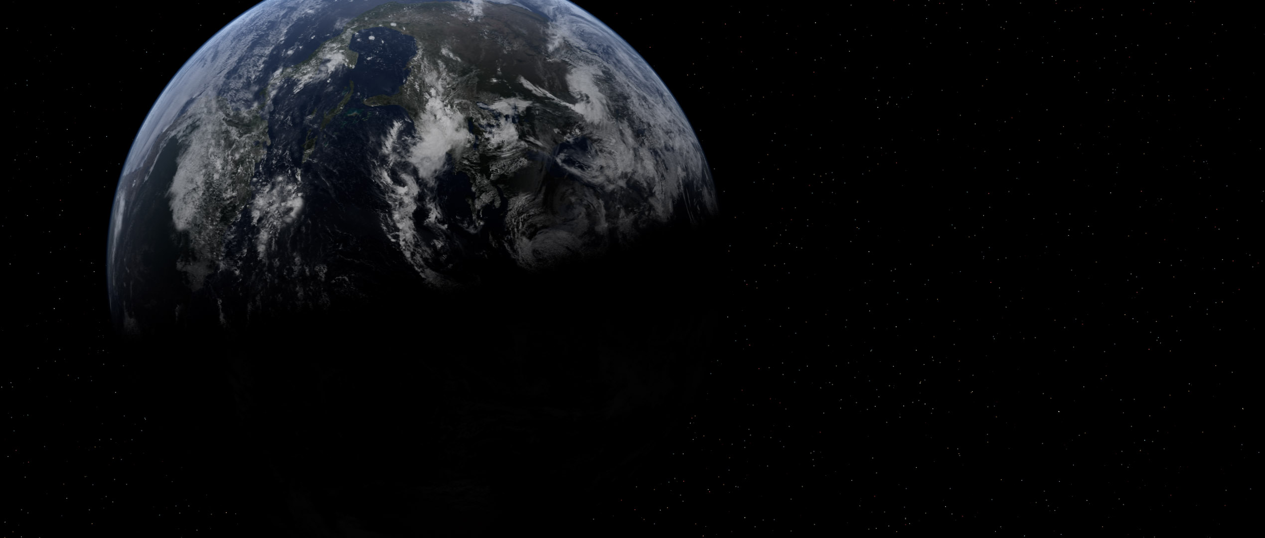
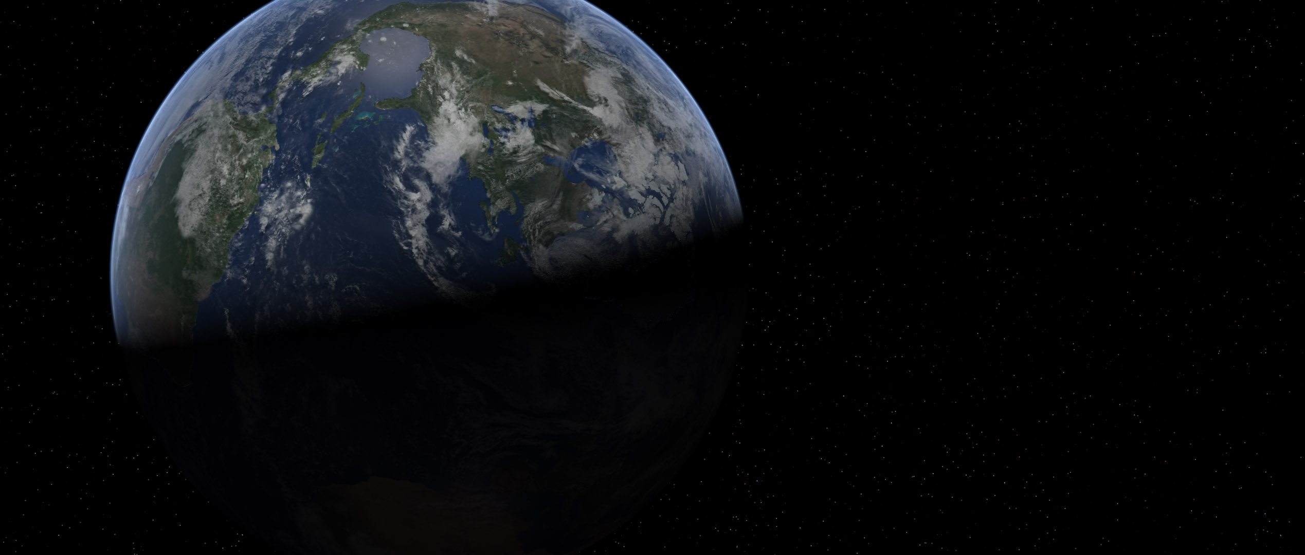
Revamped Earth, because I can’t resist a bandwagon

After seeing those sweet-looking new Earths in the Foundation3D WIP forum, I just had to get in on the action myself. I’d started to think my Earth, made from Dean Scott’s tutorial with the Blue Marble maps, looked cartoony, so I began fiddling with it.

I reduced the diffuse sharpness on the surface object so it would begin to shadow more quickly, making the clouds keep their brightness slightly farther into the night side. I darkened the surface, as well, so it was a bit less shiny and colorful. I also made the cloud layer brighter, and reduced the transparency of the atmosphere object away from the edges to help flatten the contrast of the planet.

I also swapped out the moon map with a new one I found that didn’t have shadows on the craters (which kept making them look like domes unless I kept the camera and the sun light at specific angles), and I found where the high-res Blue Marble cloud data was hiding on-line. I needed to fill in the poles with cloned data from the regular resolution version on their website, and then I had to shrink it down so it would actually load, so it ended up being only negligibly larger than the version I’d been using. At least I have a 43,200 x 21,600 cloud map waiting for the happy day when my desktop replacement is replaced with a desktop and I have the kind of power I’d need to use it.

(Incidentally, the cloud map can be found here, in two 21,600 by 21,600 chunks. Here is the smaller version I used to fill in the missing data at the poles, rather than painting in my own.)

After I rendered out these shots in LightWave, I saved them as HDRIs, as is my custom, and brought them into Photoshop for my usual bloom-and-grain treatment.


Just so everyone can see the difference, here’s that last one twice more, first with my old Earth model, and second with the new one just as it came out of LightWave, with no post work.

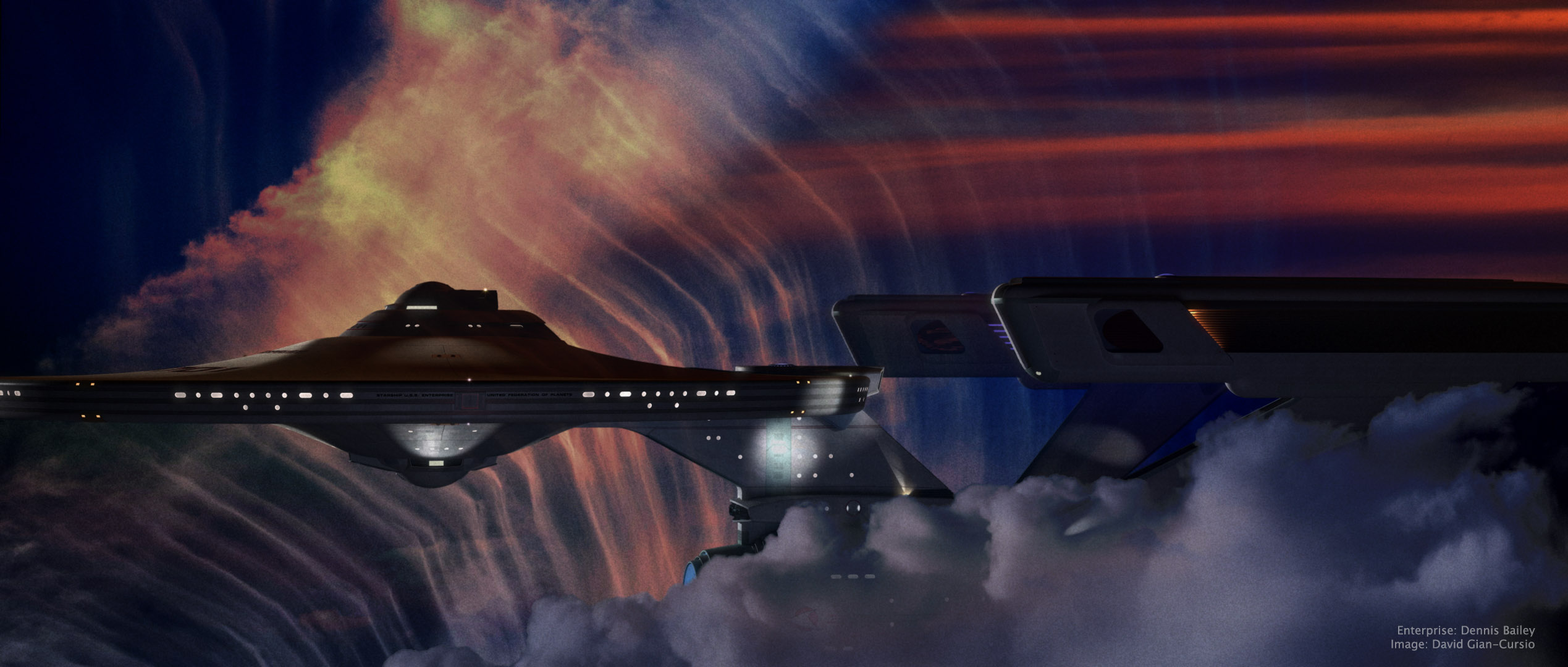
Charting the Crucible

This picture was inspired by a shot in early season 3 of Battlestar Galactica, where Galactica emerges from behind a cloud in a nebula, looking for all the world like a seaship emerging from a fogbank. I decided some time ago that the movie-era Enterprise would be a perfect ship for my own take on the shot, given that it’s my favorite spaceship and that it’s long, sleek profile means it’d fit well in the aspect ratio I normally use.

The nebula background (and foreground) was a composite of four photos of clouds I’ve taken over the years (and anyone who’s ever seen me while I’m holding a camera can tell you that I photograph a lot of clouds), colored, mixed, and generally fussed with in Photoshop. I did a good deal of fiddling with the bloom and fog depth effects on the ship as well, until I was happy with them. I quite like the colors in this picture, and it’s one of my new favorites. And any day I can look at a picture and think “new favorite” is a good day.

As for the narrative of the image, all I can say is, it’s not from The Wrath of Khan. It’s a nice, peaceful image of the starship Enterprise exploring another, completely unrelated nebula. I know it looks like the nebula from The Wrath of Khan but, well, it’s not. Because I said so.


—

Added July 11, 2008

In light of the interest this picture has gotten, I’m putting up a quarter-sized version of the final Photoshop file, as well as the source files I used to create it, for others to examine for self-educational purposes.

On the nebula effects:
The first thing I did was put in the foreground cloud. I cut it out using a layer mask that I made from selecting the color of the sky, because there was a pretty clean division and I’m far, far too lazy to matte by hand when I don’t absolutely have to. I used an adjustment layer to give it it’s color, and then another photo of a sunset to break up its color a little. I used the same layer mask to block out these two layers, as well as the bloom layer for the ship.

For the bottom layer of the background nebula, I started with a light, whispy photo of clouds, with the opacity turned down a smidge so the black background layer would darken it up a little. Then came an adjustment layer the same color as the one for the foreground cloud, with this one set to “Linear Burn” in the blending mode to darken it up, and the “Blend if” box in the blending options being set to reduce the blending as the underlying layer got brighter. This set off the clouds in that picture more from the sky. I used the same sunset again to alter the color of this part of the clouds in the next layer up, this one set to “Vivid Light.” The topmost layer was another sunset photo, with smooth bands of red clouds, that I placed in the upper right to help justify the red light on the top of the ship. That one was matted in with a layer mask as well, with much tweaking of its levels so the red part would show up but not the sky behind it.

After I’d done all this, I still didn’t feel like it was quite done. Eventually, I realized what was missing and ran back to Lightwave to render out a depth pass of the ship using the Render Buffer Export. I used that as a layer mask on the ship layer, which helped sell that it was traveling through a gaseous medium (it’s most apparent where you can see the foreground warp engine overlap the background one, but it affected the whole ship.) The topmost layer was a merged version of the image, with a filmgrain-and-blur applied, and then darkened substantially with levels, and set to about 50% opacity.

—–

It took some doing to matte in the cloud without getting a black edge of what used to be sky. Even once I’d pulled that out, I found that the thick, full feel of the cloud completely broke with the thin, wispy clouds I used in the background. I didn’t really have a more suitable cloud, and didn’t want to render a 3D one for time and aesthetic reasons, and the composition didn’t work if I took it out all together, so I made it fit more with the background by giving it some of the same color variation. It still wasn’t perfect, but it served its purpose of framing the ship.

———-

On the appearance of the ship:
I think that feeling of solidity came out in Photoshop. The lighting was pretty basic, all told. The model’s rig, along with a small white area light at about ten o’clock for the rim light, a large red area light high and past the model, and a bluish area light behind and below the camera. (I also rendered the image with “Final Gather” radiosity enabled.)

Turning layers on and off, it seems that the CGI went away with the top layer, which was duplicate of the merged image, with film grain applied and the levels adjusted so the whole ship was almost entirely black, and then reduced it to 50% opacity.

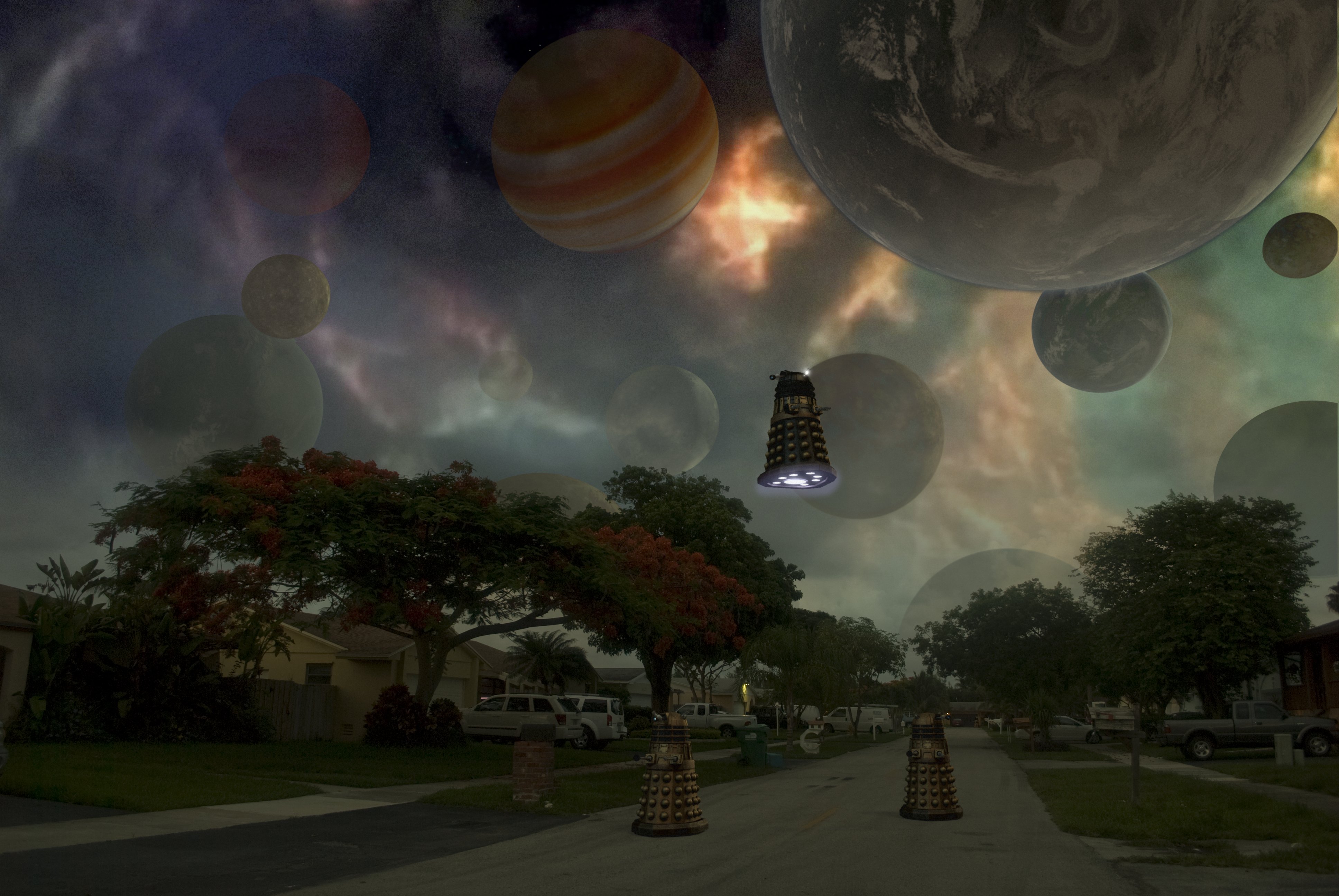
The Stolen Earth

“Do you know what, I look up and there’s all these moons and things, have you seen them? Do ya see ’em? What was I drinking last night? Furniture polish?”
“Ianto! Time and a place!”
“Yeah, it’s funny though.”

The impetus for this picture was a comment on a web-board where someone mentioned that they’d like a wallpaper-sized version of one the scene with the planets above the streetscape at the beginning of “The Stolen Earth.” After pointing out that since Doctor Who isn’t made in HD, there isn’t enough resolution in any version of the scene for it to work, I (and my massive ego) realized that I did not have the same limitation. And, hey, any excuse to fire up Layout.

I went out onto my street just after the sun had set, so I could get some appropriately dim yet not completely dark lighting. I then matched the perspective in Lightwave, and rendered the Daleks and the planets separately. I decided to give the Supreme Dalek who’s lording it over everyone an extra gun just to mix it up a little. As for the planets, I pretty much picked out anything I had that wouldn’t be a recognizable real planet and tossed it into the sky.

The real fun was in Photoshop, where I changed the white balance in the original photo (which had a heavy blue cast from the dusk light), pulled out the sky, put the sky back in a little to form a sort of haze because the gaps in the trees were giving me trouble, added in the Medusa Cascade from a screencap, and faded the planets in different amounts to give it the appearance of depth. I then fiddled with it on and off for the better part of a day before deciding it wasn’t getting better anymore, just different, and decided it was time to post it.

TOS Cylon Basestar Montage

Since I hadn’t done much in Lightwave for the past few months and have the chance again with the successful end of my creativity-sapping traditional drawing course, I decided to try out an animation. I wanted something reasonably simple to warm up, so I did a series of four drifty shots of Raffs’ Basestar, assembling them into a montage like the ones used for establishing shots of Basestars in season 3 and 4 of the new Galactica.

It also gave me the chance to try out Premiere and After Effects, as well as being my first try at faking radiosity with a spinning light globe and rendering to OpenEXR. I was going to try using Screamernet to set up a little render farm since I have access to more than one computer for the time being, but since it was apparently designed by sadists for sadists, I found it was easier just to grab my dongle, start up Layout on each computer, and set each machine to render a different range of frames.

I’m pretty happy with how it turned out.

Kicking Toasters In The New Old-Fashioned Way

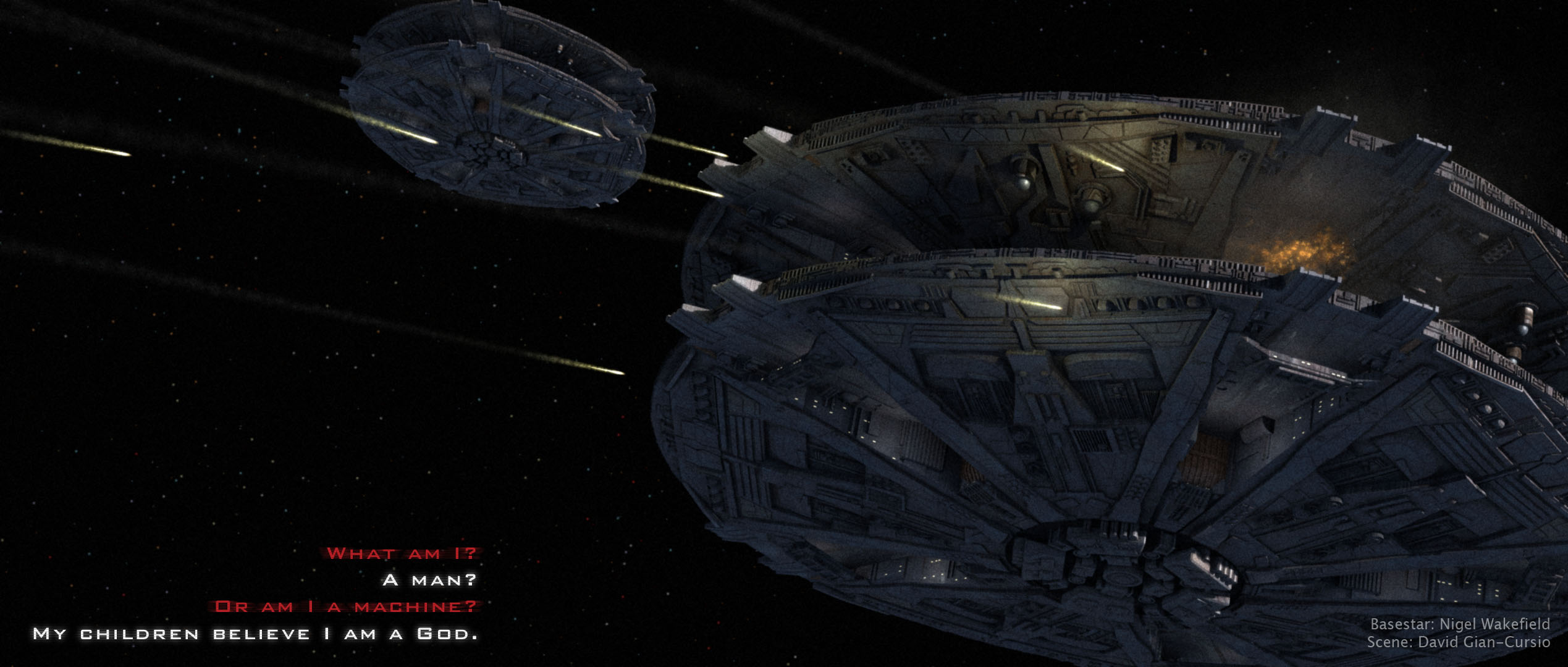
So, here we have my next step in the wide world of explosions, from the explosion-and-smoke-filled universe of the new Battlestar Galactica using Raffs’ excellent Cylon Basestar. Rendered in Lightwave, with all of the effects done in-camera (so to speak) with particles and hypervoxels.

The picture actually started life some four weeks ago. It was originally going to be poster-sized, with three Basestars in various states of explosion. As time went on and I continued to finesse the shells and fireballs, I slowly found myself losing interest. Rather than dropping the picture, I repurposed it, changing the framing and reducing the image size to my old standby, losing one of the Basestars, and having only a little bit of explosion in the hopes it would finish rendering before I completed my higher education. I gave it a once-over in Photoshop to add some bloom and improve the color of it, along with a pass of film grain (followed by a .5 pixel gaussian blur, so the film grain actually looked like film grain and not weird pixelated distortion).

I considered having some missiles coming out of the Basestars, but decided against it because, like I said, I wanted to be done. I’ll make a missile setup later, in all likelihood.

The backstory to the image is that it’s from the battle in the flashback sequence of “Battlestar Galactica: Razor.” While the Cylons were focusing on the Battlestar Columbia, the other two Battlestars had the chance to switch from defensive to offensive fire, and this is their first salvo headed for the Cylon Basestars. The quote is something that will later be said by what these Cylons were fighting to the death to protect.

Last Call

My first Doctor Who picture is inspired by the finale of the second season, wherein the Doctor parks his TARDIS next to a supernova so he can have enough power to say a final farewell to his companion, Rose Tyler.

I briefly worried that using an actual 3D model of a rose as the basis for the fire of the nova would be a bit too on-the-nose, but it ended up being nearly impossible to tell what it was originally, anyway, even when you know what to look for.