Damn the Torpedos, Full Speed Ahead!

Admiral Kirk and the Enterprise lead an assault on a Klingon base in this, my latest render.

I’m really starting to get a sense for how less can be more with detail. Part of me hates to go into Photoshop and cover up that hard-won clarity with light blooms and film grain when it took 30-odd hours to render it all out (admittedly, that’s because I was doing other things with the computer at the same time, Lightwave is running under Rosetta, and antialiasing levels are like crack to me). However, it just looks really pretty with the sort of soft glow, and the grain helps sell it, especially up close.

DRADIS Contact!

A little side project over the last few days has been recreating the icons of the DRADIS displays from Battlestar Galactica.

A couple notes: The small Unknown icon is conjectural. In “Resurrection Ship Part I” a small ship was represented with the large Unknown icon, and in “Hero,” they used the Cylon Raider icon for a small Unknown, but whited it out when they bleached the flashback scenes, so it was hard to tell. So I made is a combination of the large Unknown and the Raider icons.

Also, the Resurrection Ship icon was only seen once, from a distance, where it appeared to be a modified version of the large Unknown icon, though it was difficult to confirm any details. In “A Measure of Salvation,” the Resurrection Ship II: Son Of Resurrection Ship was represented by the Basestar icon, which was unhelpful. However, the fact that the civilian ships were all made of pieces of the Viper and Raptor icons was very helpful, so I have no ill will.

I’m not sure how or when I’m going to release them. I’m thinking a zip of Photoshop files with the arrow for each icon on a separate layer. I’m also thinking about making them into a set of Mac OS X icons, but I’m not quite sure about that yet.

Final note, thanks to TrekBBS poster backstept for pointing me to the almost-perfect DRADIS display font, “Visitor.” And after drawing out text pixel-by-pixel, “almost” perfect is perfect.

“Approaching Star”

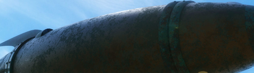
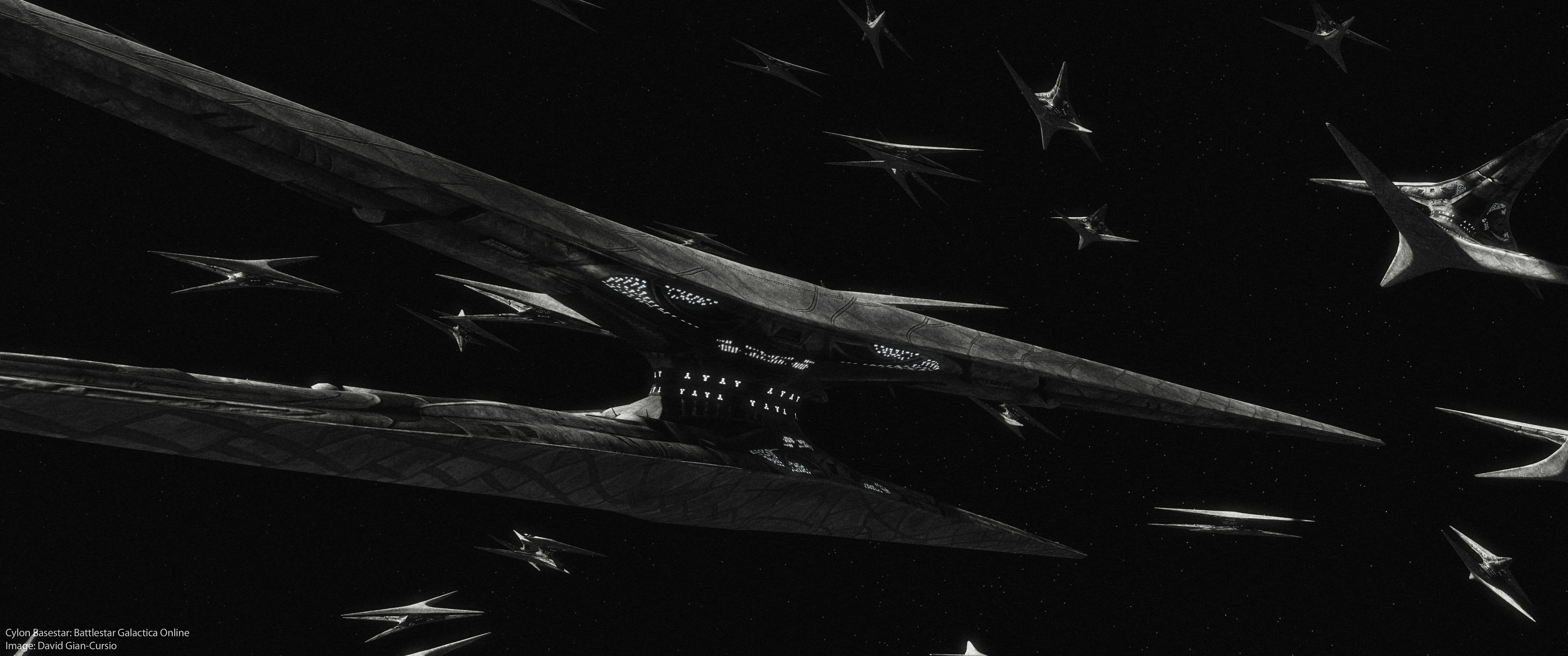
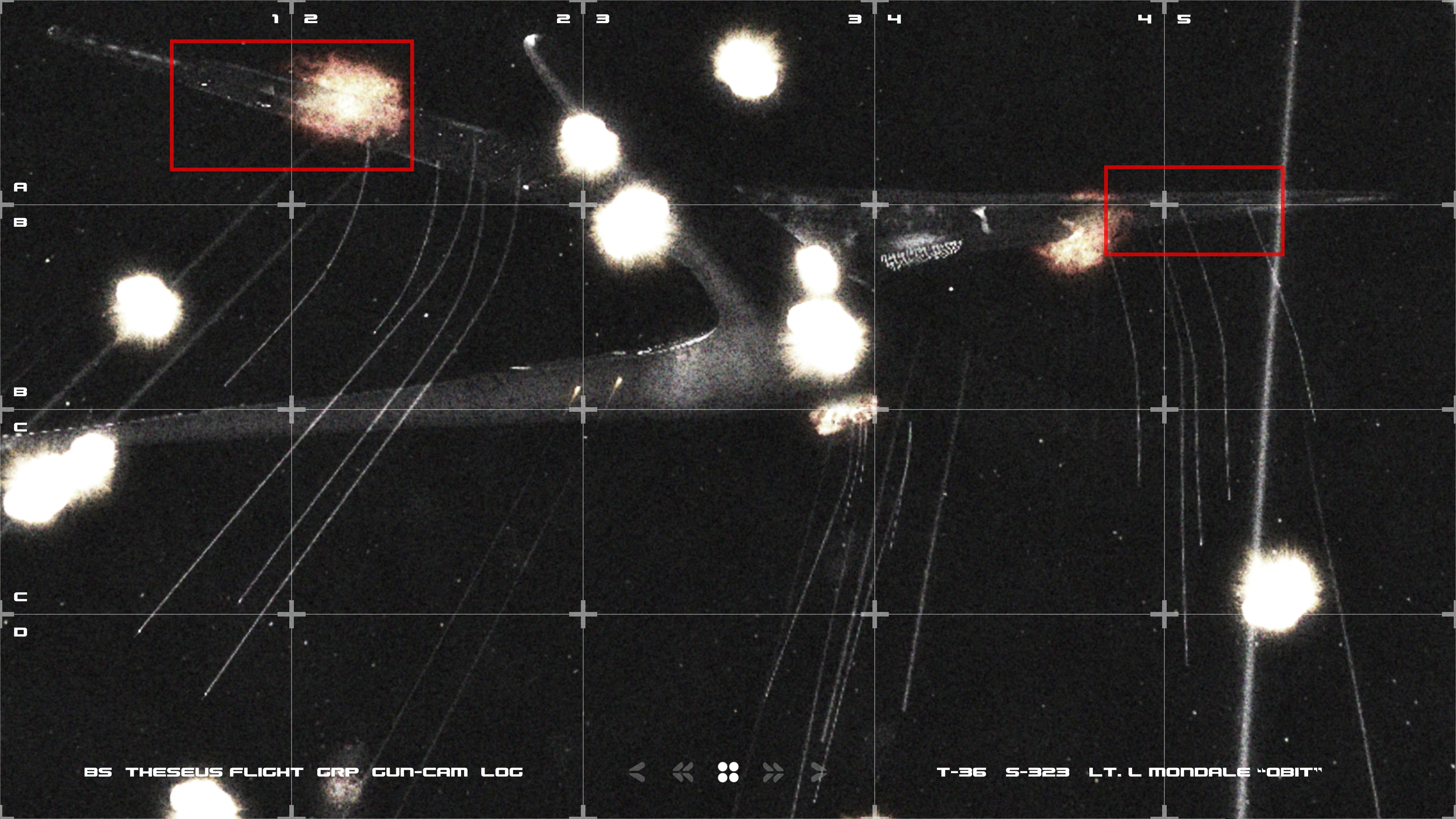
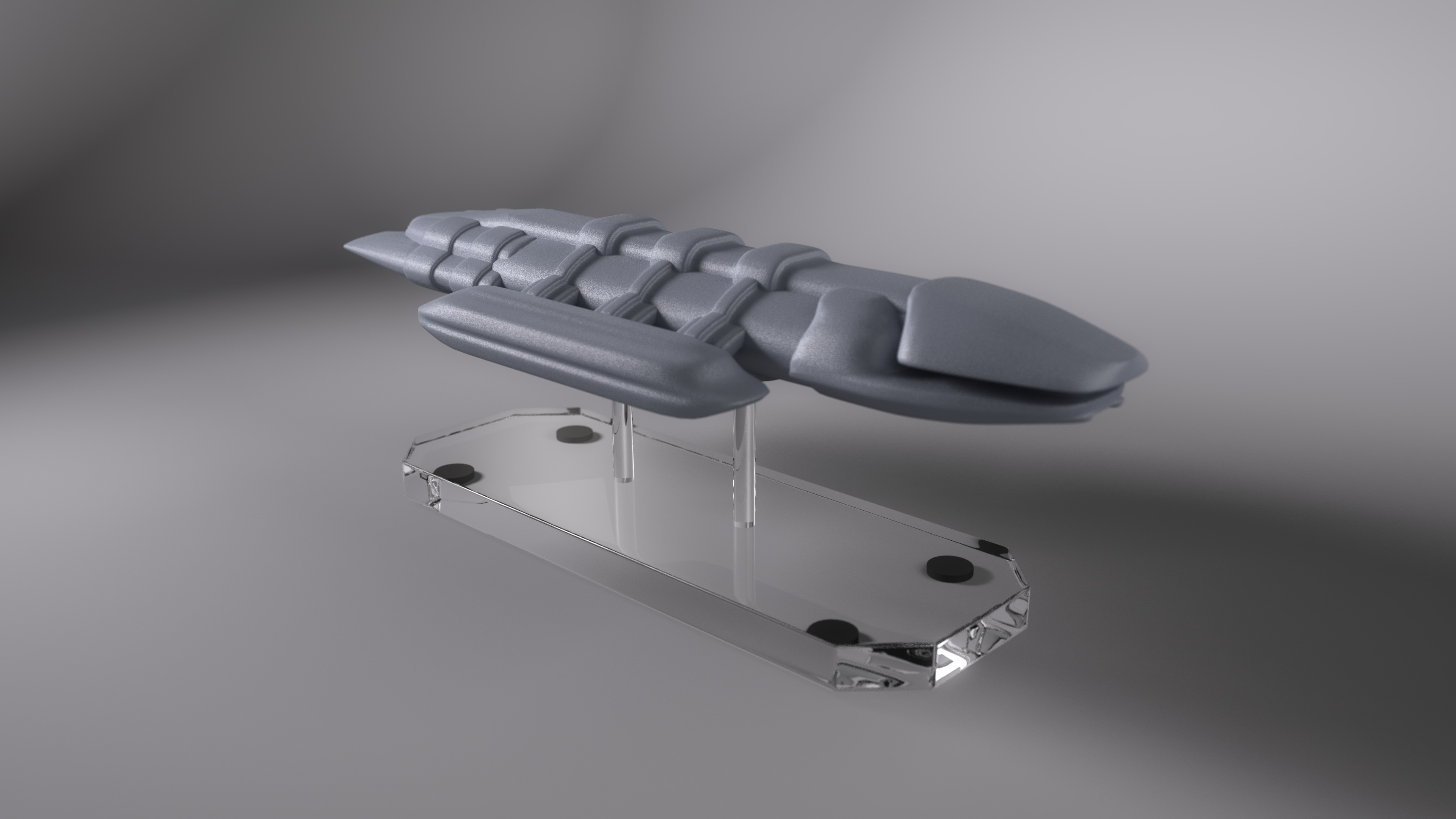
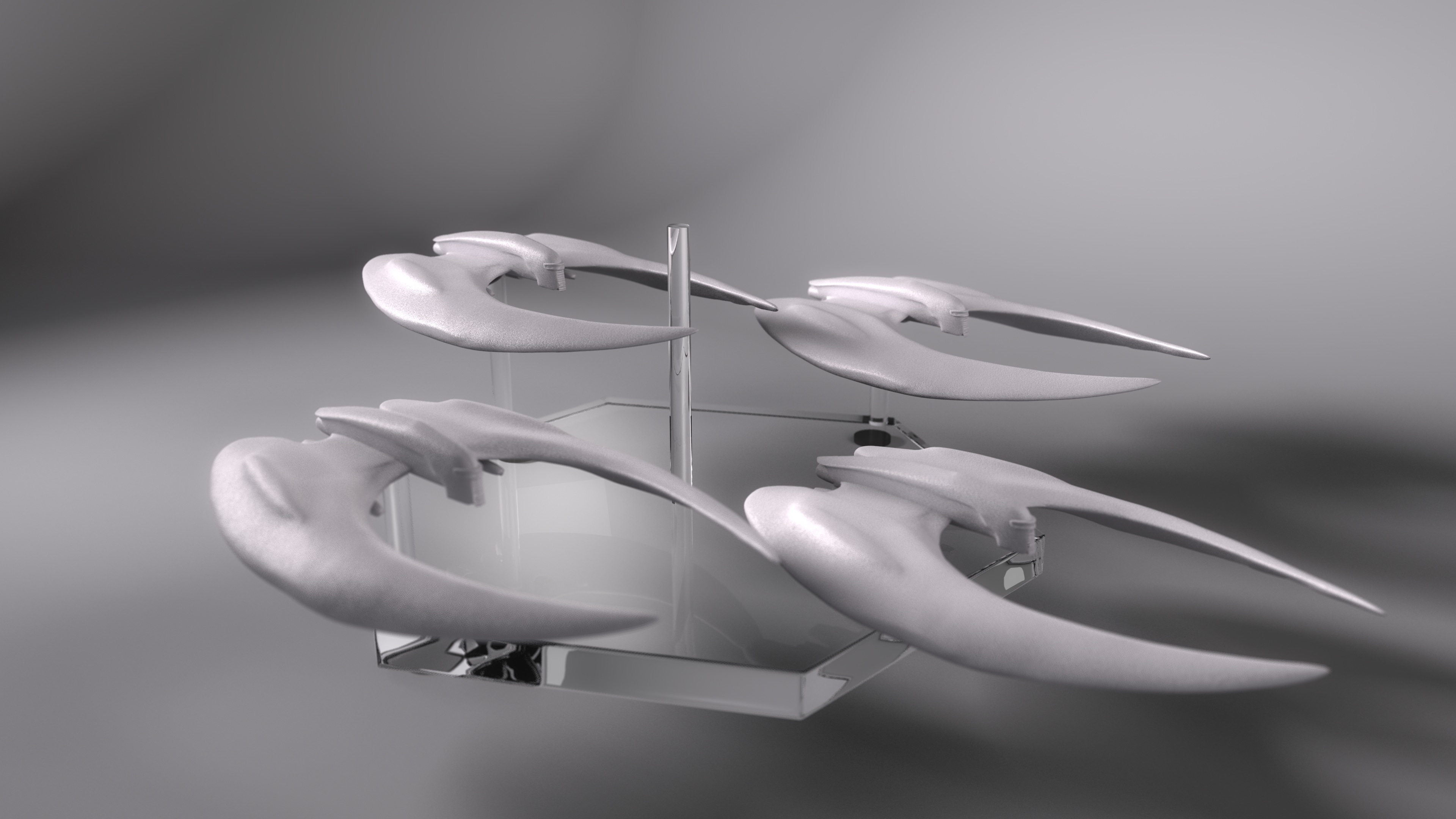
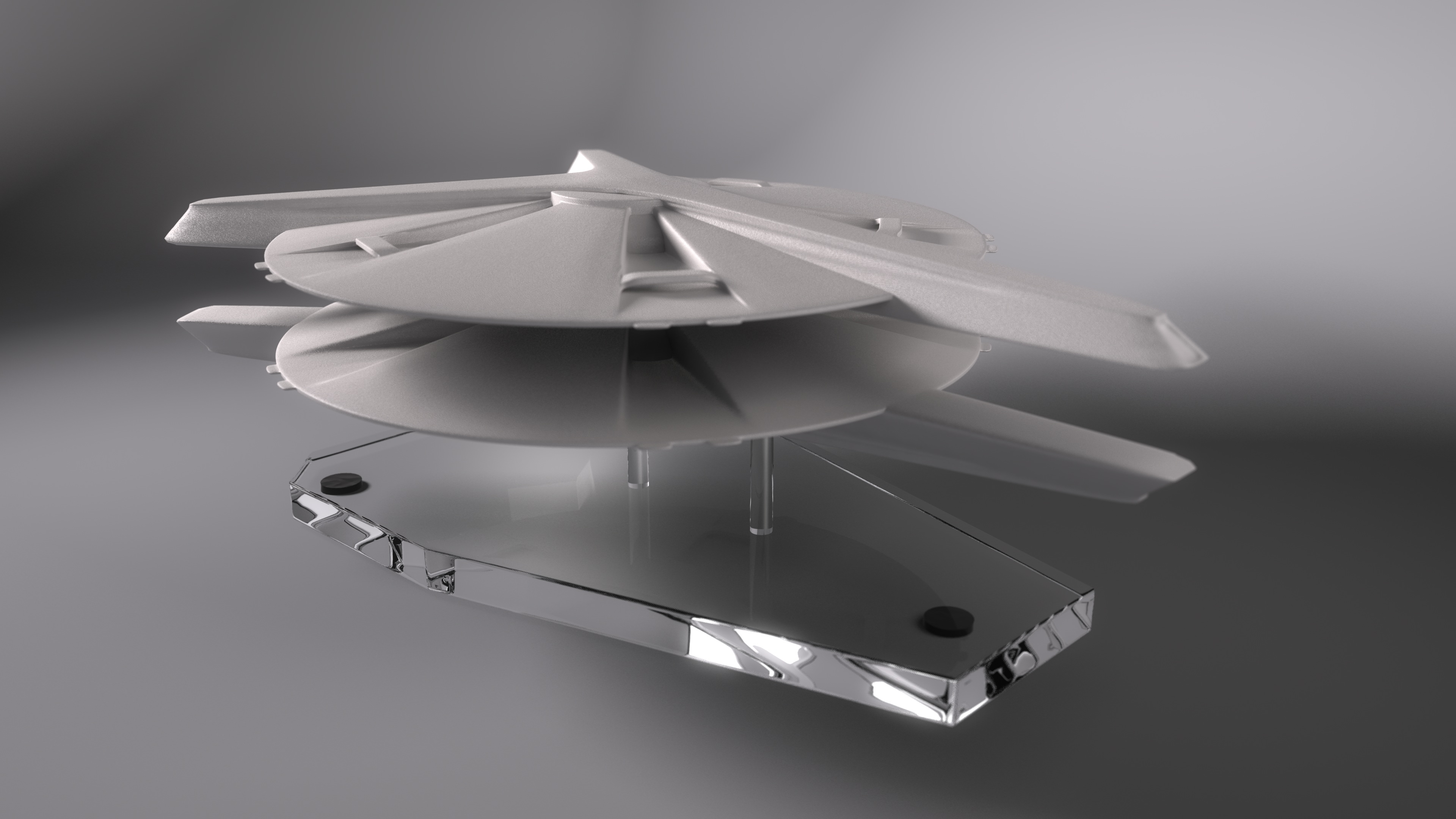
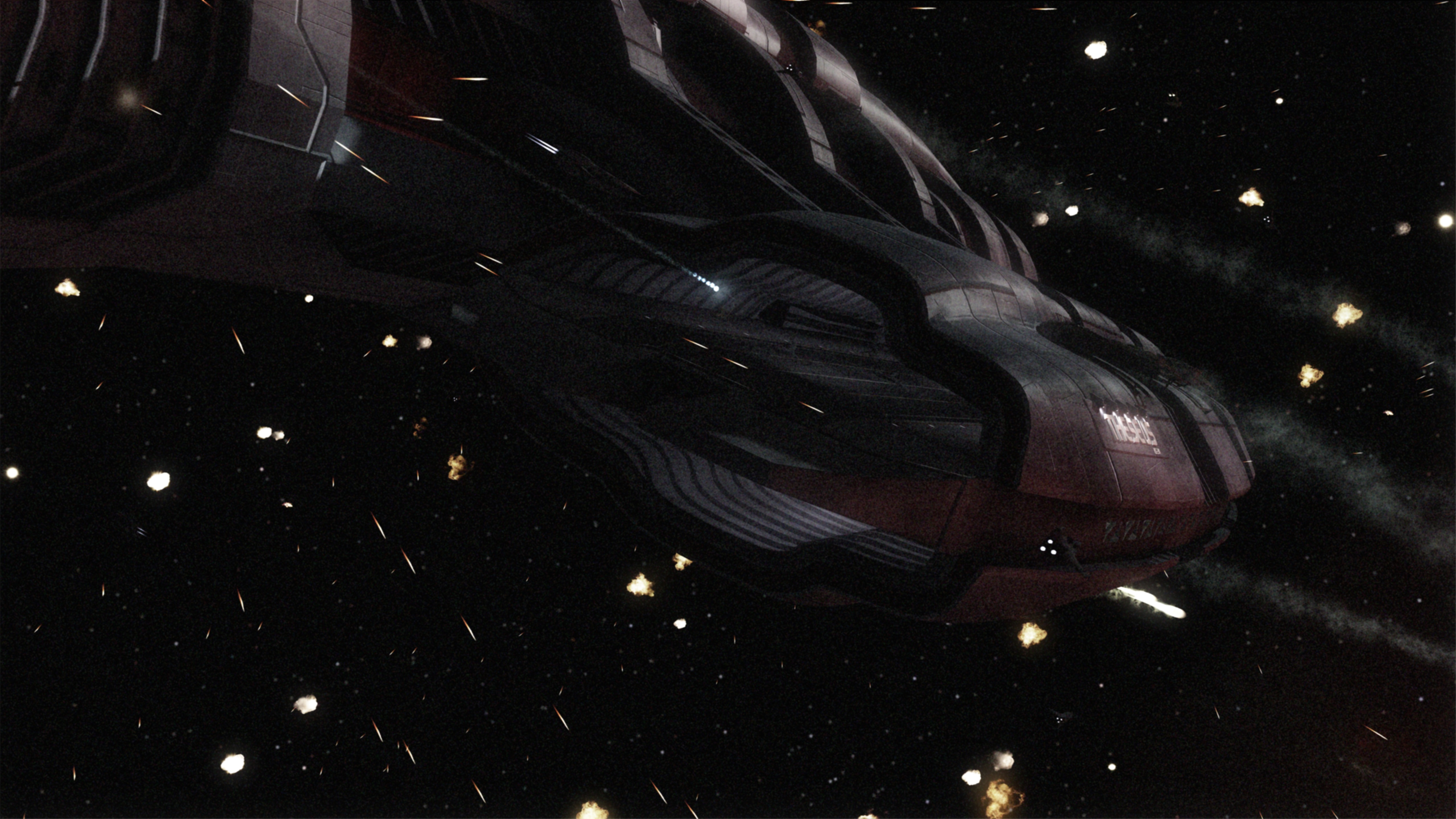
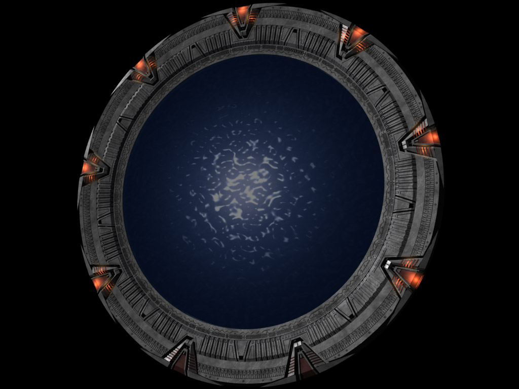
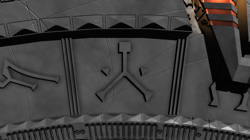
Not too much to tell about this image, really. Originally, I wanted to try to get the raw, high-contrast look that the early Babylon 5 publicity renders had, so I made a fairly boring image with intent to brighten it up later in Photoshop. Well, that didn’t work out.

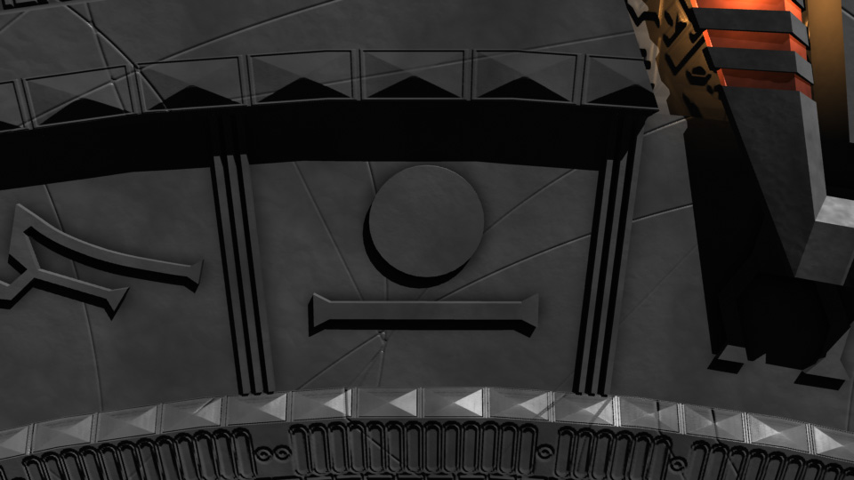
About a week later, I was looking at some photography websites, and decided that I needed to experiment with more techniques, not just someday, but that right then. So I pulled up the image from my harddrive, and thought back to a magazine article on making better-looking black and white photos by using the “Channel Mixer” in Photoshop instead of just de-saturating the image. A few minutes of balancing red, green, and blue, adding a little light bloom, and some film grain to complete the effect, and I had a much better image. It’s now become one of my favorites.

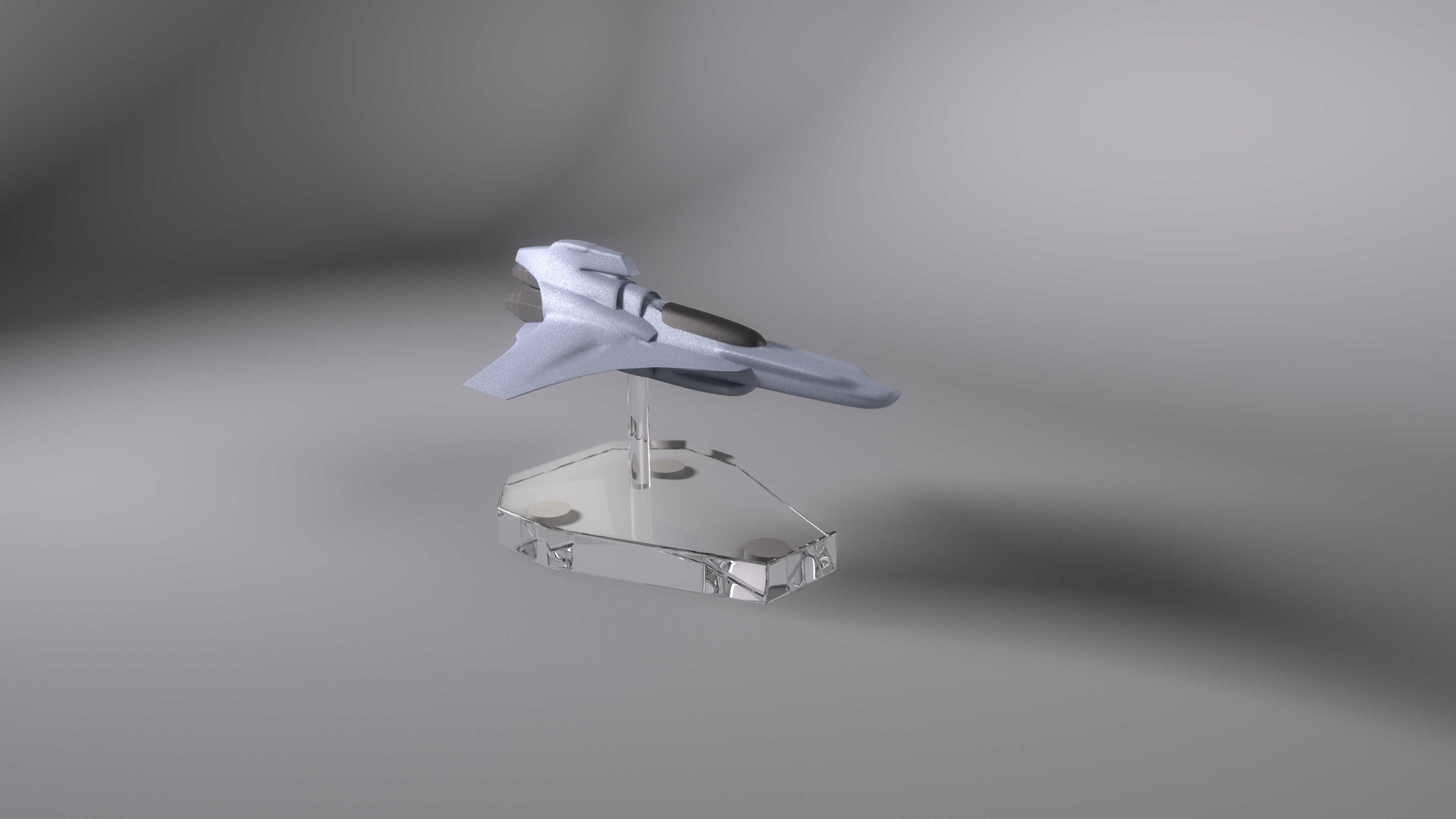
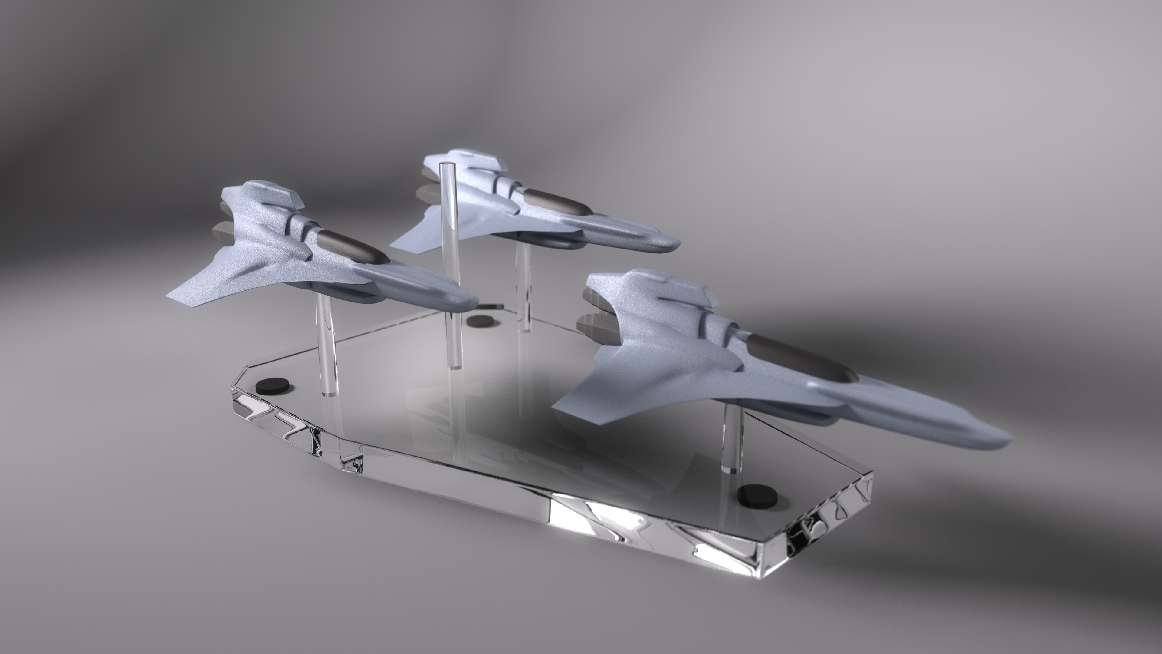
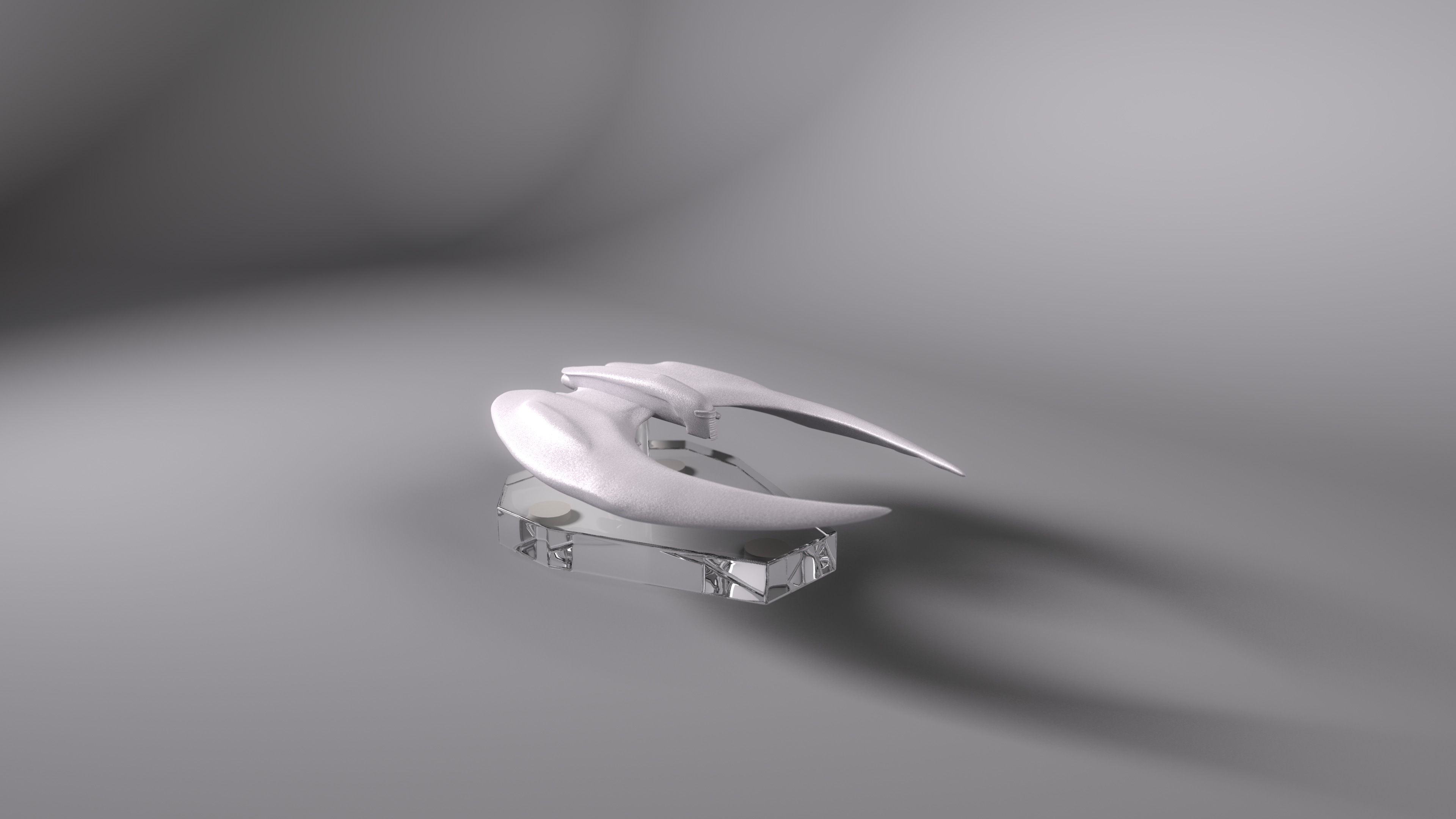
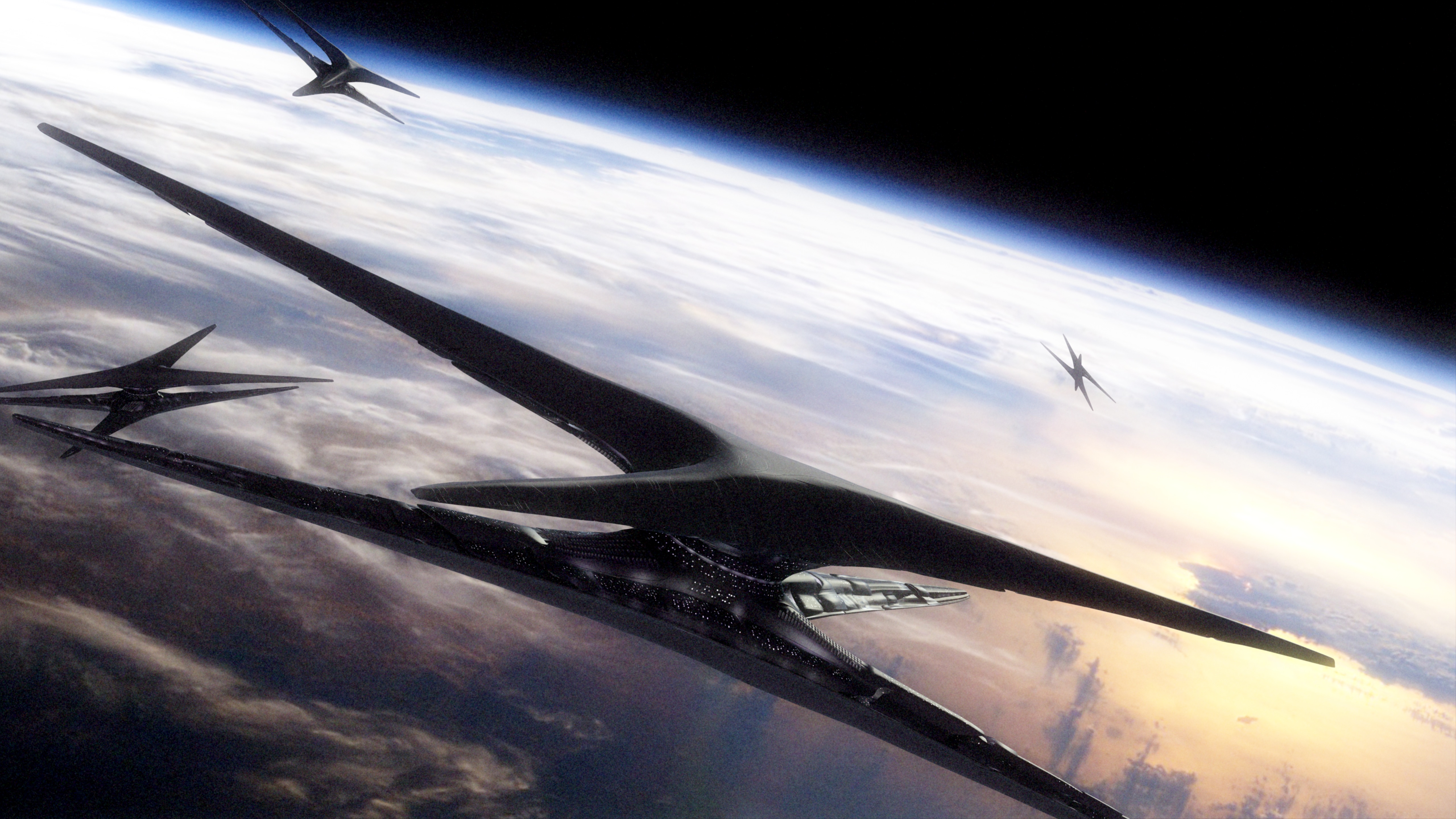
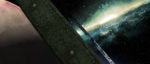
Rising Star (Black and White)


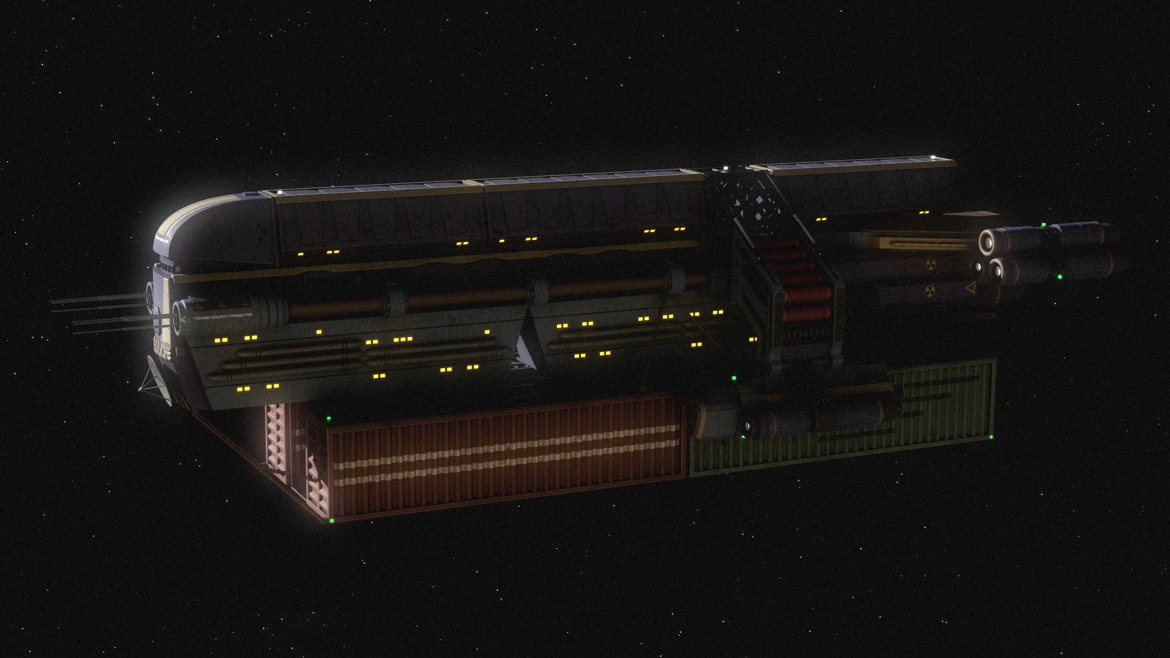
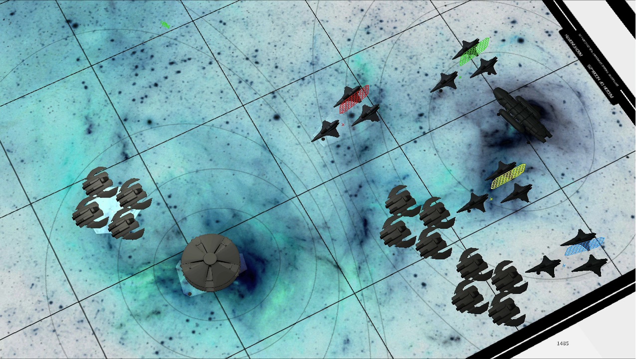
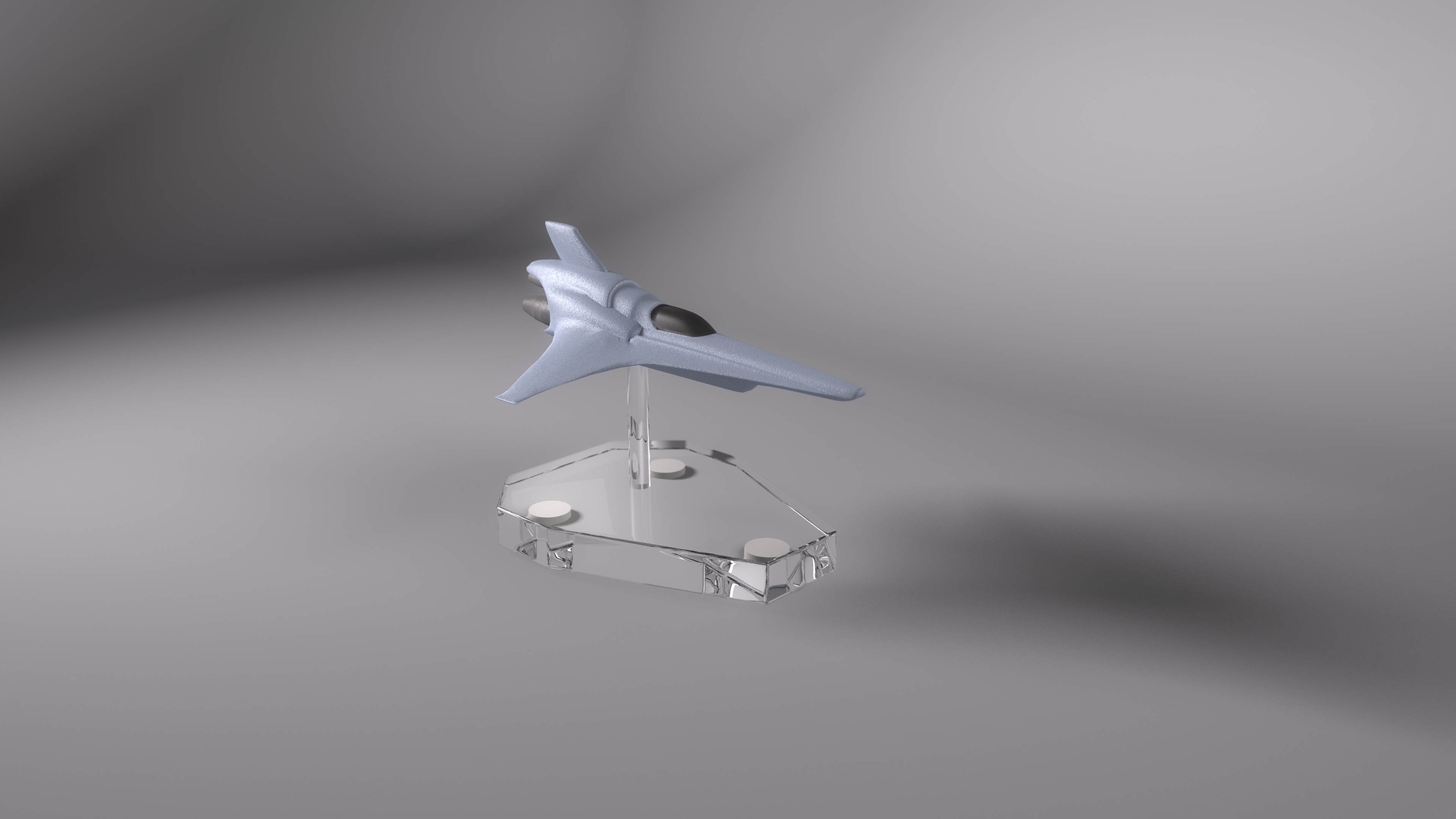
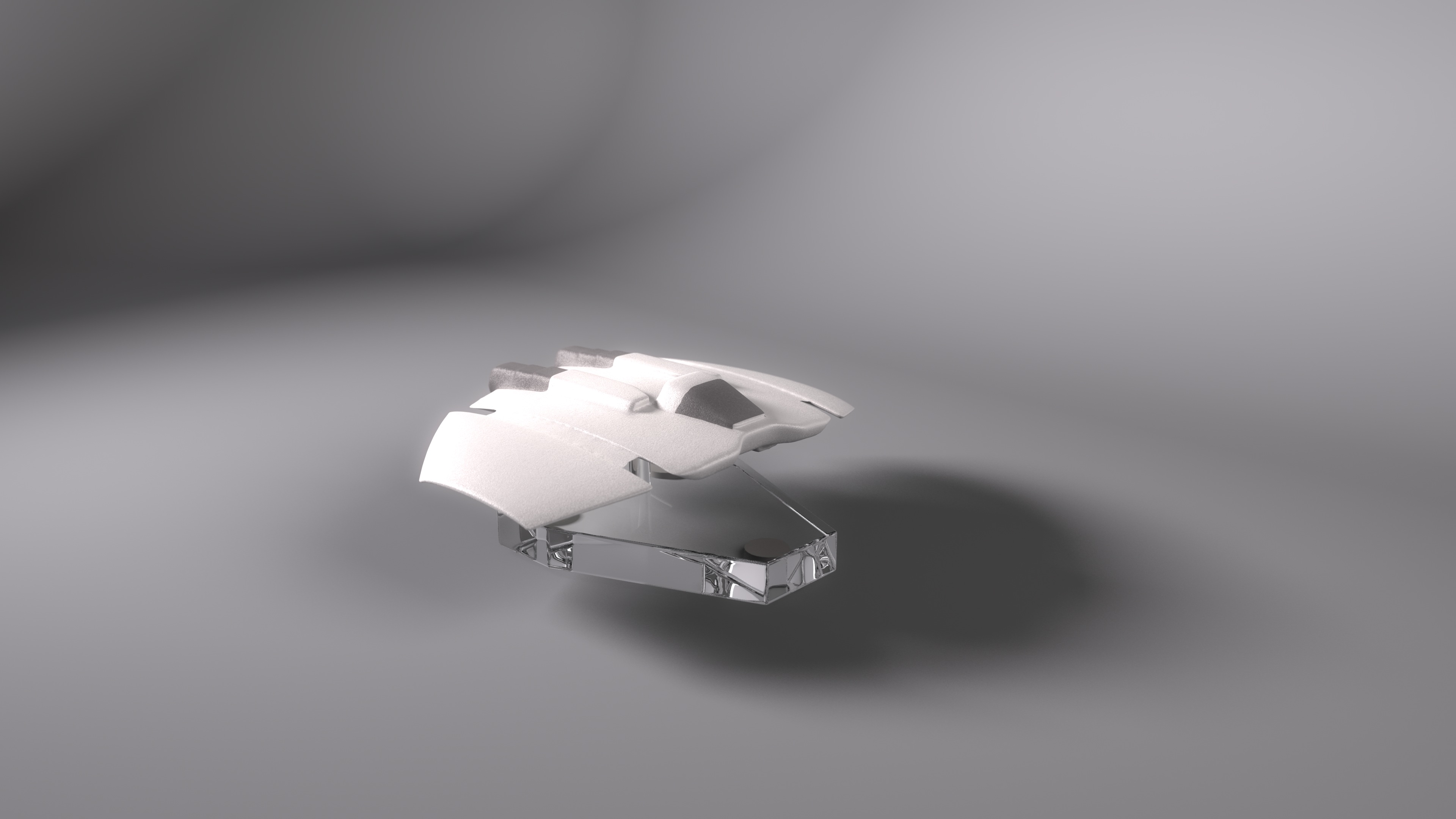
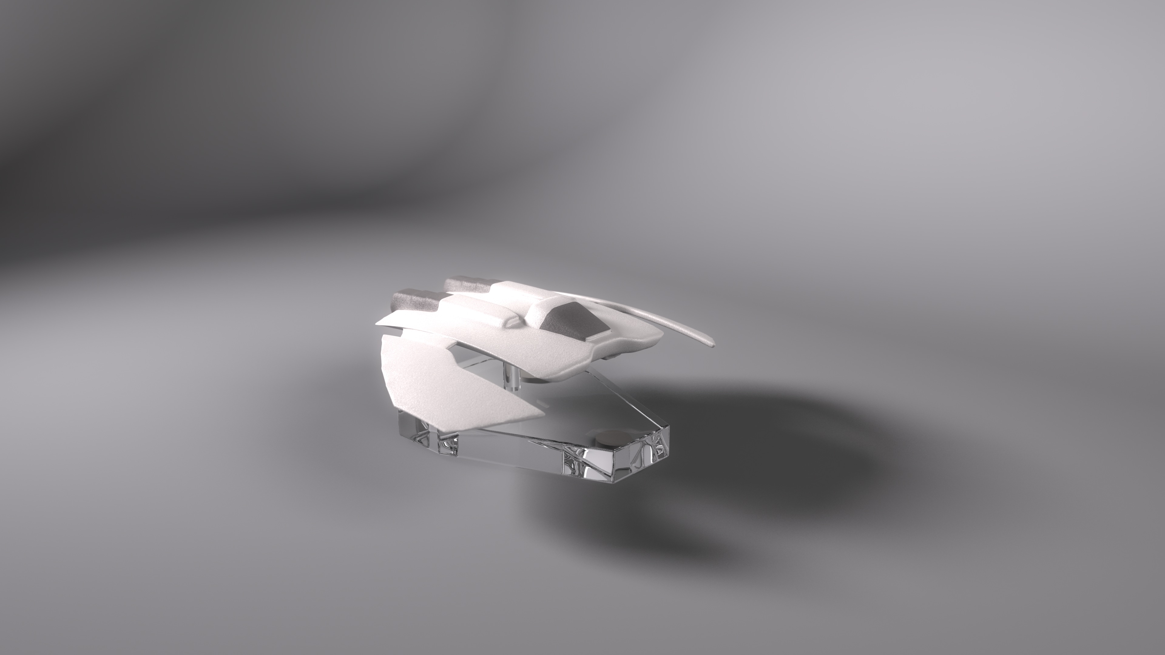
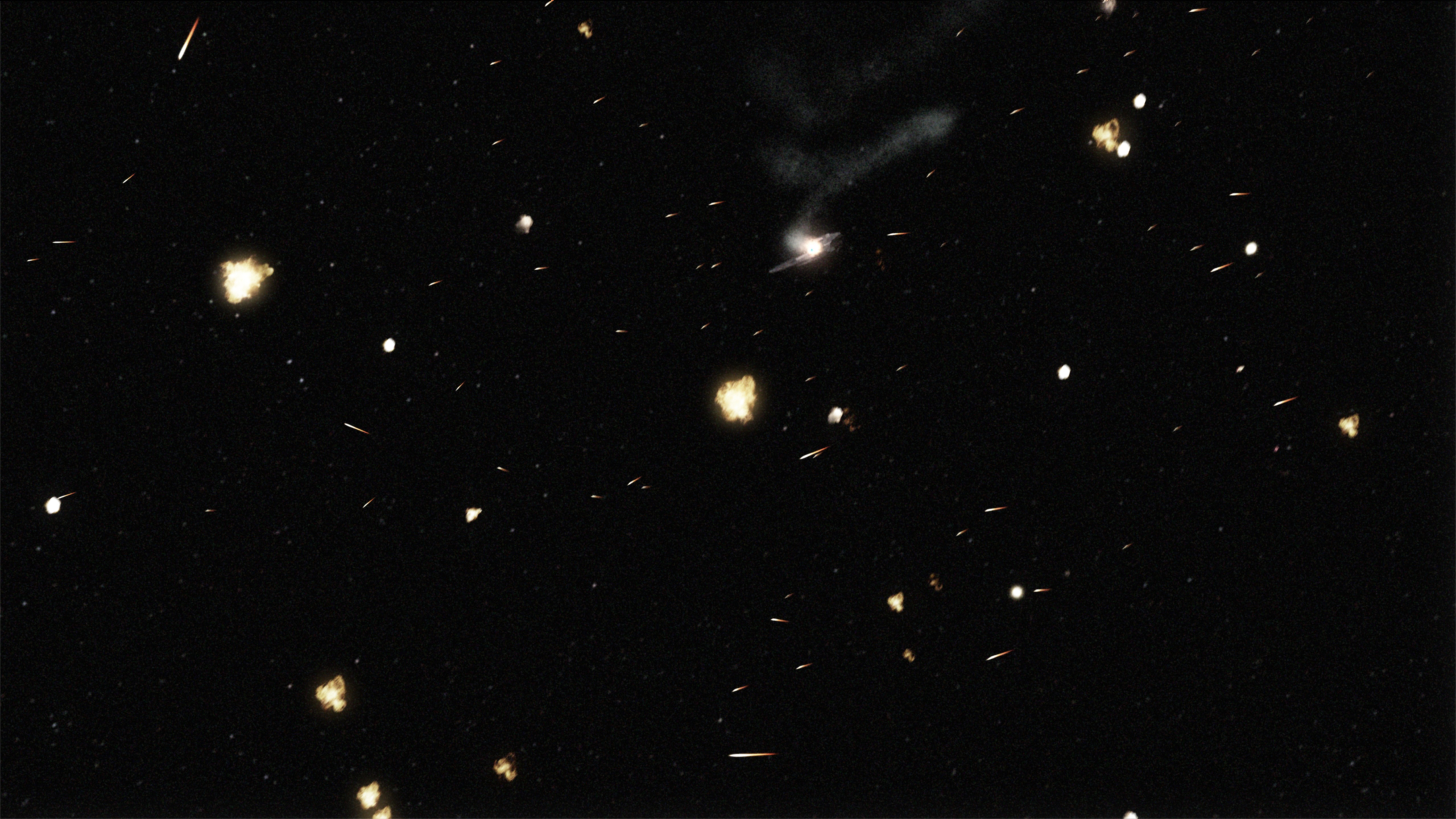
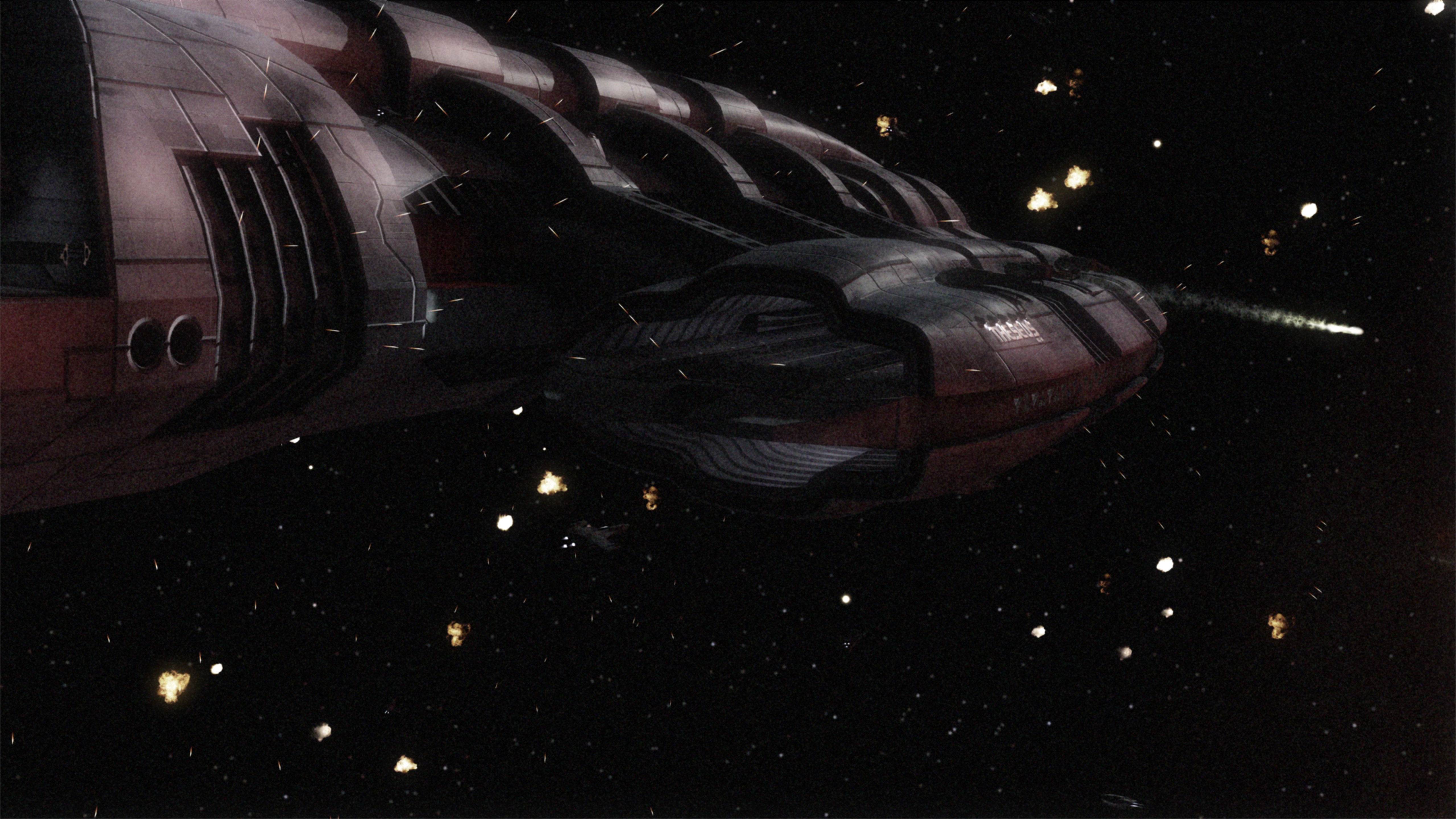
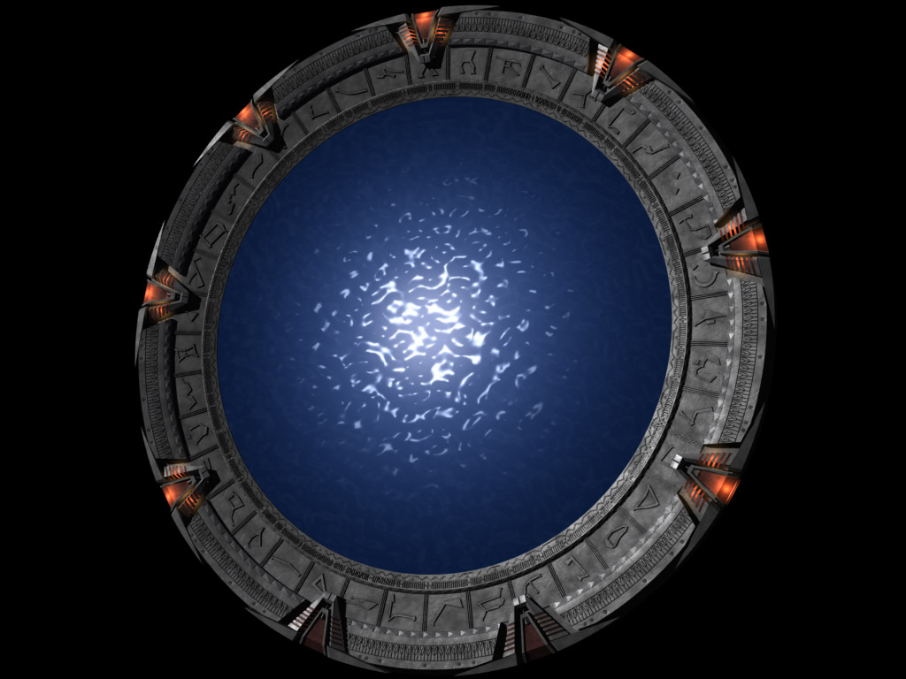
If you’re curious, here’s the original color image.


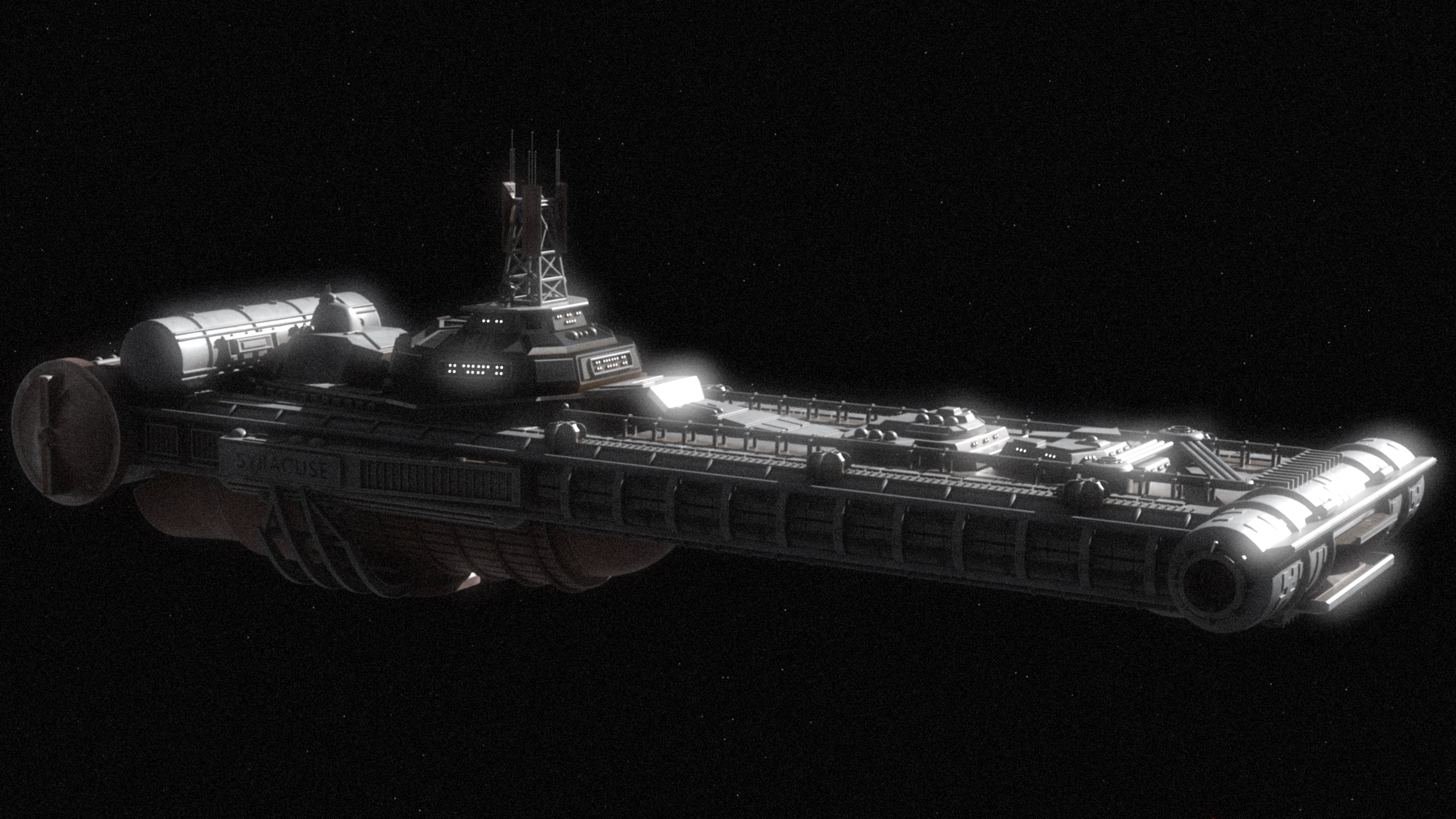
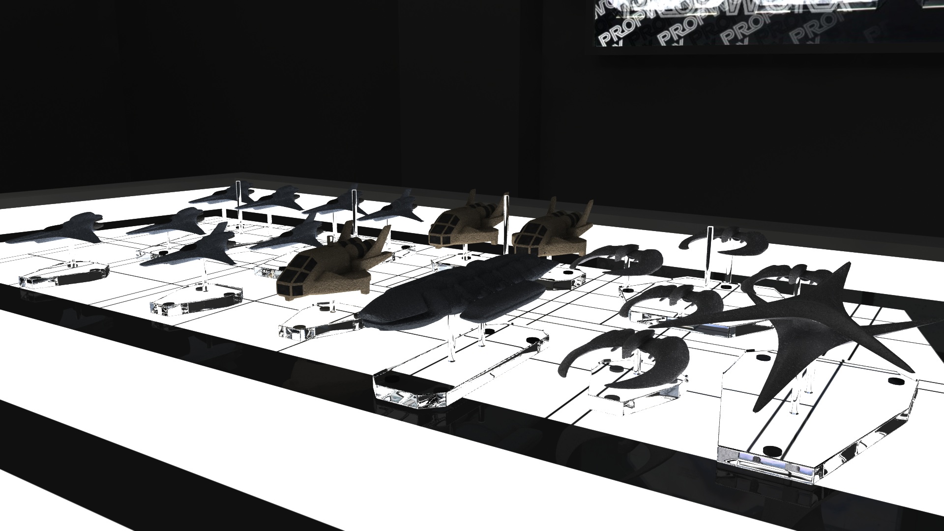
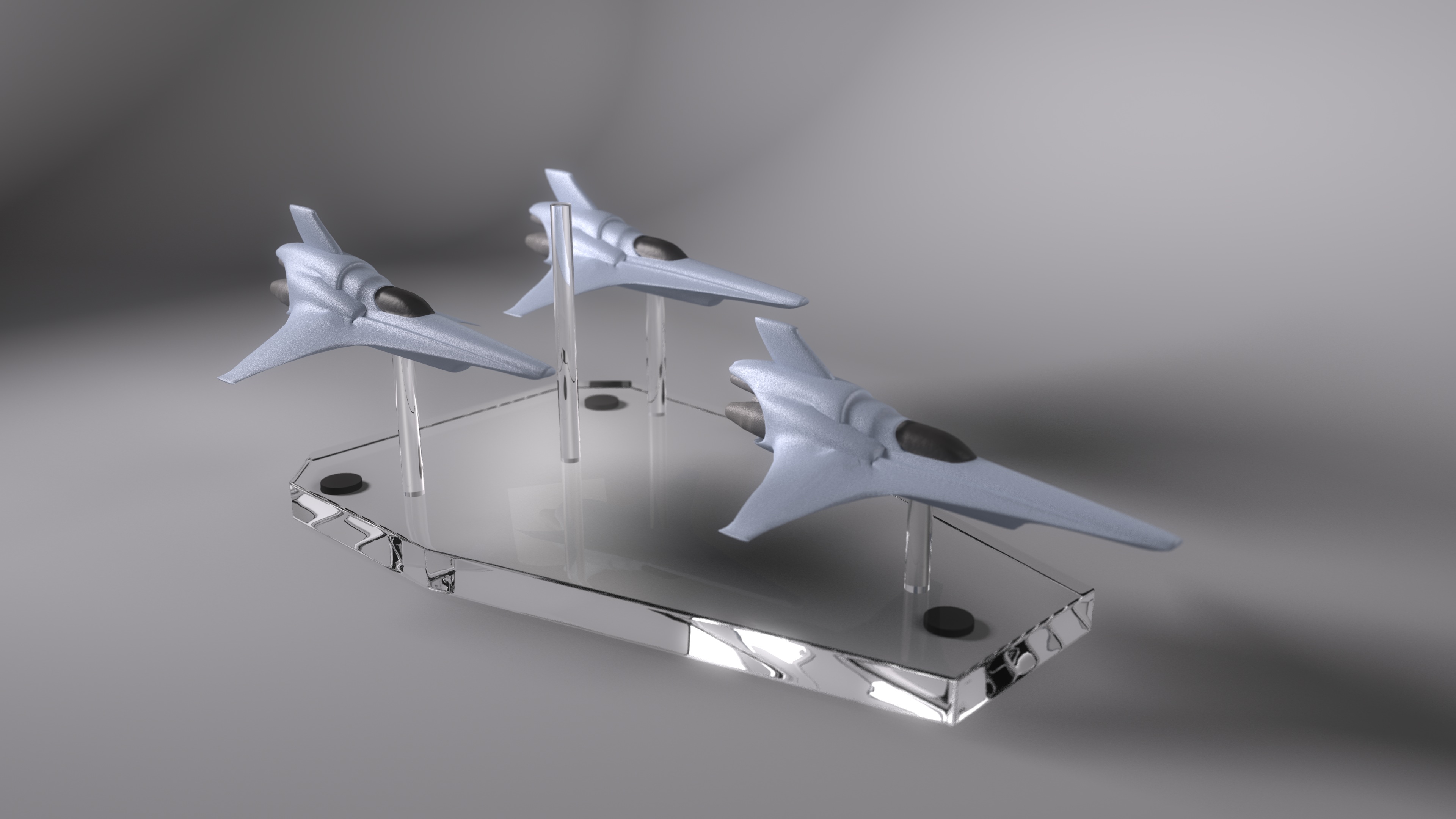
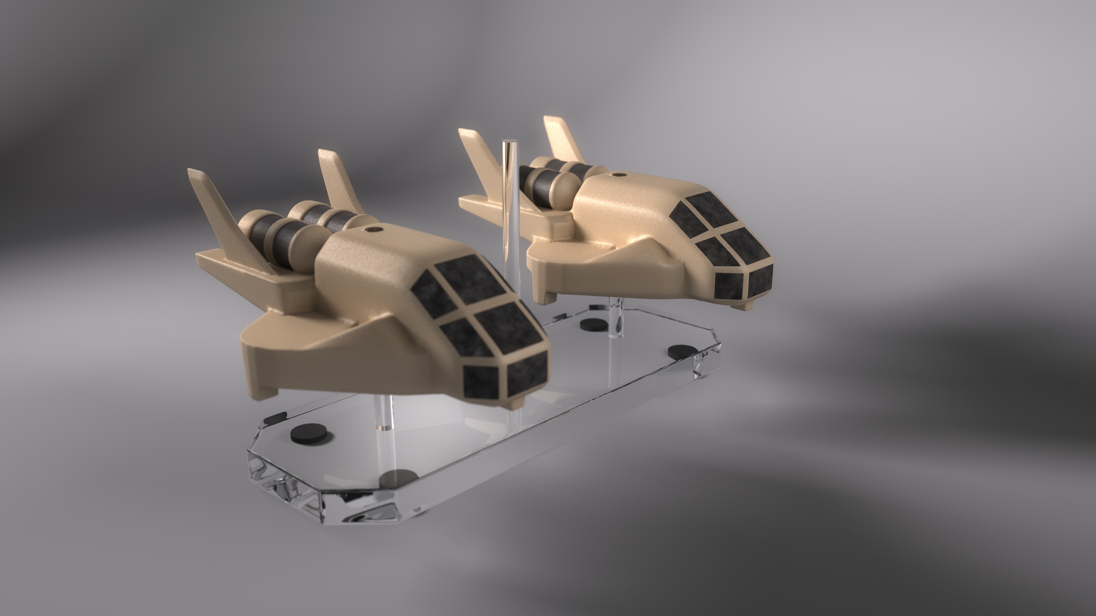
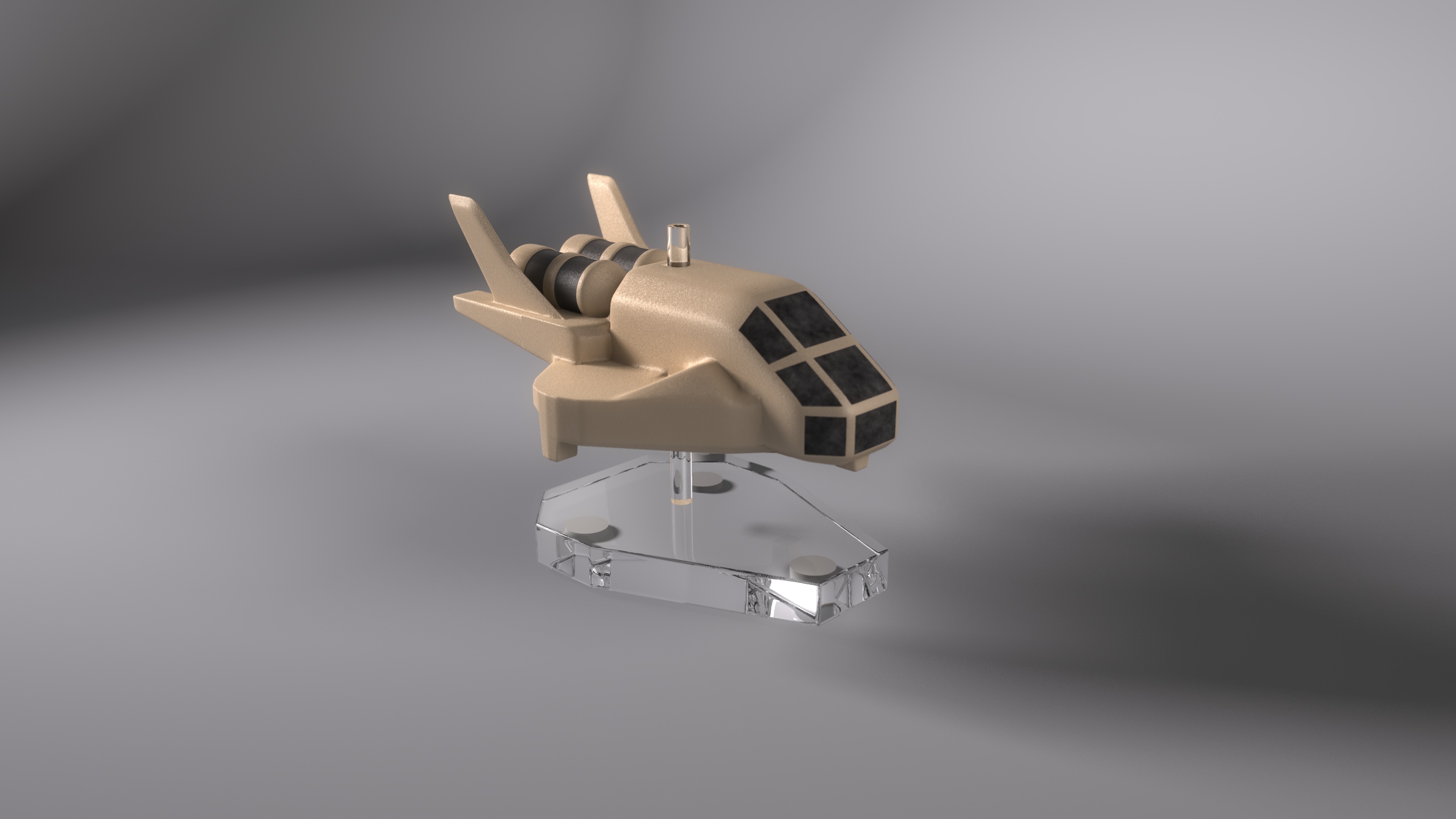
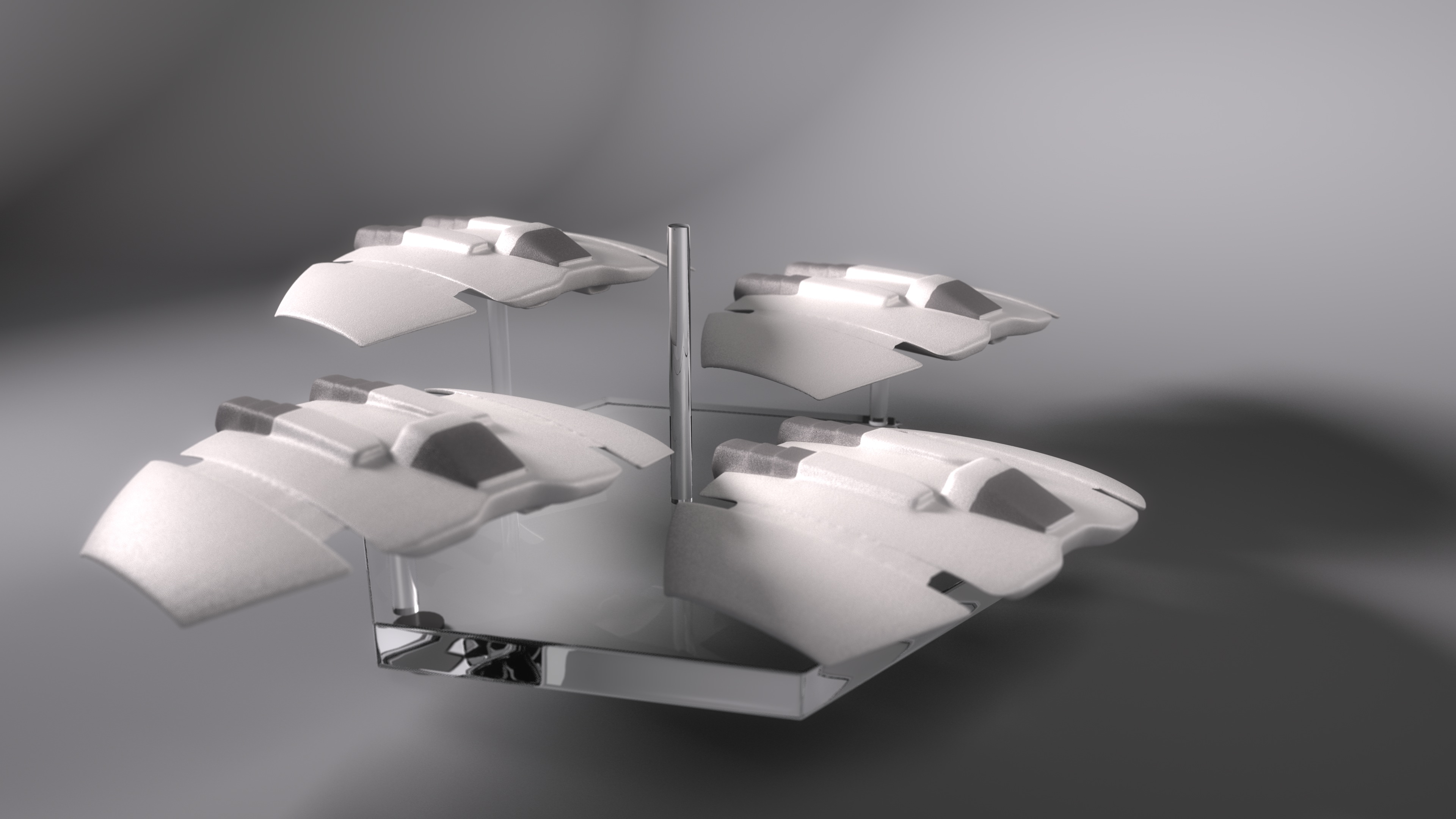
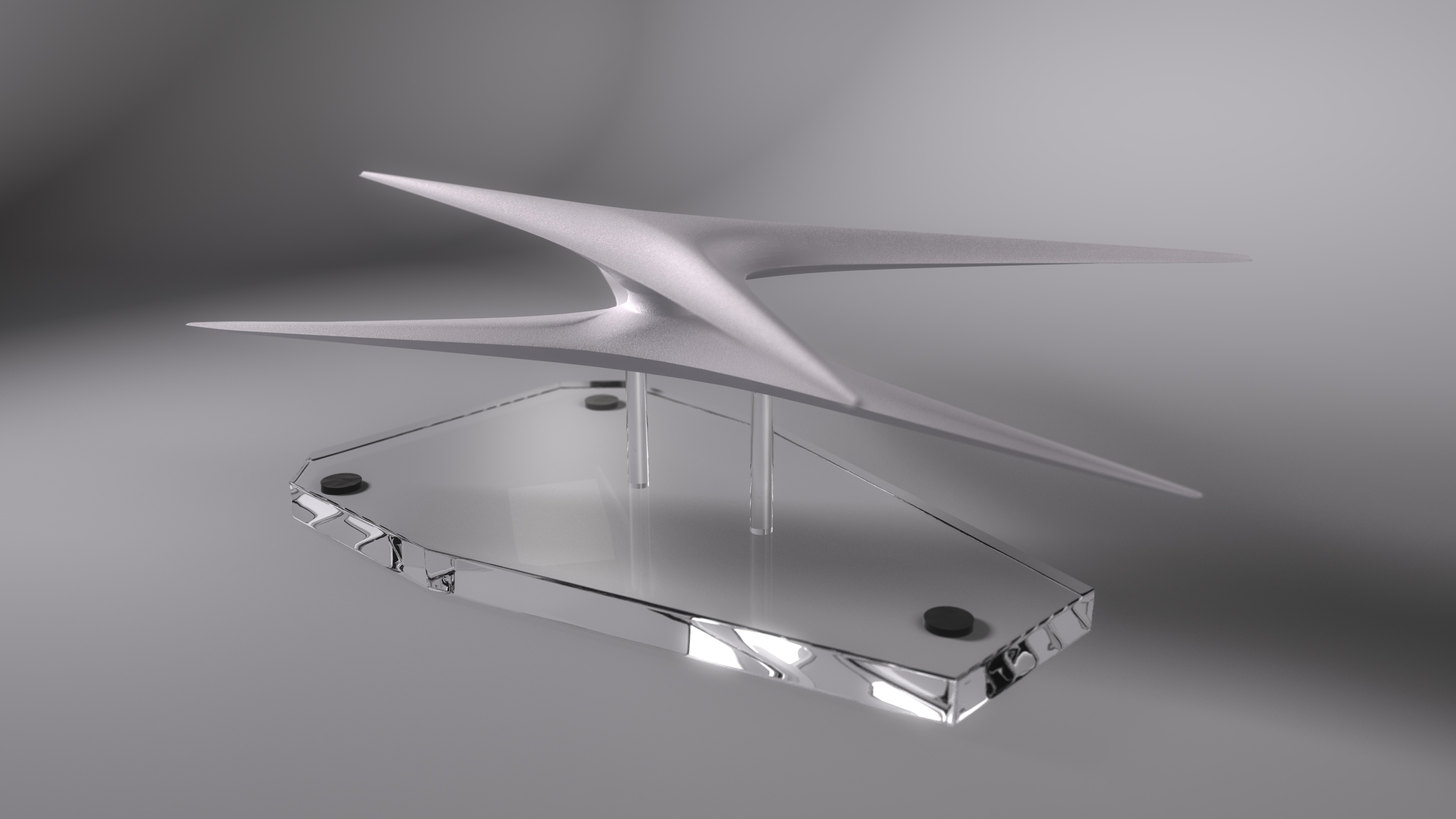
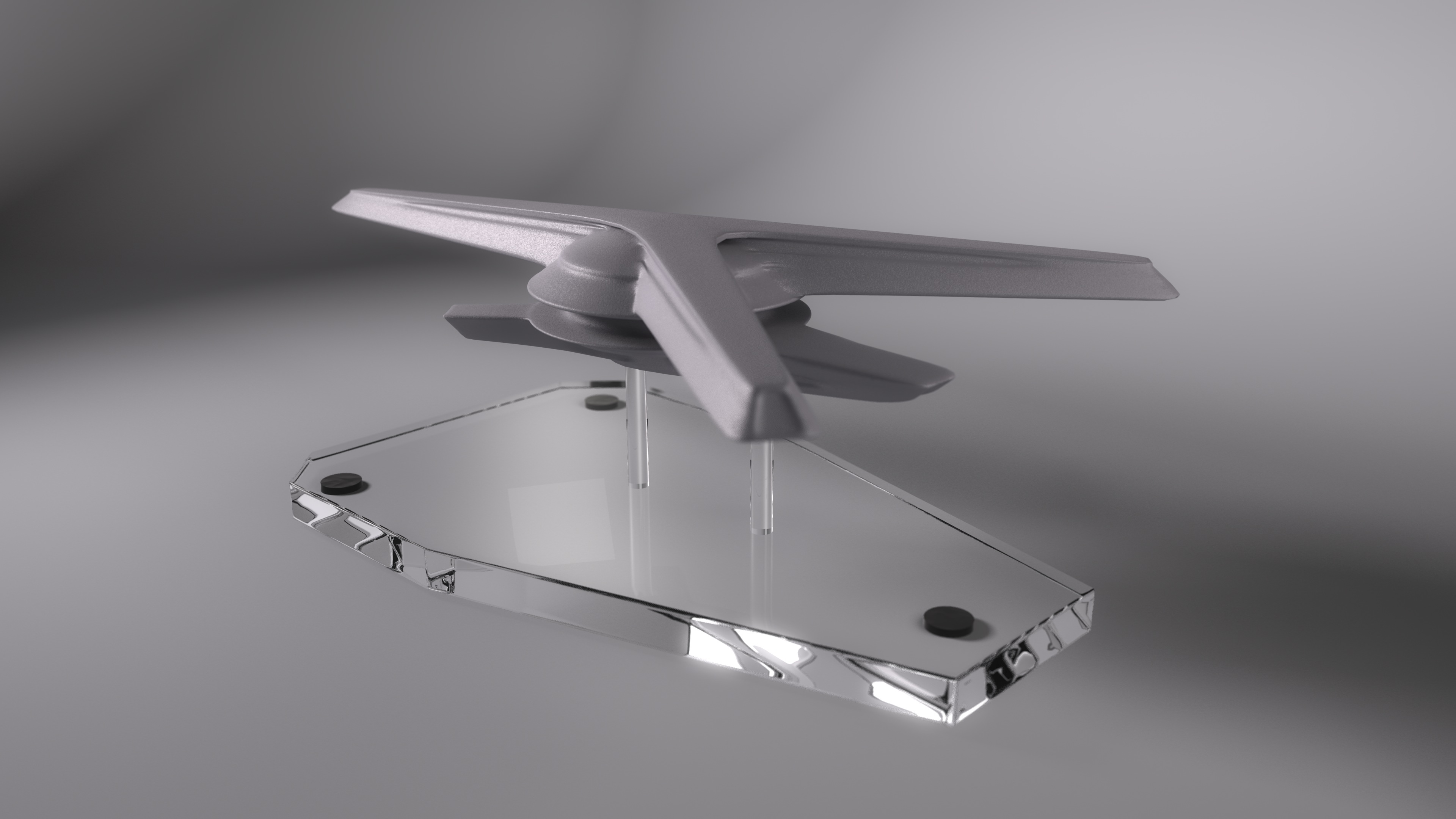
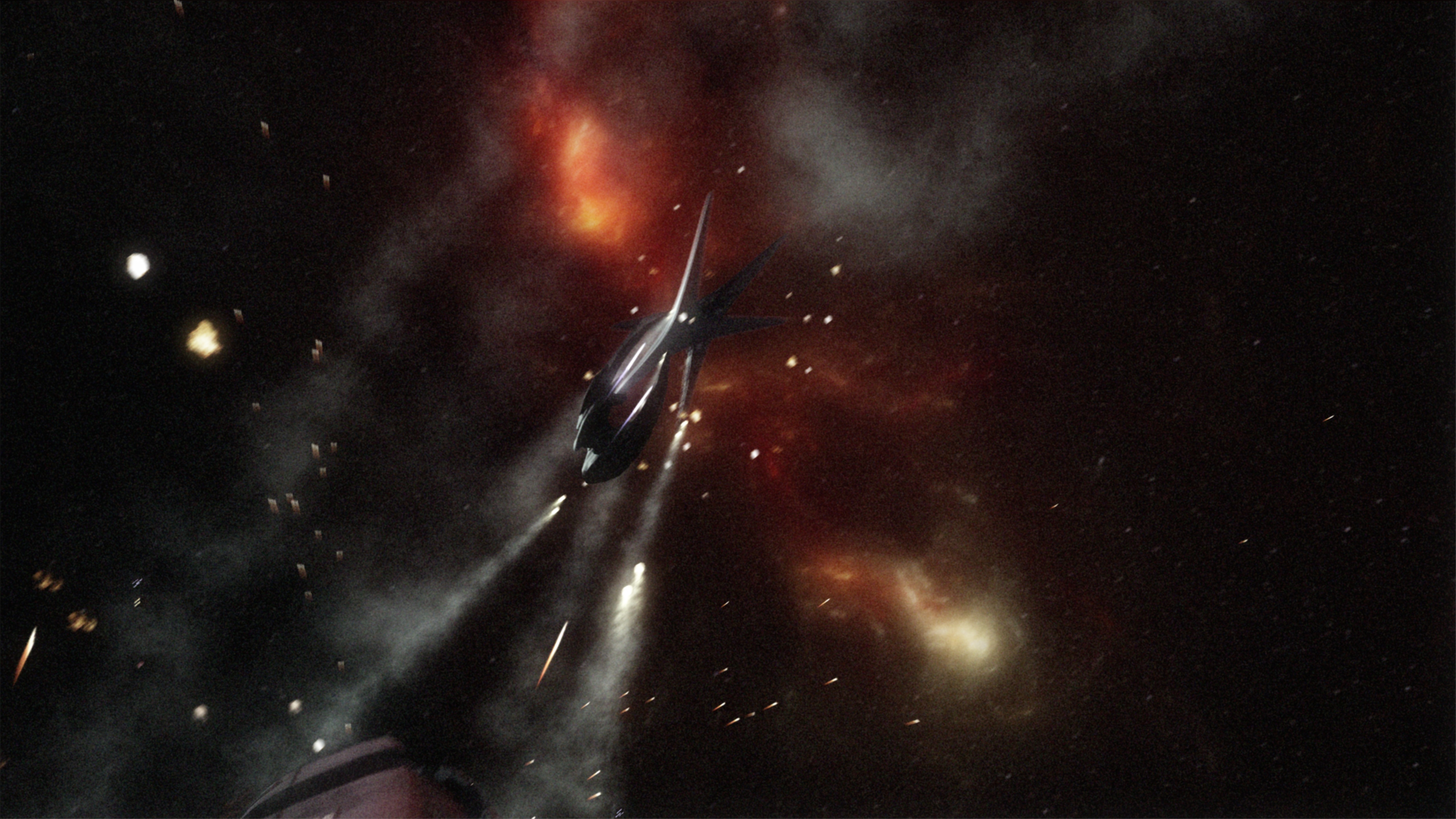
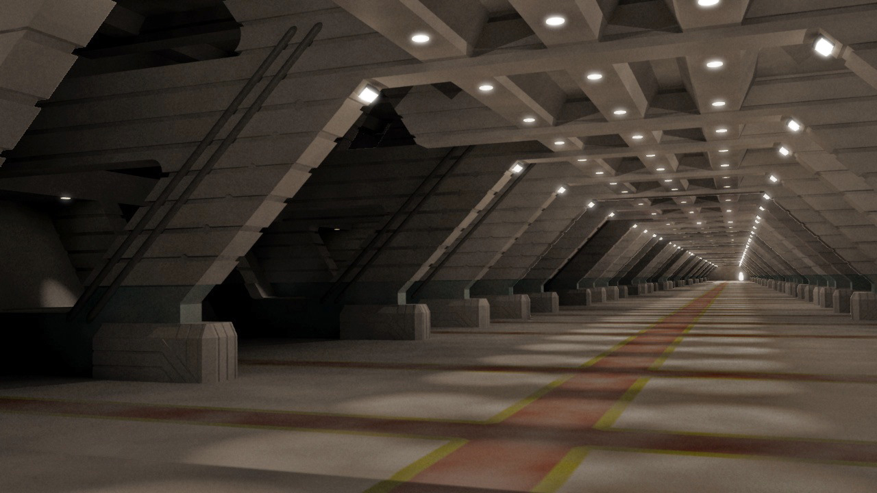
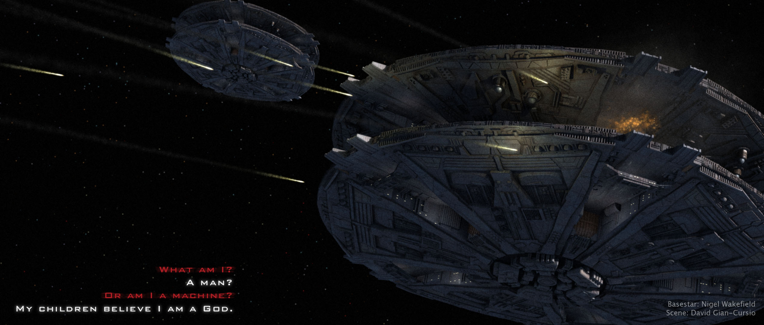
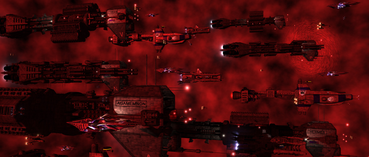
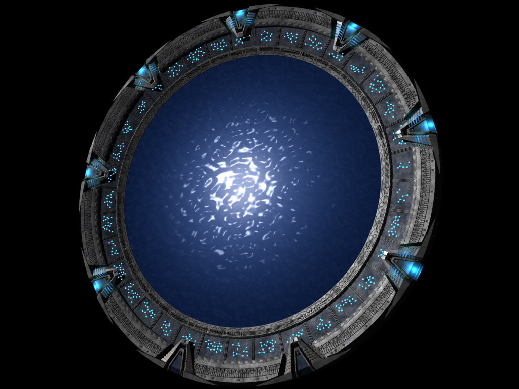
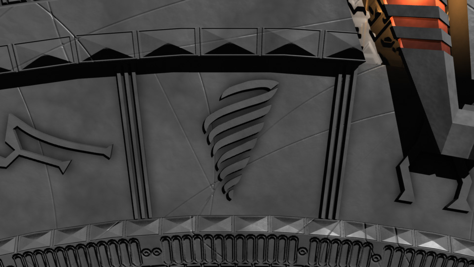
Also, as a bonus, here’s another render from a while ago that I didn’t bother posting on it’s own, because it was a remake of an older image that was so flat and boring that I, apparently, never bothered to post it on-line. Admittedly, this one got a bit more of a makeover than my HD rerenders normally get (usually it’s just swapping in some area lights for planet and nebulae fill lights).

Strange New Worlds in Collision

A special treat today, considering I rarely render Star Trek pictures, owing mainly to how their greed for light doesn’t really mesh with my own style of lighting. After seeing the cover of James Blish’s “Star Trek 4,” I decided to make a picture based on it. Since I don’t have a model of the TOS Enterprise handy, I used Vektor’s Constitution. And then after I finished rendering out all the elements, I decided for the sheer unadulterated hell of it to make a second version with Dennis Bailey’s refit-Enterprise

So, without further ado…

The Constitution version:

The Enterprise version:

Early Babylon 5 Lightwave Animations

These five brief Babylon 5 animations are from my first year or two using Lightwave 3D, somewhere around 2002/2003.


“GROPOS”

Based on a shot from the Babylon 5 episode “GROPOS” with a Nova Dreadnought alongside the station.

Babylon 5: Ed Giddings

Nova: Matt Tarling

Epsilon 3: Matt Tarling and Jeff Richards

Nebula: Jeff Richards

Music: “Without Help” by Jerry Goldsmith

“Shadow Threat Test”

Once upon a time, I decided to redo, shot for shot, the “Shadow Threat” teaser released for the now-long-canceled Babylon 5 computer game. I used these two shots to make sure my timing was right so far and that it meshed with the trailer’s soundtrack.

Shadow Battlecrab: Nadab Göksu

Omega: Matt Tarling

Nebula: Jeff Richards

Music: “Z’ha’dum Suite” by Christopher Franke


“Convoy”

This one actually started life as a still, which I decided to render as an animation on a lark.

Hyperion: Craig A. Clark

Starfury and Shuttle: Mark Kane

Olympus: Leo Dunin

Nova: Matt Tarling

Music: “Big Trouble” by James Newton Howard


Hyperion Jumpout

Another shot-for-shot, this time of the Hyperion’s entrance in “A Voice In The Wilderness Pt. II.”

Hyperion: Craig A. Clark

Jumpgate: Yuri A. Parovin

Jumppoint: Matt Tarling

Nebula: Jeff Richards

Epsilon 3: Matt Tarling and Jeff Richards

Babylon 5: Ed Giddings


White Star Jumpout

A render based on a shot from the episode “Matters of Honor” with the White Star exiting a Jumppoint.

White Star: Kier Darby

Nebula: Matt Tarling and Jeff Richards


Stargate Yard Redux

Since I have a new, better Stargate model, I decided to do a new, better version of the only real picture I made with my first Stargate model, namely the ‘gate in my backyard. I also added a little something to allow the inner ring to spin freely. I’m not 100% happy with where the rendered concrete meets the real concrete, and something seems off about the scale and/or perspective of it, but I don’t know how to deal with that.


Halo Gallery

The 2006 Gates Are Here

…and it’s about danged time, too!

Well, I’ve been lazy about putting everything together, and I didn’t want to advertise the model until it was ready to go out, but now it is. Anyway, I’ve remodeled my Stargate from scratch, and I do believe it is far superior now in accuracy, detail, and general prettiness.

First, to refresh your memory check out the old version.

Now, get a load of the new version, in all its glory.

This uses the lighting setup and cove object from the LWG, by Jason T and Lightwave7871. And, after using it, it’s the only way to show off your models. Well, if you’re me, at least. Gad, it just brings everything right out on the modeled details and textures.

There are three versions of the main model, a low, medium, and high-detail version.

Low
Medium
High

Now, some of these next images were made while the model was still being fined tuned, so there may be minor details that are different.

Top of the Atlantis gate
Back of the SG-1 gate
Front of the SG-1 gate
Front of the Atlantis gate
Earth Origin Symbol
Abydos Origin Symbol
Antarctica Origin Symbol
P7J-989 Origin Symbol

And, don’t forget it’s animatable. You’ll need an up-to-date version of Quicktime to view these.

Chevron 1 Locks using a movie-style animation setup
The beginning of the Atlantis Stargate’s outgoing dialing sequence
The Atlantis Stargate’s incoming dialing sequence
The puddle effect (with lighting!)


Go here to download it.