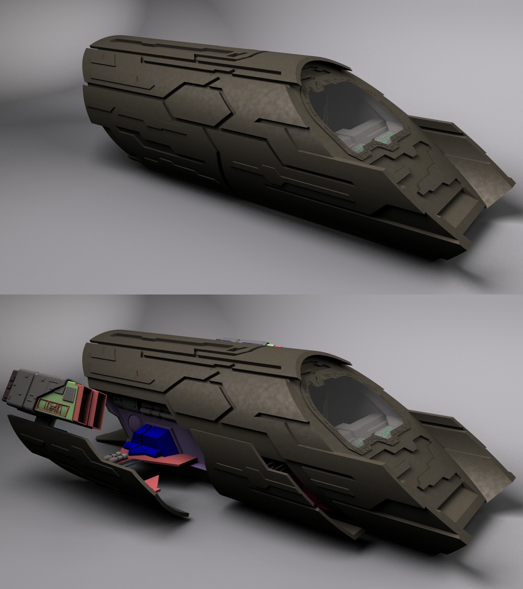
Well, it’s a “ship” that goes through the “gate,” so we’ll call it…

…a puddle jumper!

Front view

Rear view

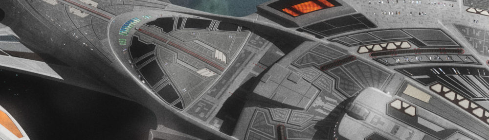
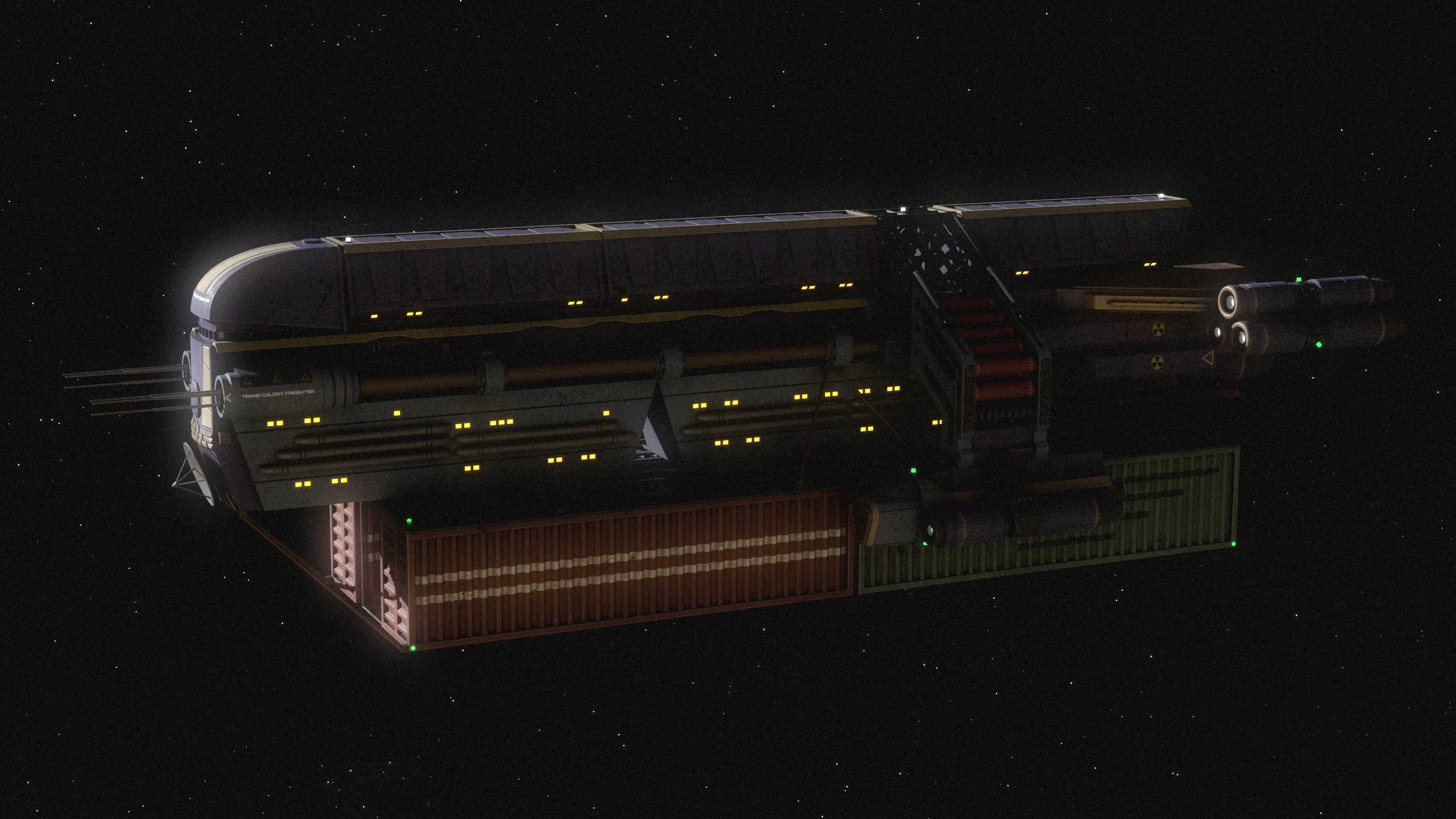
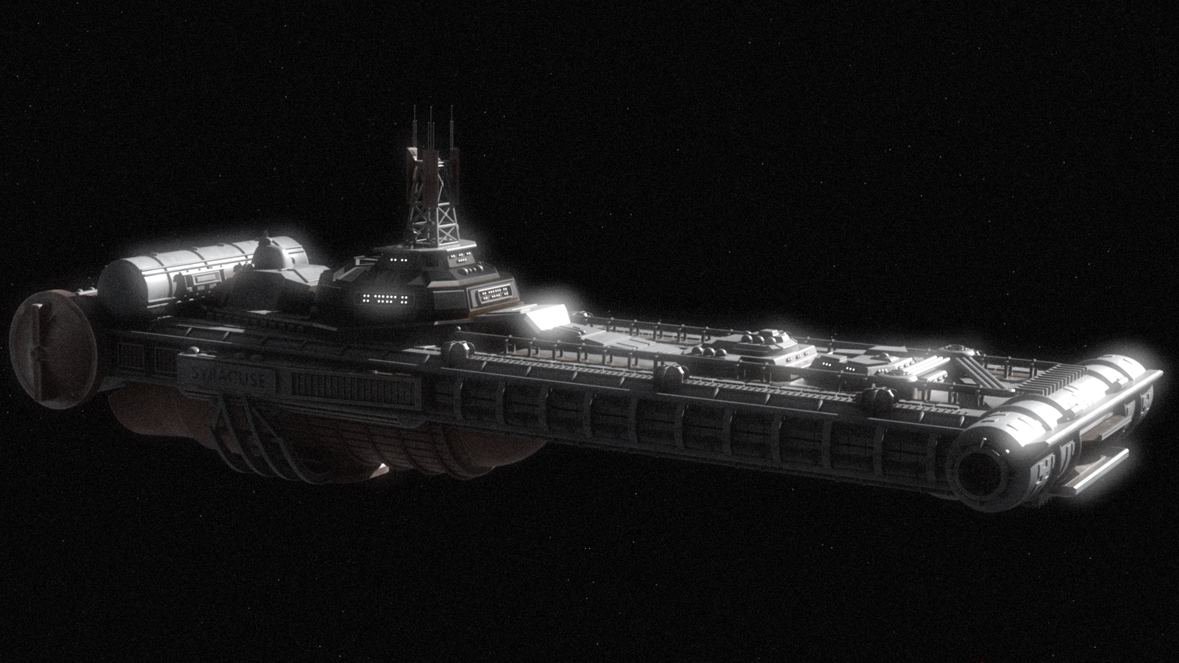
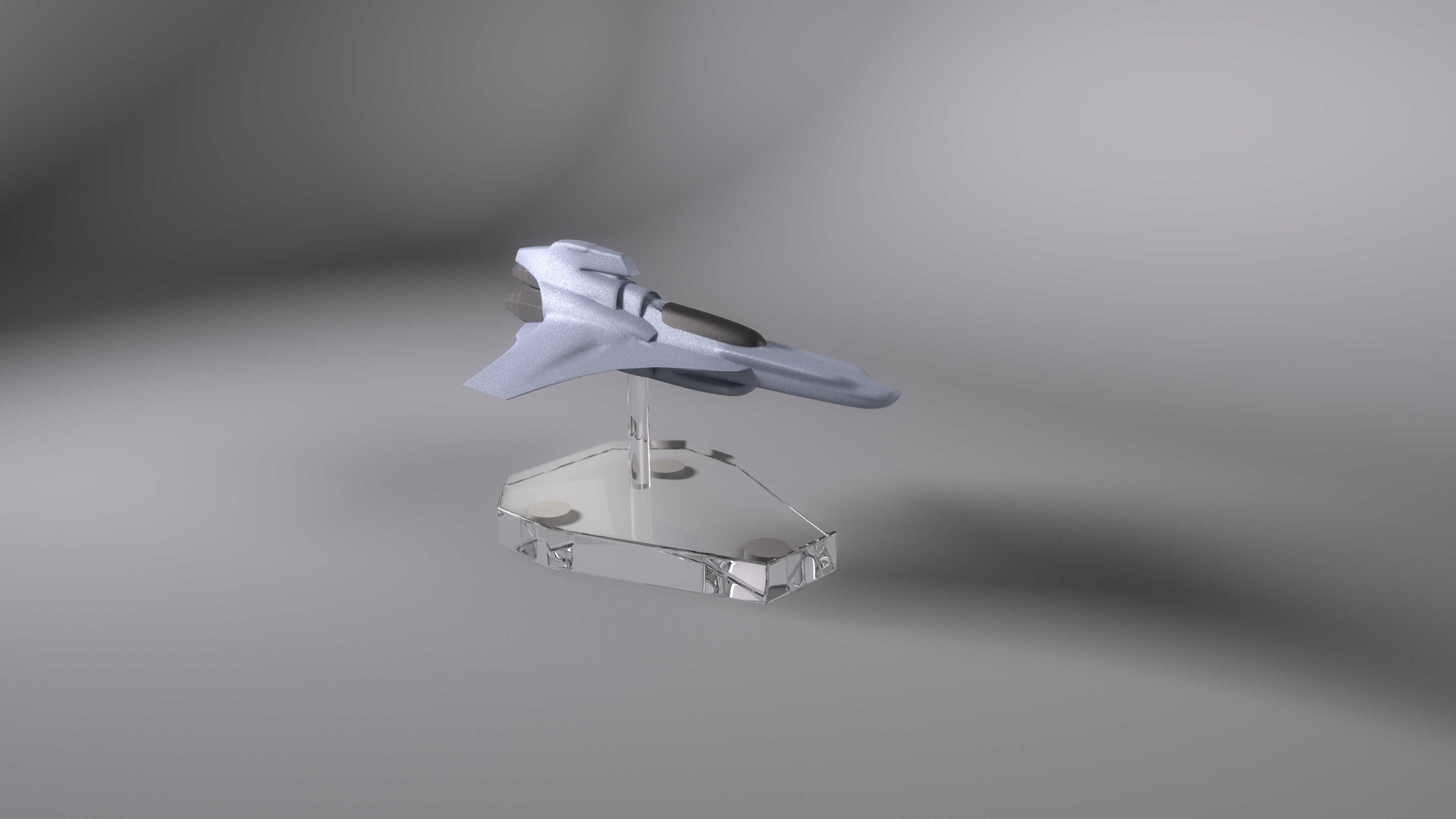
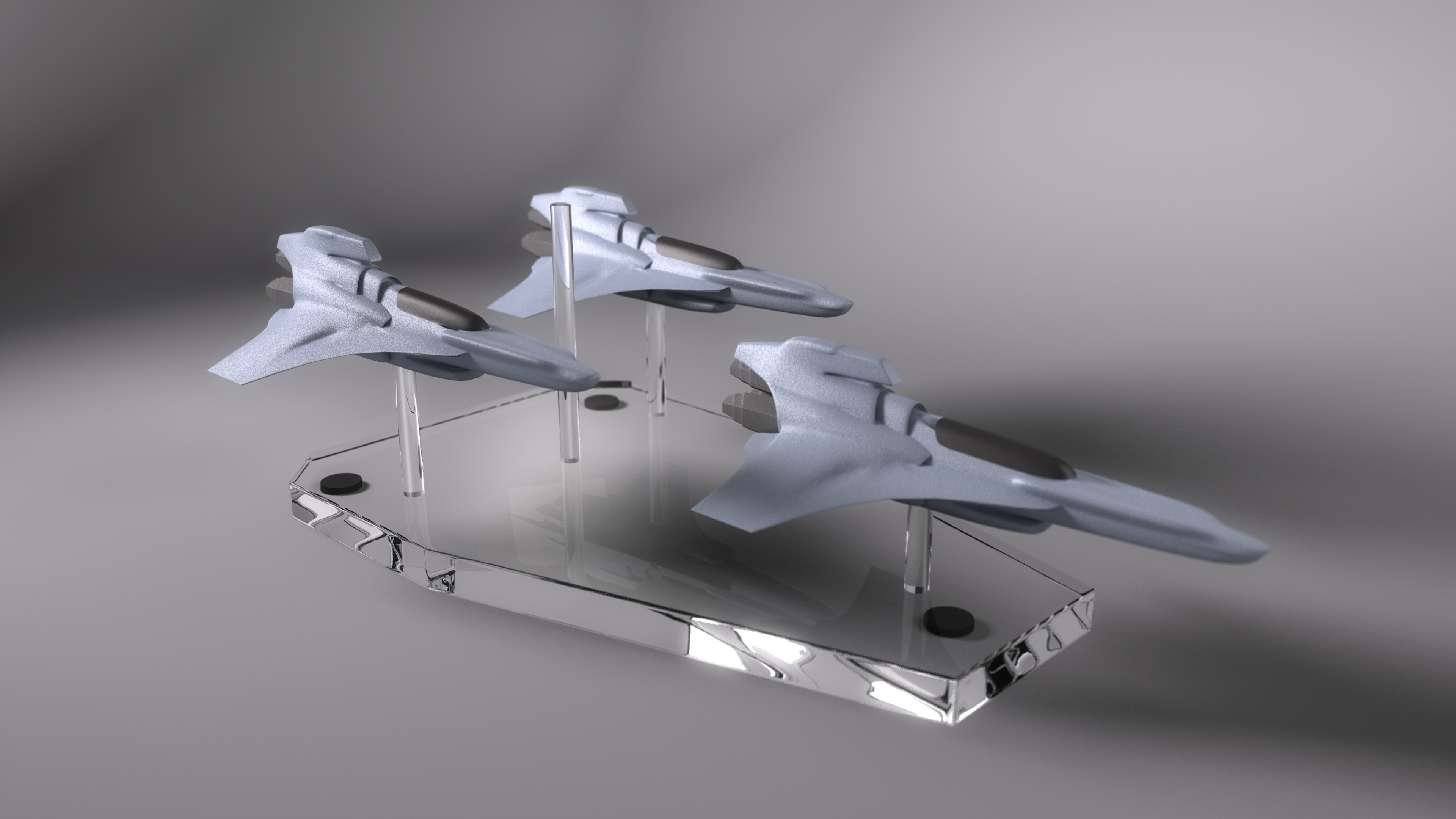
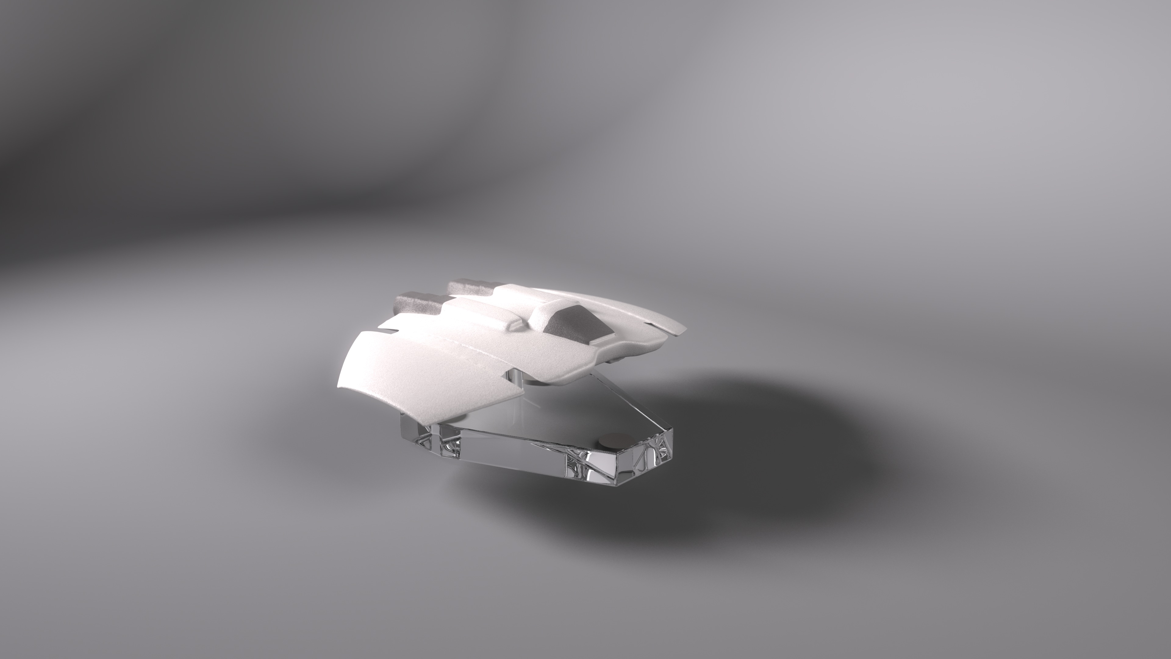
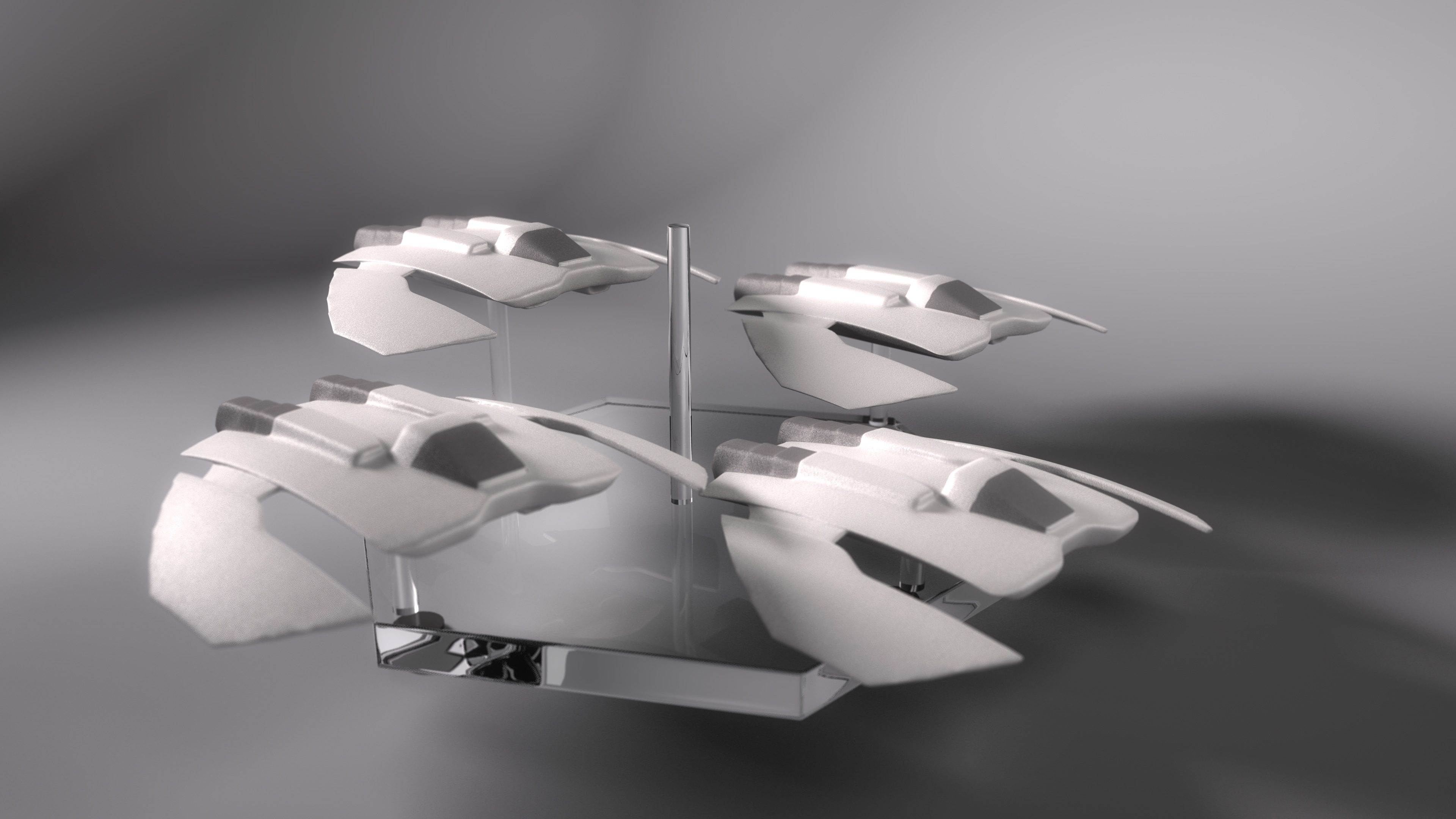
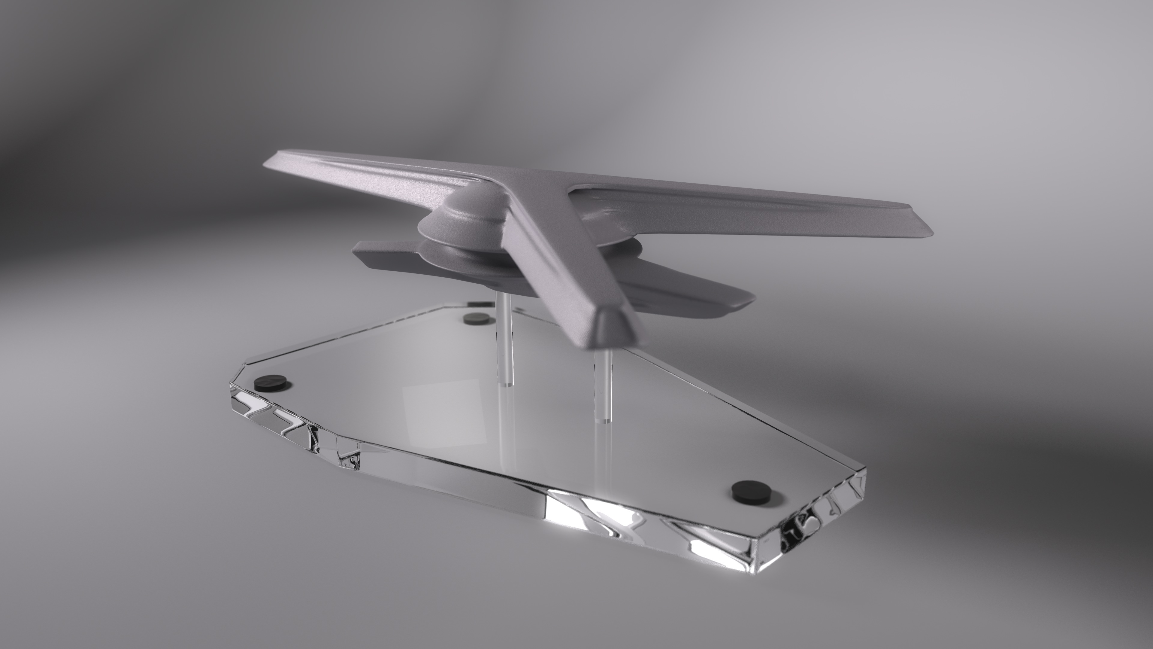
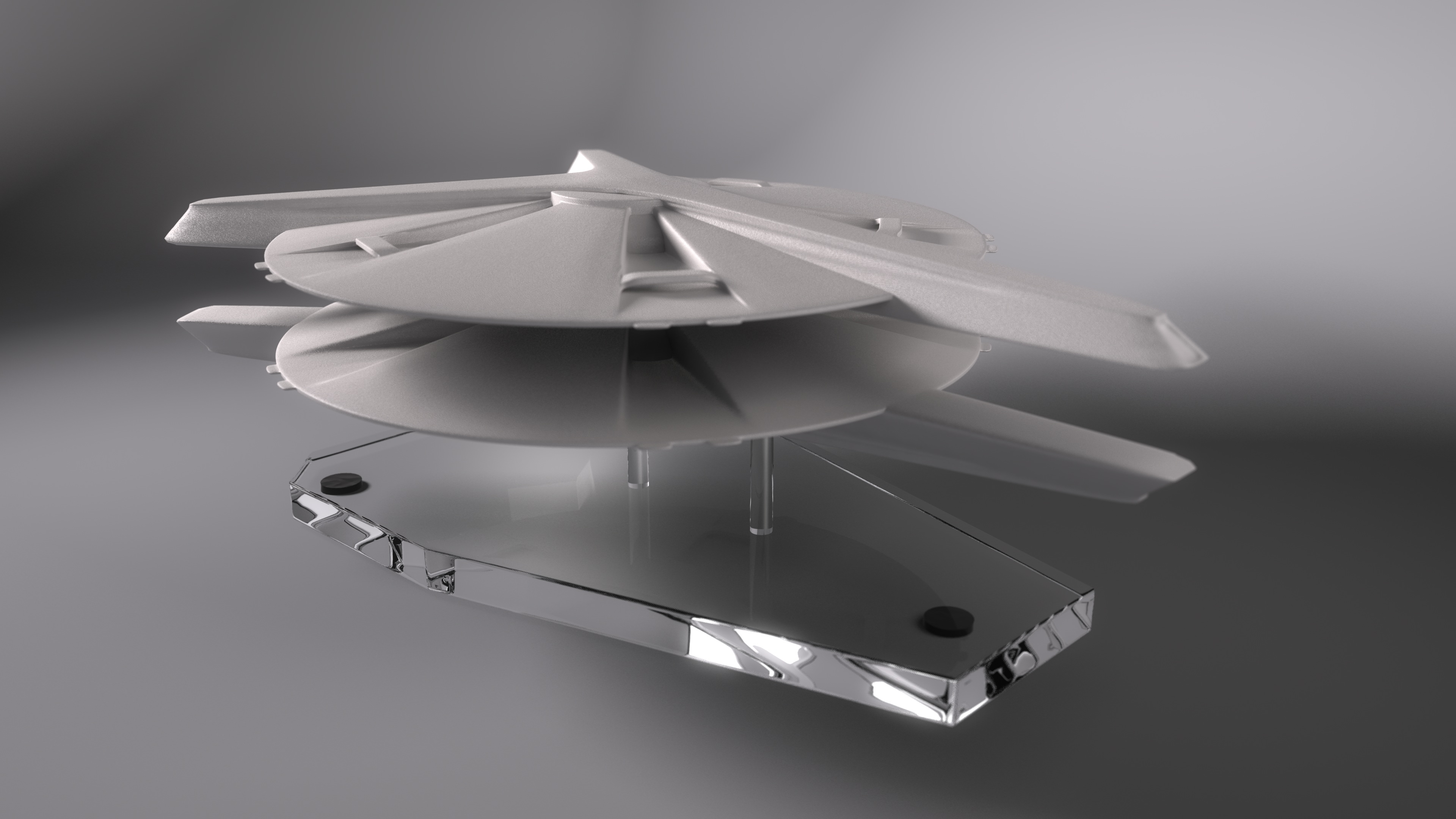
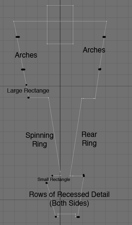
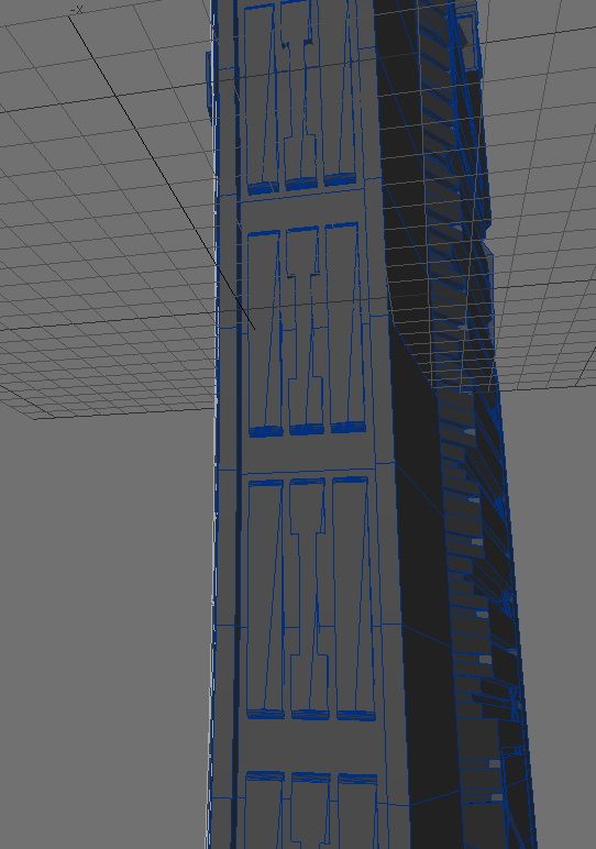
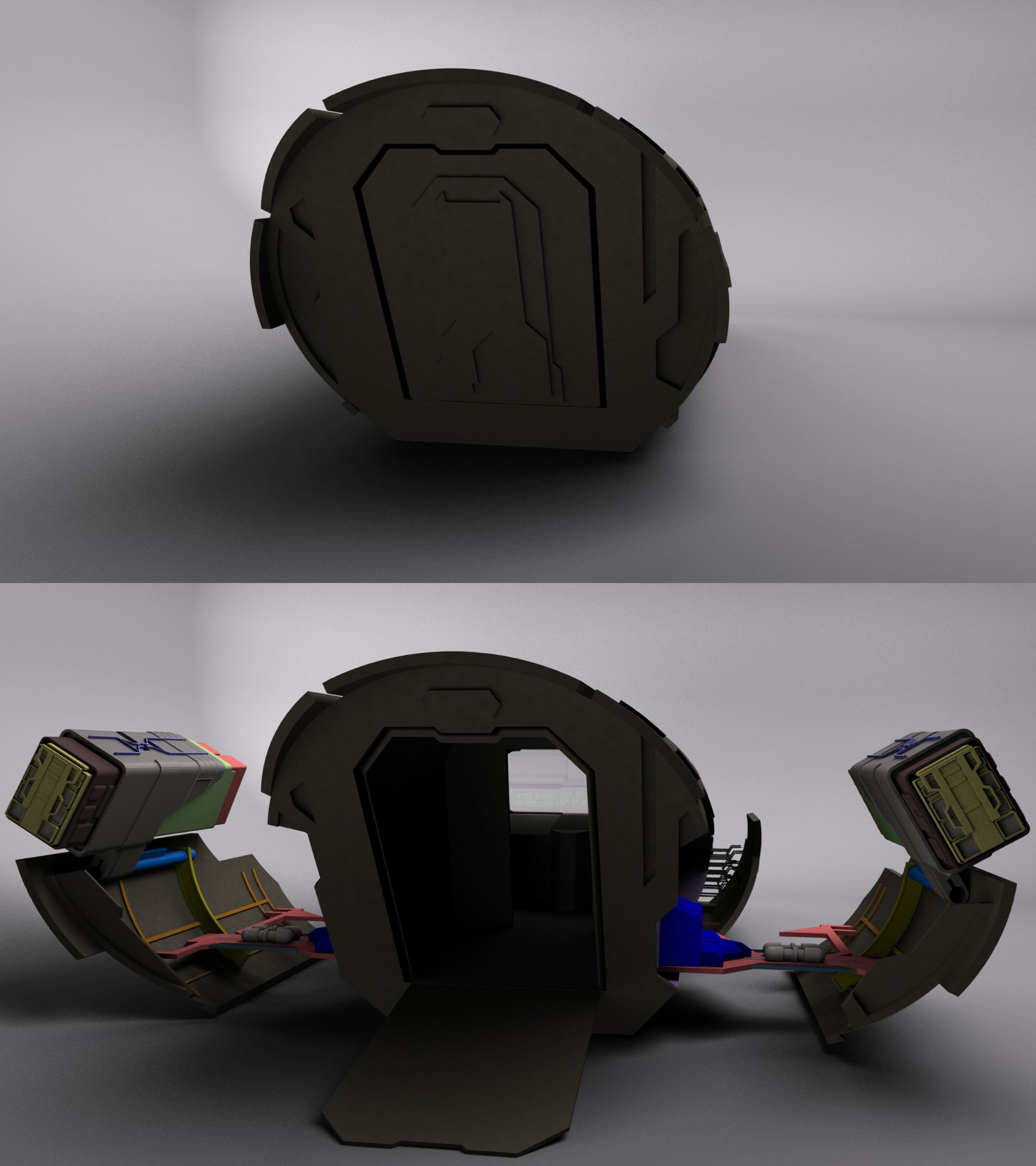
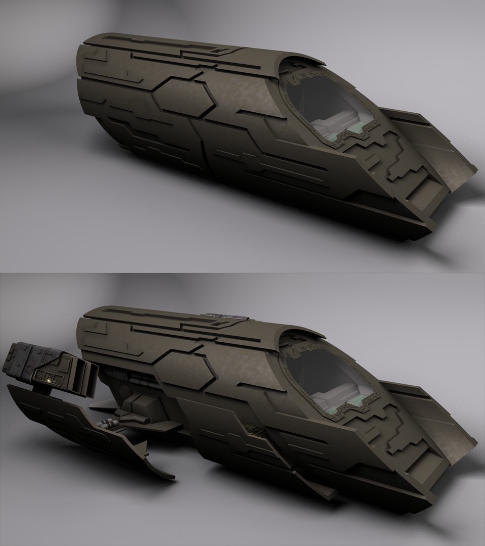
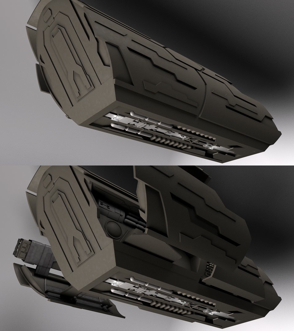
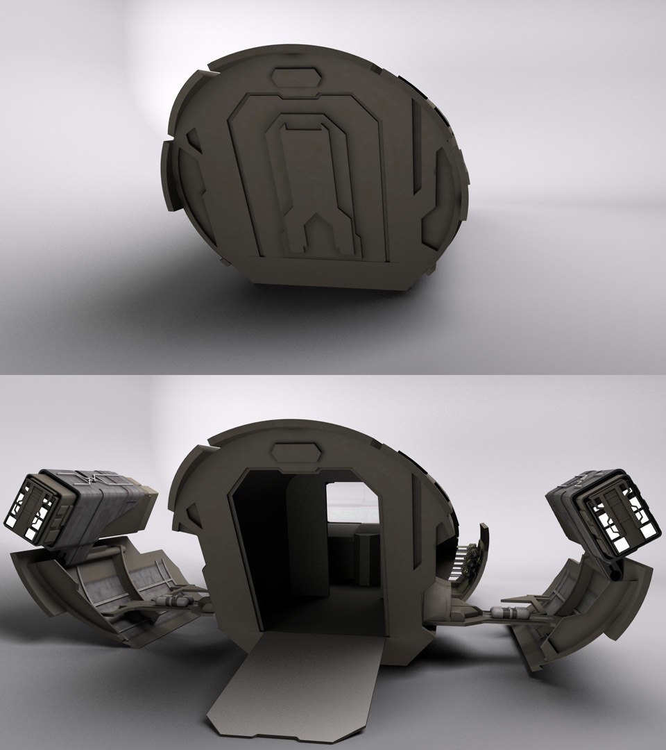
Now that the modeling of the exterior is finished, I believe I have enough invested in it to start up the WIP thread. I’ve started on texturing, and I believe I have a good base for the hull texture above. I’m painting alpha maps for it so the mottling isn’t so uniform. I already finished animating the unfolding of the engines, though I’ll need to work out a new way to clip the objects so they don’t show up inside the cabin of the ship when they’re retracted. The method I’m using now only works when the ship is pointed along the Z-axis.

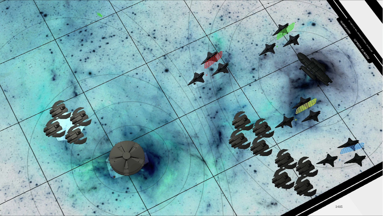
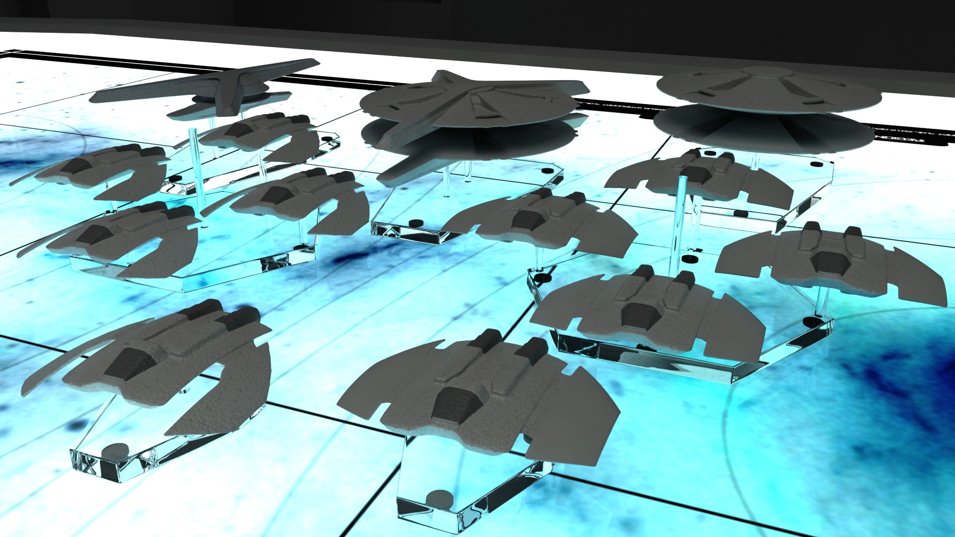
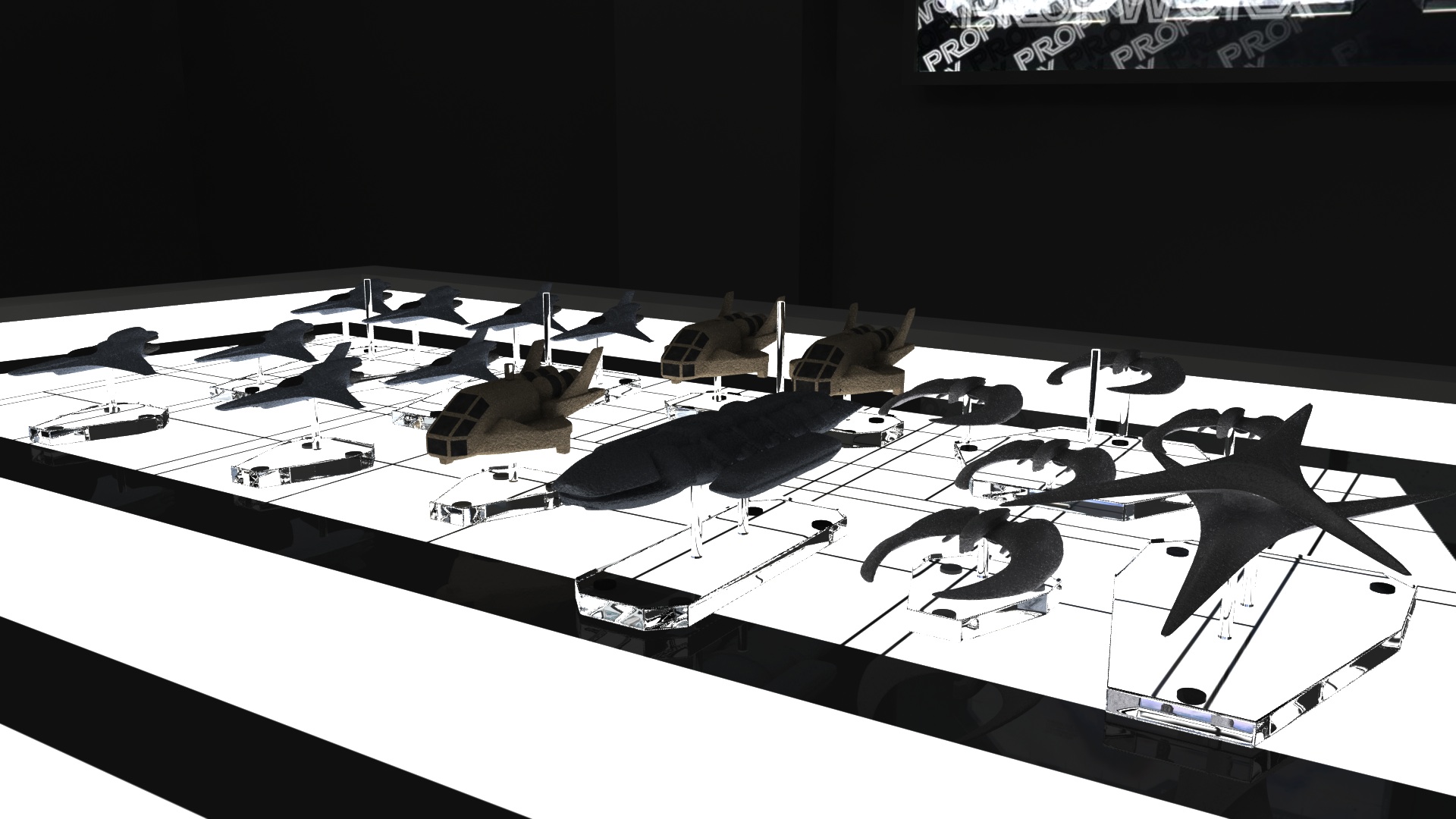
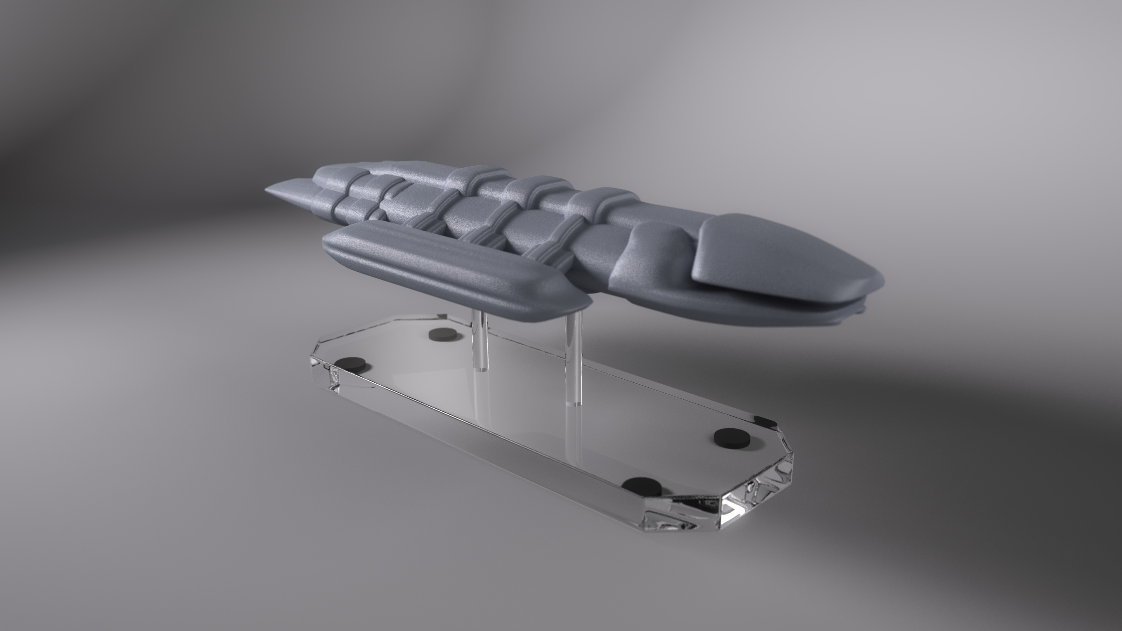
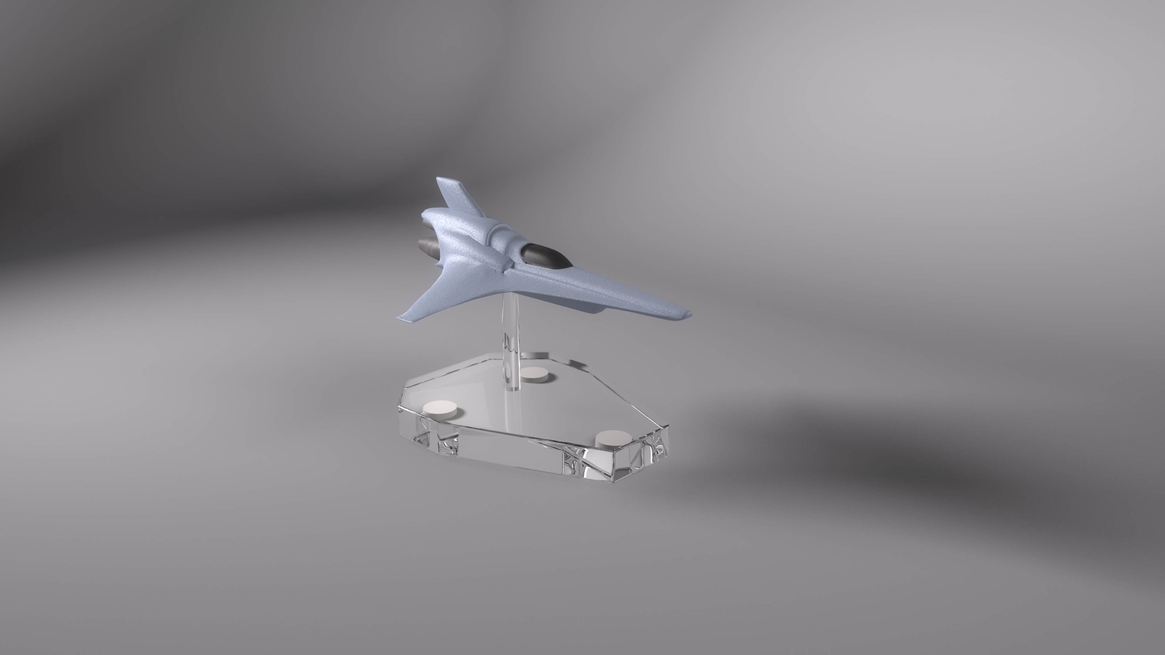
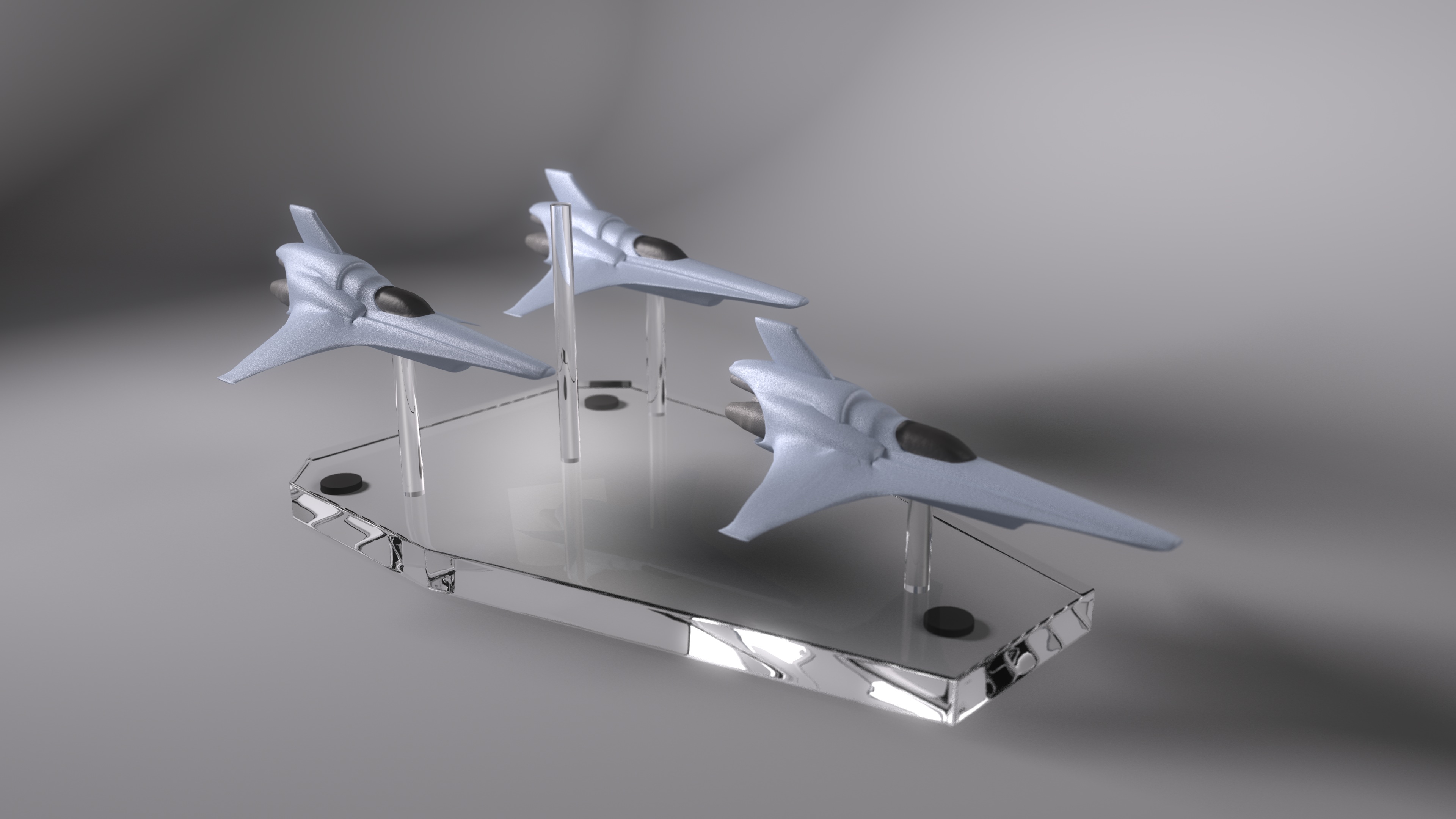
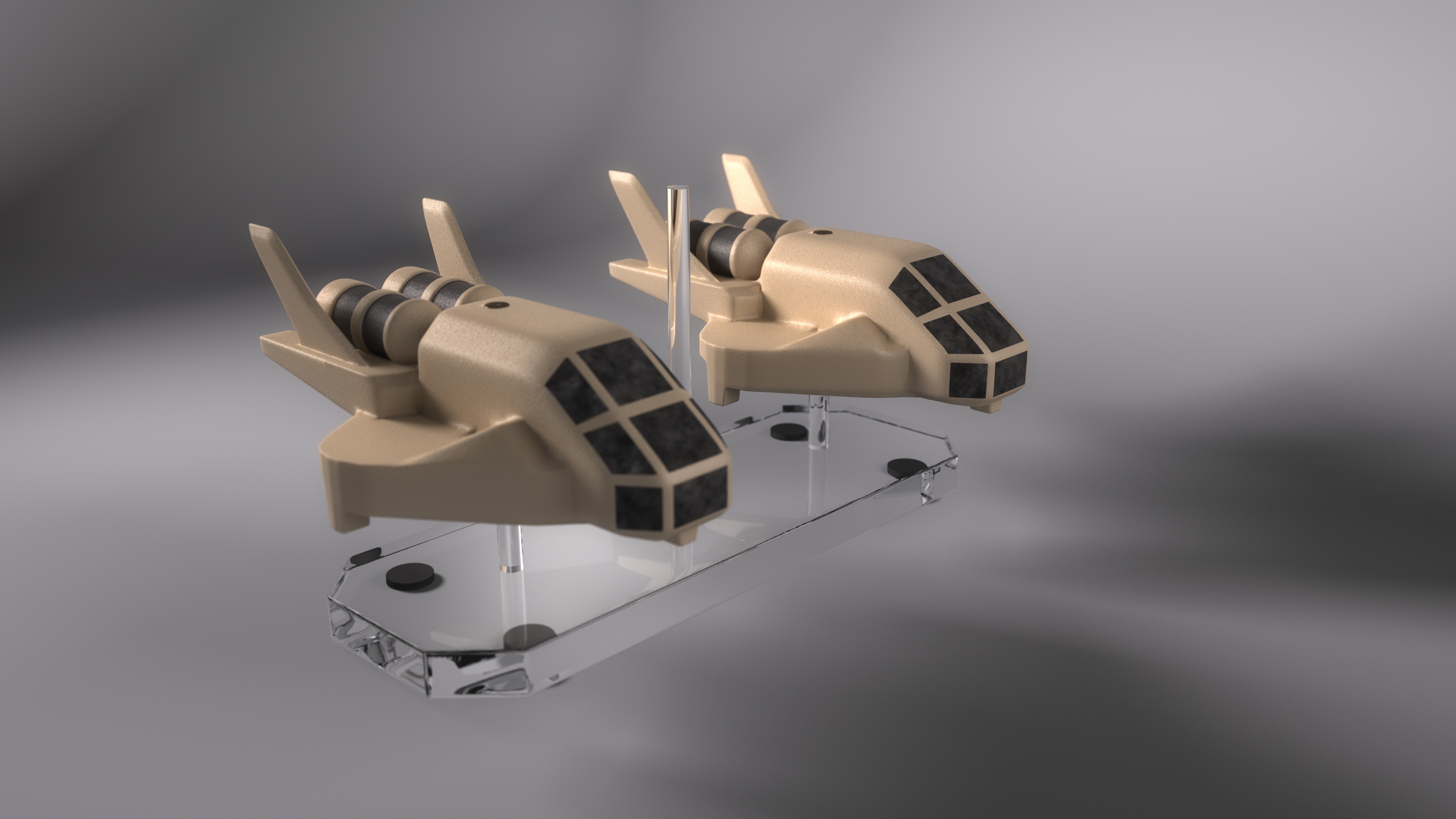
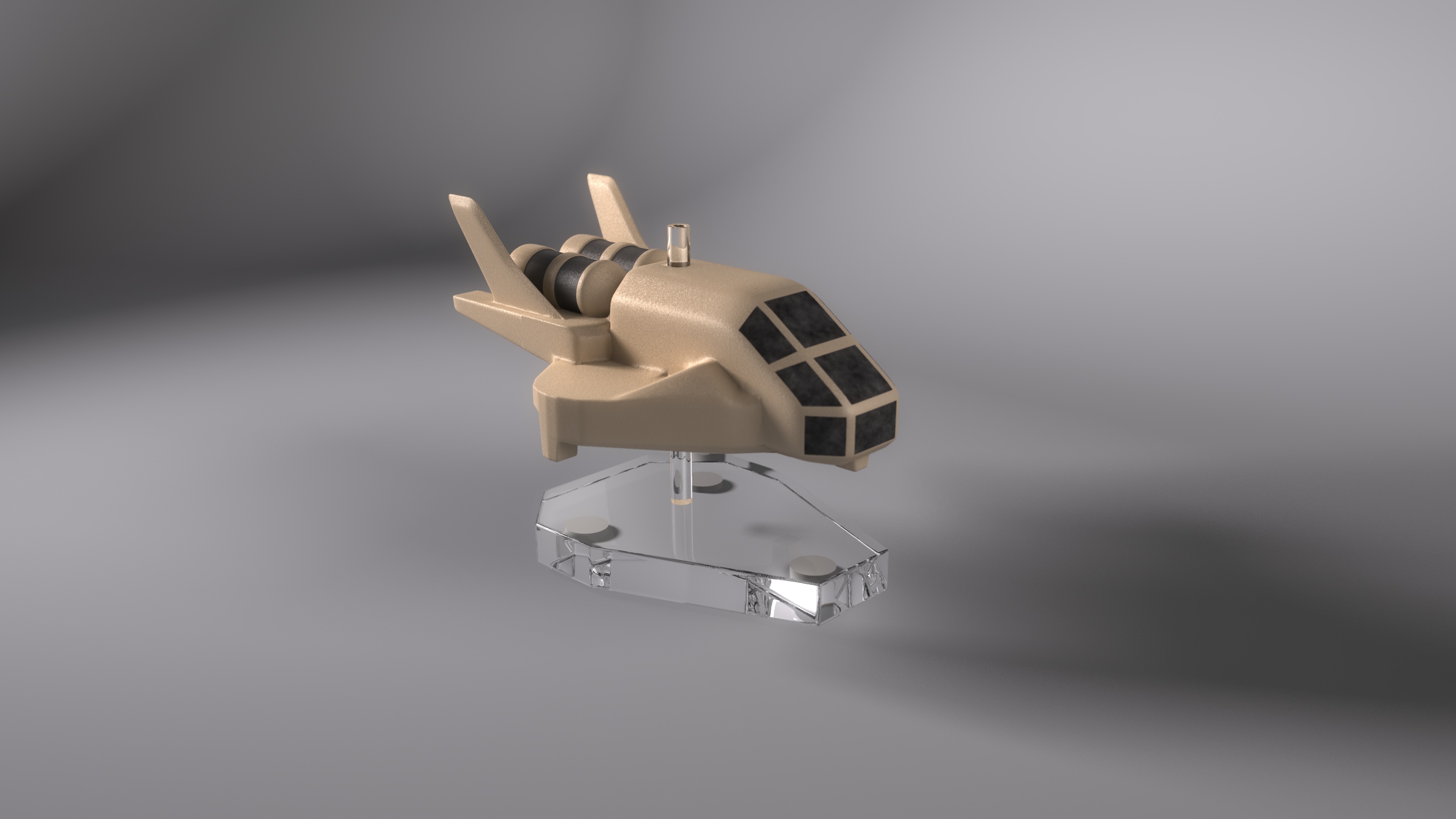
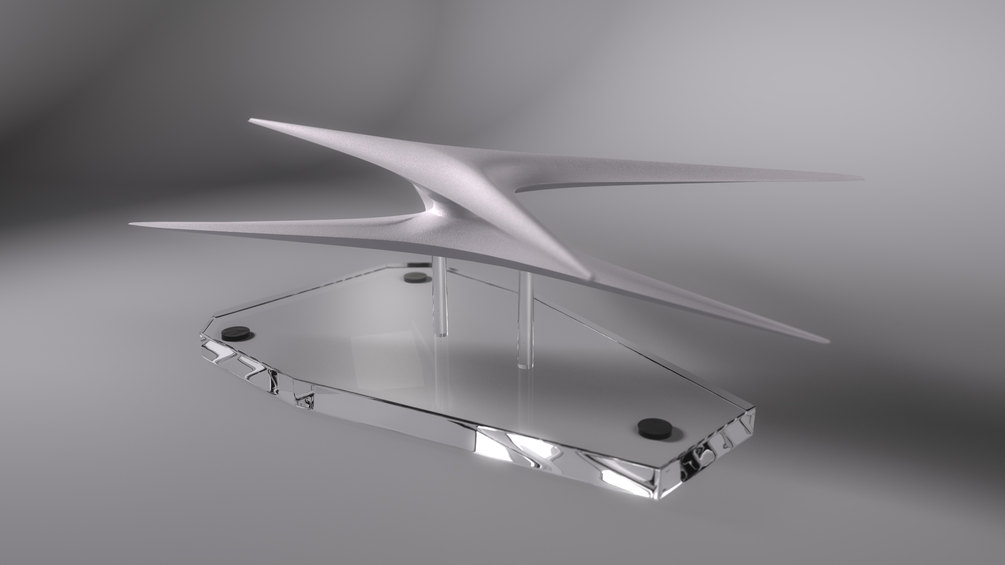
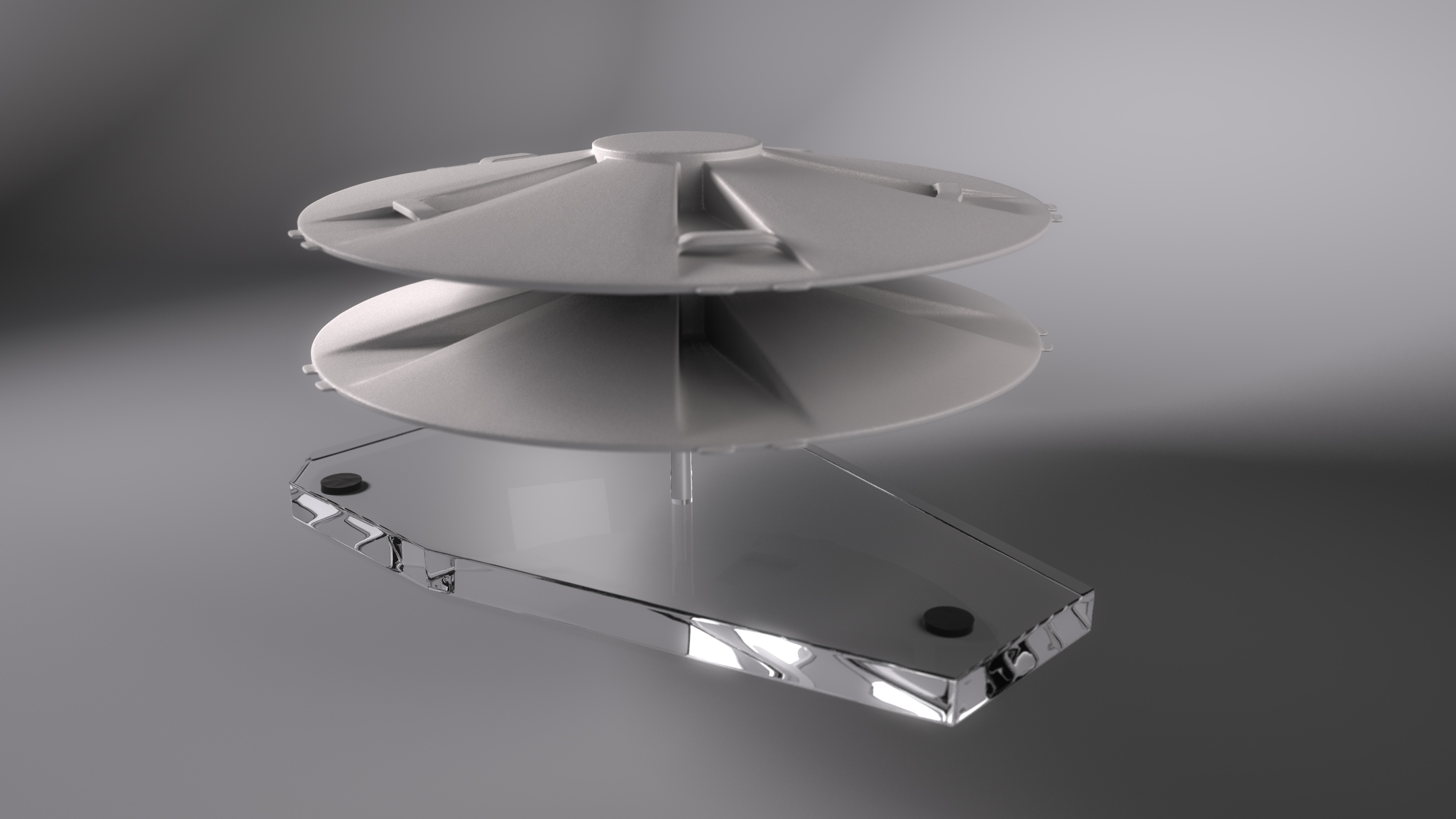
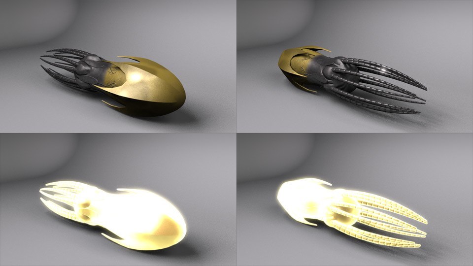
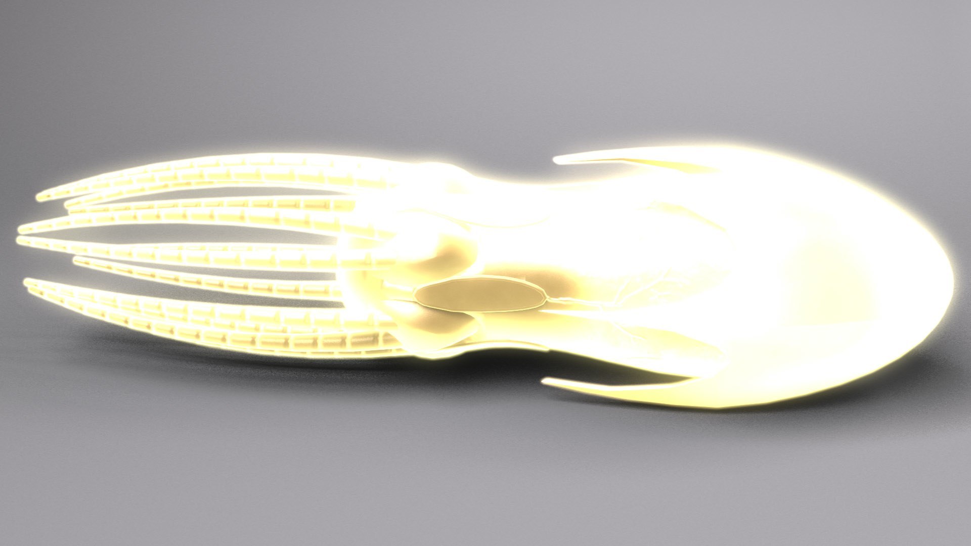
Also, I’ve finished texturing on the drone weapons, complete with a low-detail version for those scenes when you have thousands of the things flying every which way.

Drone Showcase

Active Drone

Added July 22, 2007

I’ve finished texturing and the light set-up on the exterior. I’m going to try to figure out how to get this clip-mapping fixed, though. Being able to only point the ship in one direction is a bit limiting for cinematography. After I’ve gotten that done (or given up in hopes of figuring it out later), I’ll get back to modeling the interior.

Also, I’ve rigged the engines so I can throttle their brightness with one slider. In fact, with the complicated retractions this ship does, I have to say, sliders and Master Channels are an absolute Godsend.

Front

Bottom

Rear

Added July 23, 2007

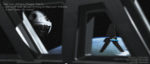
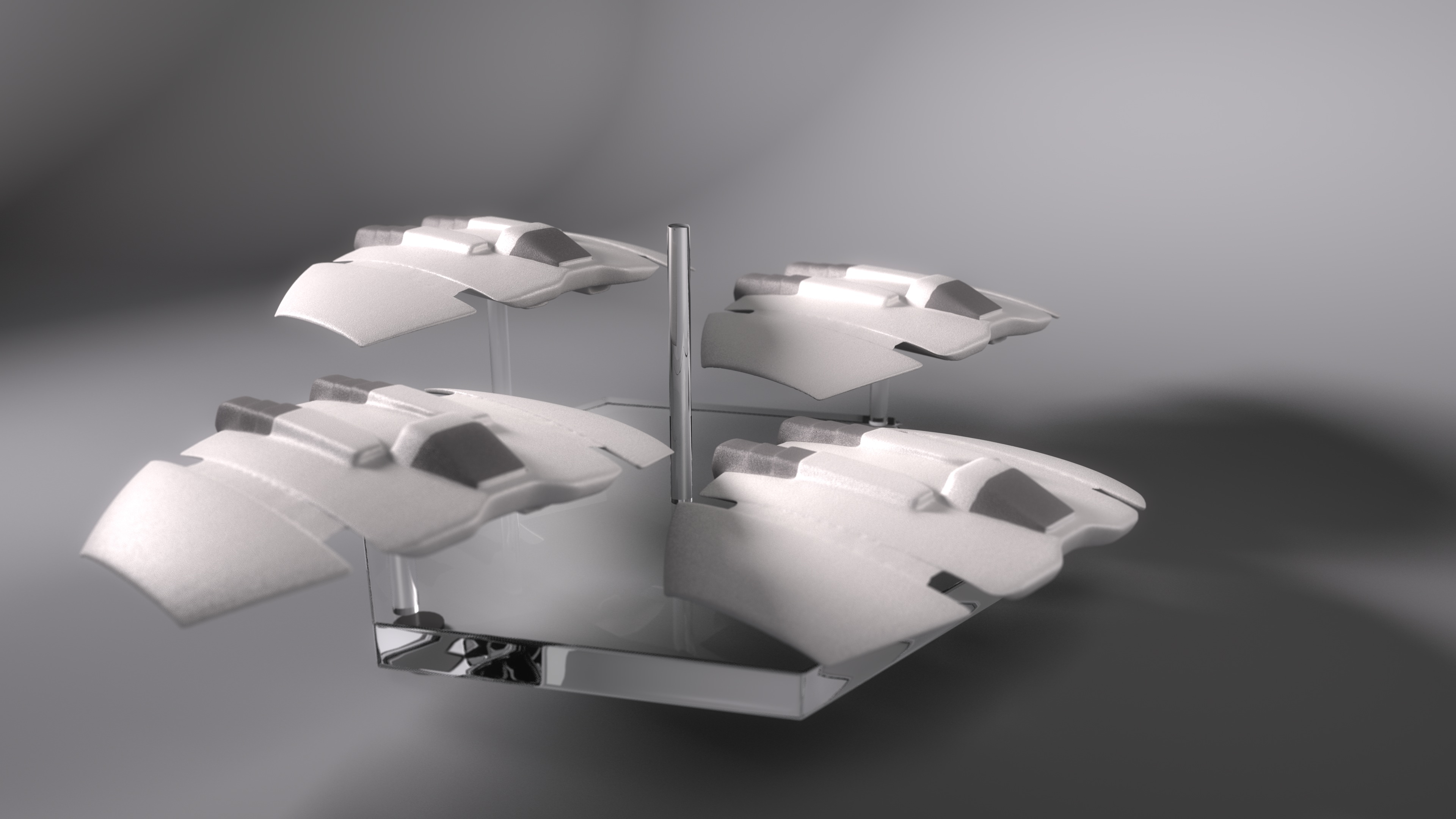
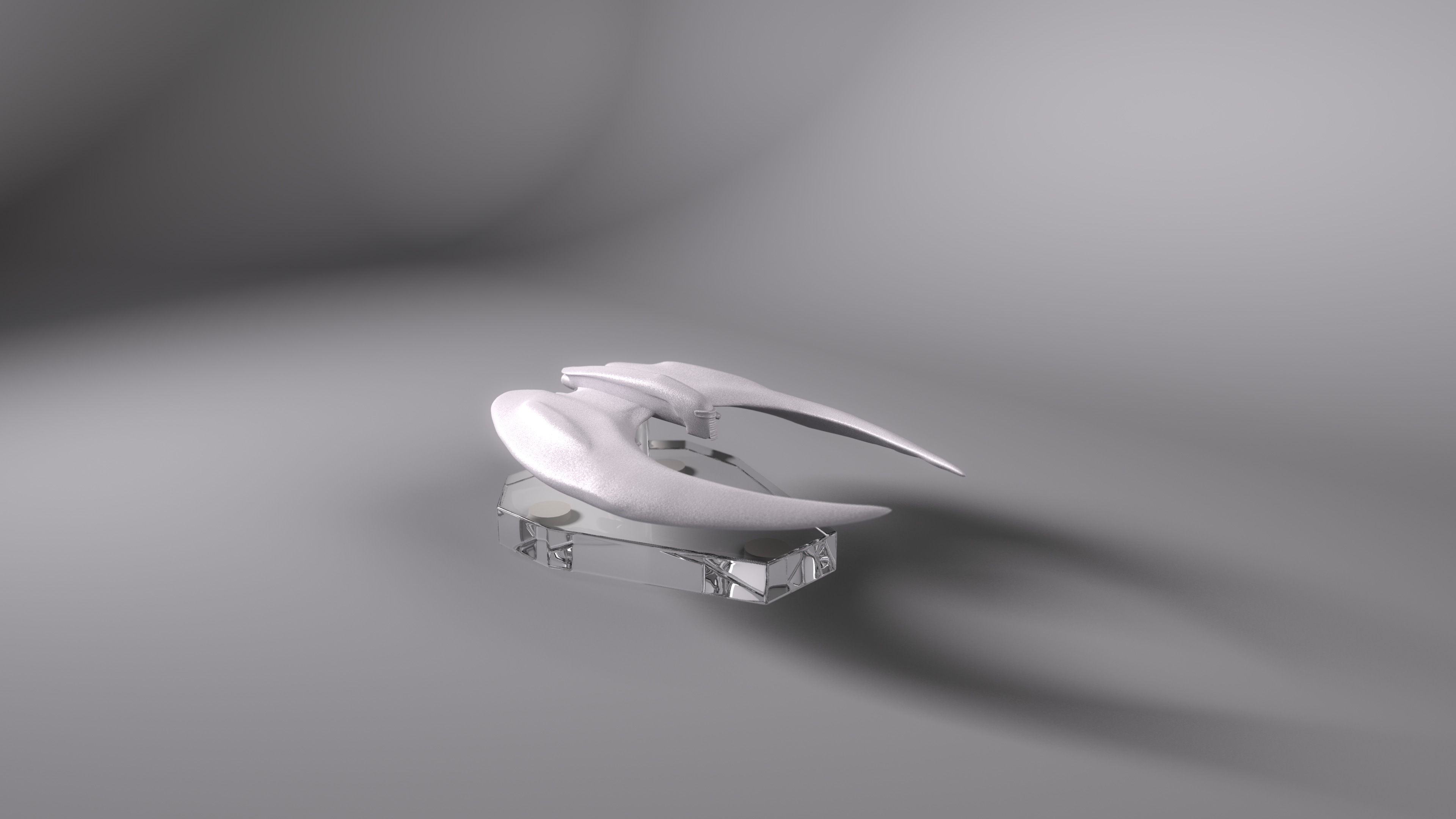
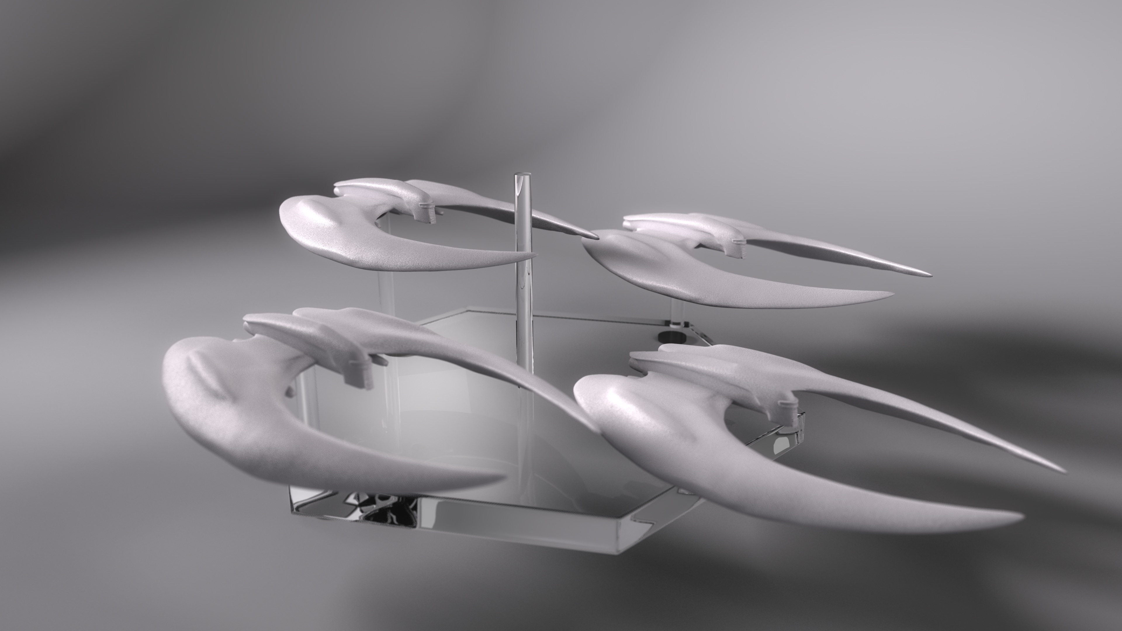
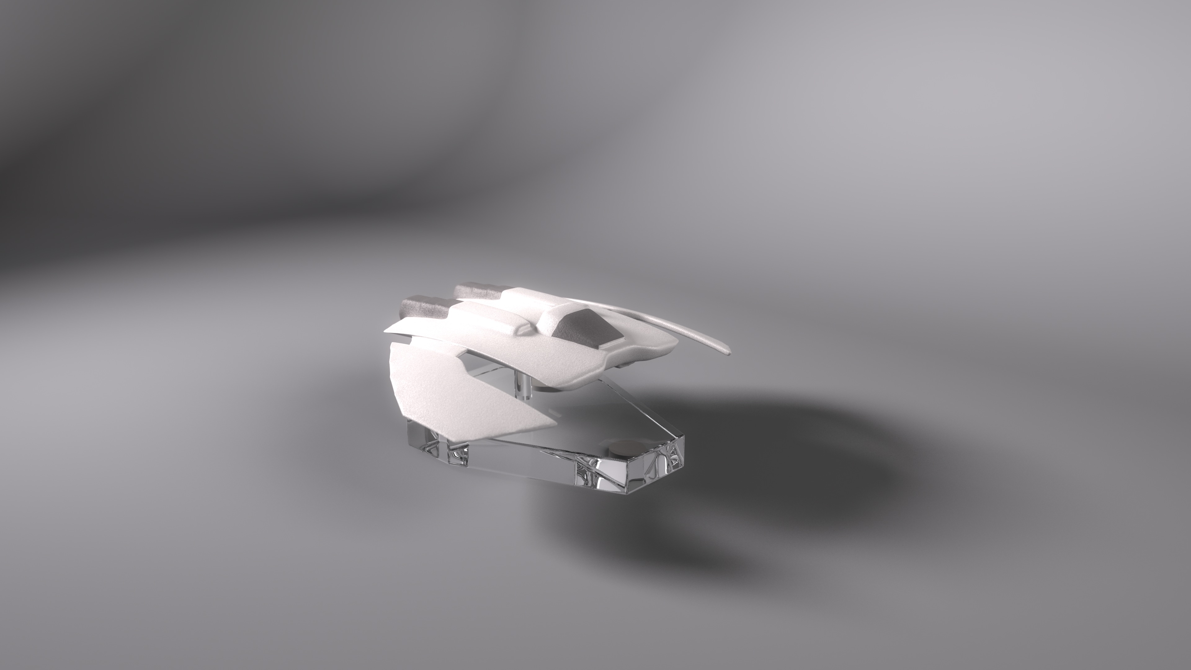
As for the engines on the Jumper, those are a magical wonderland of cheating. The engine bays on the original are about twice as deep as mine (the reason the bays on my model are shallower is so the rear compartment fits in at something close to its actual proportions), so the actual engines fit in with a bit less of a problem. However, it seems clear that the pivot they rest upon jumps off of its track while it’s retracting, so the engines can point straight up. Also, the wings themselves just pull into the body, without any sort of fake compartment or rationalization as to how they could possibly fit into the ship. Part of the fun of making this model was realizing exactly what compromises were made in its design, right after I made the same ones and thus knew what to look for.

The best look at how the engines retract (and how the VFX artists hide the fact that its physically impossible for them to move the way they do) come in the opening shot of the episode “Trinity,” and in a number of shots in “38 Minutes” (thought the best angles from those episodes aren’t included in those caps).

Seriously, after reverse-engineering this whole thing, I’m thinking about doing a writeup on the Jumper, mostly a taxonomy of the 3+ distinct 3D models of done on the show.

Here’s a movie of the cycles for the drone and engine bays. I’ve already decided I’ll take a page from the Atlantis VFX teams and only show the engines unfolding while the ship is distant, in motion, in shadow, or all three.

The same movie as above, but with the main body of the ship hidden so you can see precisely how the engines have to be clipped out so they don’t show up inside the cabin.

Serenity Liftoff

Now, this picture was an interesting one for me to make, since I tried a few new things. The contrails were a first for me, and I’m happy with how they turned out. The heat ripples coming out of Serenity’s engines also worked well. After a little polishing in Photoshop so the rendered elements blended in with the photographed stuff, I’m ready to call it done.

…For as Long as This Place Remains

From humble beginnings…

Seriously, I did this picture because I was frustrated with another project and felt like making something I could call finished, but I didn’t have any images in my head. So I decided, what the hell, I’ll duplicate a professionally made picture and call it a lighting exercise (and, hey, good lighting is important, and being able to figure out whatever the lighting setup was used at a glance is danged useful). So I picked the first (and so far, only) CGI still from the new Babylon 5 direct-to-DVD anthology series, “The Lost Tales.” This particular shot is from the opening sequence, and is itself a redo of a shot from the final episode of Babylon 5.

As with most of my recent pictures, the magic happened in Photoshop, where I began my customary bloom effect. Also, rather than just reducing the saturation of the picture, I duplicated the image on a new layer, made the duplicate grayscale in the channel mixer with a bias toward the blue channel, and then reduced the opacity of that layer. Finally, I applied a slight gaussian blur so that the Photoshop grain didn’t look so perfectly pixeled.

Screencap from “The Lost Tales” that this picture is based on.

Star Wars Gallery

DRADIS Icons

These are the icons seen on the DRADIS displays of Colonial vessels in the 2003 version of Battlestar Galactica. Updated January 23, 2008 with Cylon Com Relay icon seen in “Razor.”

DRADIS_Icons_1_23_2008.zip In Photoshop format.

dradis1A.ai Galactica 2D Field DRADIS Screen background in Illustrator format, created by Matthew Haley

dradis2.ai Galactica 3D Field DRADIS Screen background in Illustrator format, created by Matthew Haley

BSG_DRADIS_Screens.zip Galactica 2D, 3D, and countdown clock in PSD format, with image sequences for 2D/3D sweeps.

Pegasus_DRADIS_Screens.zip Pegasus 2D/3D Field DRADIS Screen background in Photoshop format, with image sequences for 2D/3D sweeps

DRADIS Showcase with scan-line monitor effect

DRADIS Showcase Clean without the scan-line effect.

Damn the Torpedos, Full Speed Ahead!

Admiral Kirk and the Enterprise lead an assault on a Klingon base in this, my latest render.

I’m really starting to get a sense for how less can be more with detail. Part of me hates to go into Photoshop and cover up that hard-won clarity with light blooms and film grain when it took 30-odd hours to render it all out (admittedly, that’s because I was doing other things with the computer at the same time, Lightwave is running under Rosetta, and antialiasing levels are like crack to me). However, it just looks really pretty with the sort of soft glow, and the grain helps sell it, especially up close.

DRADIS Contact!

A little side project over the last few days has been recreating the icons of the DRADIS displays from Battlestar Galactica.

A couple notes: The small Unknown icon is conjectural. In “Resurrection Ship Part I” a small ship was represented with the large Unknown icon, and in “Hero,” they used the Cylon Raider icon for a small Unknown, but whited it out when they bleached the flashback scenes, so it was hard to tell. So I made is a combination of the large Unknown and the Raider icons.

Also, the Resurrection Ship icon was only seen once, from a distance, where it appeared to be a modified version of the large Unknown icon, though it was difficult to confirm any details. In “A Measure of Salvation,” the Resurrection Ship II: Son Of Resurrection Ship was represented by the Basestar icon, which was unhelpful. However, the fact that the civilian ships were all made of pieces of the Viper and Raptor icons was very helpful, so I have no ill will.

I’m not sure how or when I’m going to release them. I’m thinking a zip of Photoshop files with the arrow for each icon on a separate layer. I’m also thinking about making them into a set of Mac OS X icons, but I’m not quite sure about that yet.

Final note, thanks to TrekBBS poster backstept for pointing me to the almost-perfect DRADIS display font, “Visitor.” And after drawing out text pixel-by-pixel, “almost” perfect is perfect.

“Approaching Star”

Not too much to tell about this image, really. Originally, I wanted to try to get the raw, high-contrast look that the early Babylon 5 publicity renders had, so I made a fairly boring image with intent to brighten it up later in Photoshop. Well, that didn’t work out.

About a week later, I was looking at some photography websites, and decided that I needed to experiment with more techniques, not just someday, but that right then. So I pulled up the image from my harddrive, and thought back to a magazine article on making better-looking black and white photos by using the “Channel Mixer” in Photoshop instead of just de-saturating the image. A few minutes of balancing red, green, and blue, adding a little light bloom, and some film grain to complete the effect, and I had a much better image. It’s now become one of my favorites.

Rising Star (Black and White)


If you’re curious, here’s the original color image.


Also, as a bonus, here’s another render from a while ago that I didn’t bother posting on it’s own, because it was a remake of an older image that was so flat and boring that I, apparently, never bothered to post it on-line. Admittedly, this one got a bit more of a makeover than my HD rerenders normally get (usually it’s just swapping in some area lights for planet and nebulae fill lights).

Stargate Reference Information

March 14, 2021: This information is drastically out of date. I’m leaving the page up for historical reasons, but if you want far more accurate information about the design of the stargate setpiece, I recommend looking at the blog and Facebook page of The Children of Mac Gyver, or EMG, a fan-group which has used pieces of the original set-pieces and exhaustive research to construct their own stargate. You may also examine the model and renders of my newer model of the film, SG-1, and Atlantis versions of the Stargate

If you’re making you’re own Stargate and are using mine as reference, here are some larger, detailed renders, as well as information on certain details of note that aren’t entirely visible in the showcase renders.


Posted in Uncategorized