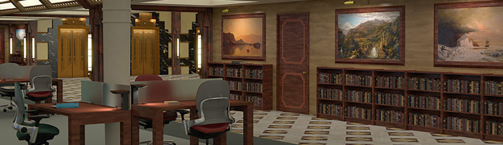
Category Archives: Lightwave
Scene Development Reel – June 2013
Modeling Reel – June 2013
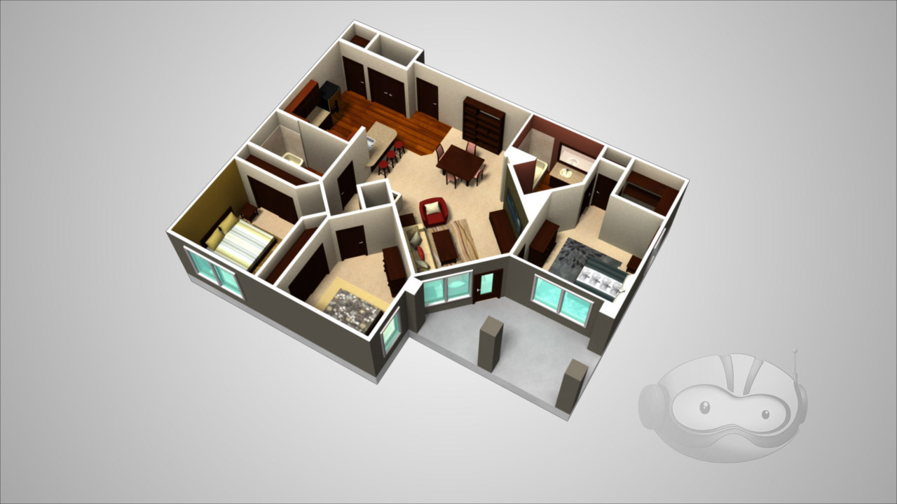
Now I am an Architect
One day at Ninjaneer Studios, Joe Rosa called in to the office while off-site with a question. “Do you think we can do some architectural visualization?”
The response? “And how!”
We were given a floor plan and an example of a 3/4 aerial cutaway view of a home. I was assigned to the task.
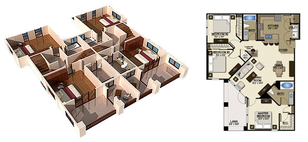
The first step was to trace out the walls and extrude them into place. Once that was done, I filled in the lintels above the hallways and split out the different rooms and surfaces, assigning them loud, contrasting colors so that I’d be able to differentiate them at a glance and would be less likely to forget to assign one a real texture later on than I would be if I left it at default grey.
Next, I began filling in furniture and other objects from our stock model library. A handful had to be tweaked to more closely resemble the illustrations on the floor plan, but I was able to match the original spec fairly closely. I then popped in some temporary lighting (just a single point source in each room on the ceiling).
Having roughed in the furniture, it was the work of moments to adjust the model to be used for the final cutaway view. The walls were clipped down to around 3/4 of their full height, and the camera moved outside of the structure. Once in the birds-eye view, I began applying rough texturing to the apartment. A turnaround was rendered, and this was the result.
It was missing a certain je ne sais quoi, and, not knowing what that could be, I FBX’d the model out of Lightwave and sent it over to Heather Knott, a professionally trained interior designer. She unclipped the walls and raised the camera, as the lowered wall height made the rooms look deceptively large, and replaced my haphazardly placed furniture with sets that actually looked of a piece, proving the importance of both teamwork and expertise
A version of this post appeared on the official Ninjaneer Studios blog.
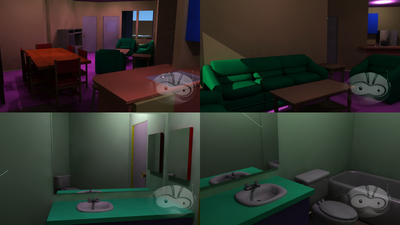
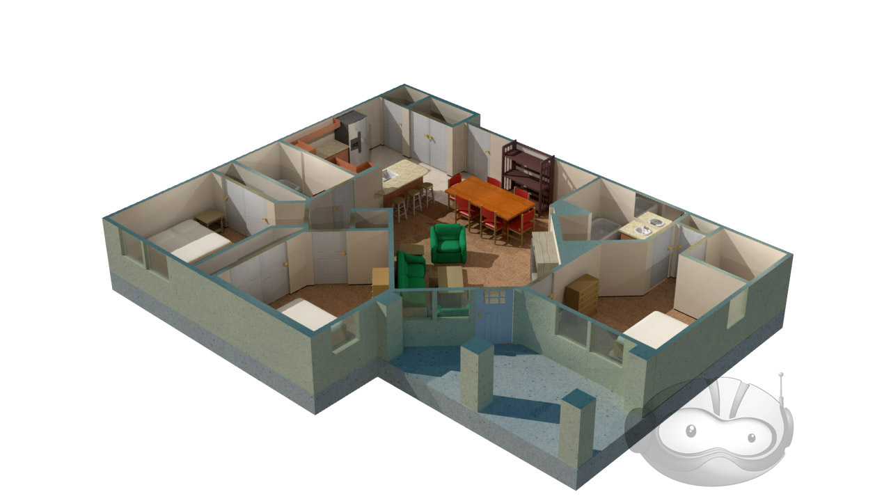
We Do Not Have Time For Your Damned Hobby, Sir!
The Red Silk Thread is an opera by composer Stella Sung with libretto by Ernest Hilbert. It tells the story of Marco Polo’s return to Europe at the end of his famous voyages through Asia. This past April, a workshop performance took place at the University of Michigan, in advance of a full premiere at the University of Florida in April, 2014.
Ninjaneer Studios provided virtual sets for the Opera, projected behind the actors and used in place of physical scenery. There are six principle settings in the drama: the Court of Kublai Khan, the Gardens of Kublai Khan, a Chinese treasure ship at sail, the Court of the Persian King, a Genoese prison cell, and a desert dream-scape.
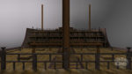
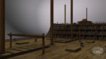
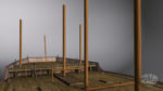
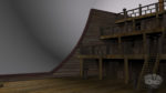
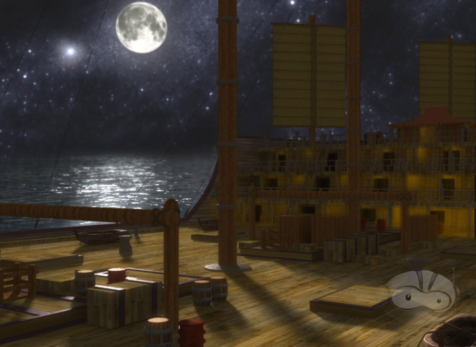
Thanks to my love of all things nautical, I immediately volunteered to take over the ship scene. The opera’s creative team had already put together some research on the types of boat they had in mind.
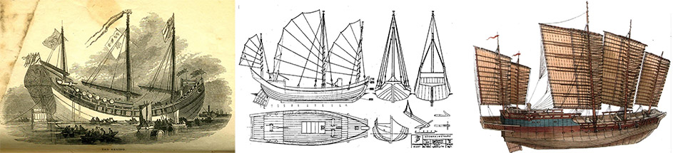
I used this as a jumping-off point, and found additional materials. My primary reference ended up being a high-resolution photo of an exquisitely detailed model of a Ming Dynasty treasure ship. While this exact design is of dubious historicity, especially for an ocean voyage, and dates from at least a hundred years after Marco Polo died, information on the ships of his time was sketchy at best, and what I did find didn’t look nearly as impressive.
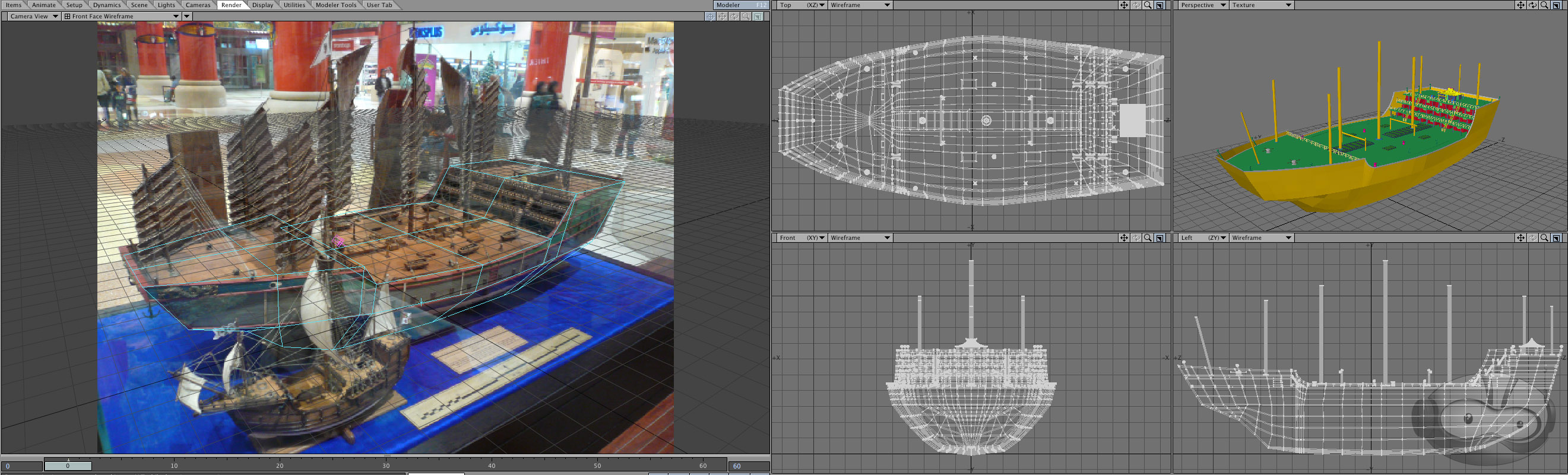
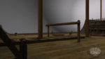
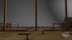
I began by roughing out the general shape of the hull in Lightwave Modeler. Even though the concept only called for the deck to be seen, I wanted to have at least a foundation for the exterior in case it was needed later. It also made it easier to ensure the deck was proportionate. I matched the camera angle as best I could to my reference photo in Lightwave Layout, and switched back and forth while adjusting the hull. I’ve found that while it isn’t a perfectly accurate technique compared to working off a set of orthographic schematics, it’s much better than eyeballing it.
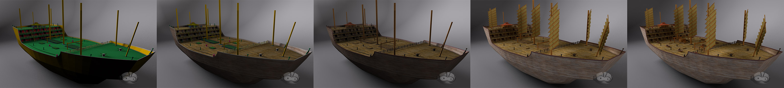
After completing the majority of the modeling, I began texturing the model, ending with populating the deck with various scenery objects
I then presented Dr. Sung with a set of potential camera angles.
After getting the go-ahead for a 3/4 view towards aft, I began setting up the scene and lighting. The motion of the horizon was based on stock footage from a locked-off camera on the deck of a boat. A long-exposure photo of the night sky was used as a placeholder. I started with my standard ocean model, but had the usual problem with flickering as it got closer to the horizon. A combination of making the waves larger and rendering a limited region of the frame at a much higher resolution blunted the problem enough that it was no longer visible after post-processing.
The frame was split into several passes for rendering. This was primarily for efficiency, so only passes which required lengthy render processes like extreme antialiasing or multi-bounce radiosity would be put through them, and simpler elements could be rendered at reduced quality or, occasionally, as single frames.
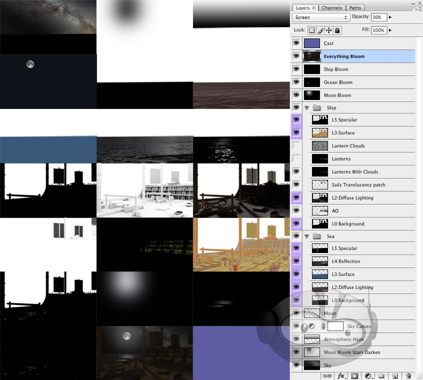
I prepared a test composite in Photoshop, which I passed along to Christopher Brown, who handled the compositing for all scenes in the opera. He built on my design, unifying it stylistically with the other scenes, and altering it to fit with the limited staging available for the workshop performance.
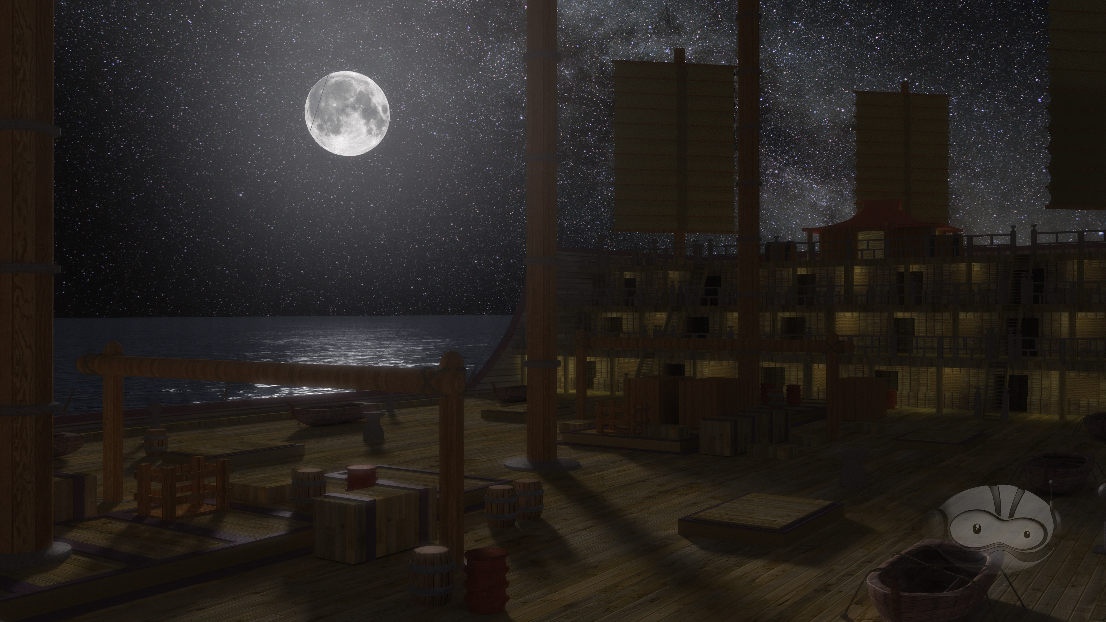
Initial Photoshop Test Composite
Final After Effects Composite
Over the next several months, all of us at Ninjaneer will be revising and expanding our virtual sets for the premiere at the University of Florida next year. I don’t want to ruin the surprises we’re planning, but I wouldn’t be surprised to see a few more ships in the Great Khan’s fleet.
A version of this post appeared on the official Ninjaneer Studios blog.
Wetter is Better
While working on a landscape for a forthcoming project at Ninjaneer Studios, I found that the animated reflections in some open water took prohibitively long to render thanks to a combination of the reflections and the diffused lighting of the scene. There had to be a quicker process that gave similar results, so I began investigating alternatives.

Render With Full Lighting and Raytraced Reflections
I found that Adobe After Effects has a filter called Displacement Map, allowing me to distort one layer based on another. One big drawback to this filter is the way it displaces, resulting in artifacts at the edge of the screen and other transparent areas where it attempts to sample data that is out-of-frame. This was easy enough to solve, but required some creative shot breakout.

Displacement Map (Note the ragged edges along the bottom and left sides)
Returning to Lightwave, I rendered out a reflection pass of the foreground elements. I changed the surfacing of the water so it was mirrored, deleted everything except the foreground elements, and set the foreground element to be unseen by the camera. This gave a pass consisting only of the reflection of the foreground, accounting for the perspective distortion in the reflection.
Thanks to the distance, there wasn’t enough perspective difference between the background and sky and their reflections to require a true reflection pass to be rendered, so I just reused those, flipped vertically. The clouds were a single panoramic plate, slowly receding, so those were likewise flipped vertically and layered into the basic reflection composite.
With the reflected version of the scene now created, all that remained was to make it look like water. I returned to Lightwave and rendered out basic diffusion and specularity passes from the original water object. To get the input for the distortion map, I created a duplicate of the water object and took surfacing in the bump channel and reapplied to to the color channel. After zeroing out the other channels and setting luminosity to 100%, I rendered it out, creating a shifting cloud pattern which corresponded perfectly to the diffusion and specularity passes I rendered earlier.

Diffusion, Specularity, and Bump Passes
Back in After Effects, I brought these passes in and layered them over the reflection composite I had created. I hid the bump layer and added an adjustment layer between the reflection elements and the diffuse and specularity layers. I applied a displacement map to it and set the bump layer as the input. All that remained was to tweak the horizontal and vertical displacement to make the reflection appropriately wavy.

The Final Post-Production Reflection
A version of this post appeared on the official Ninjaneer Studios blog.
Clearing Out the Workbench
Over at Foundation3D, a new downloads category opened up for unfinished models. A couple days after seeing the thread, I remembered that I had a very rough version of the hangar deck from the 2003 version of Battlestar Galactica, and also the foundation for the Halo: Reach version of the Pillar of Autumn. I’d finished the initial work for both, which is usually the part of modeling that gives me the most trouble, but I’d also burned out on them getting that far and moved on to other things.
I uploaded both of them. The Autumn includes a large number of screencaps from Reach, a few downloaded from the internet, but most I took myself to use as reference for the project.

The hangar was actually for a school assignment, to match a professionally made 3D rendered environment, either a virtual set or something from an animated film.

You can download the Pillar of Autumn and hangar (local mirror) from Foundation3D. The models are in Lightwave format, though I included OBJ versions for users of other packages. All I ask is that if you let me know if you do anything with them. I still have a few images in mind that I’d like to make with these objects.
As an aside, the reason I was looking at my hangar model was that I was playing with some of the new BSG designs from Blood and Chrome and comparing them to the parent show. While doing that, I did some scaling with the new Viper (based on a production diagram posted by Doug Drexler) and found out that it’s a big sucker (10.6 meters long, with a 6.8 meter wingspan). I thought I may have made a mistake, but the cockpit matches the size of the cockpit on the Mark II version, and they seem to be using the second Mark II cockpit set from BSG without any modifications, so they should take up the same space.
Babylon 5 2×01 Effects Update Part 004- Steamed, Not Boiled
Today’s update is a fairly straightforward sequence. We’ve now reached Act 2 of the episode, which begins with one of the common season 1 establishing shots of the station.

The stock shots of the station were something I wondered about earlier in this project. On the one hand, part of the philosophical basis for doing this is to give the show a more unified appearance, rather than the variations from shifting styles and evolving technology during the original run. On the other hand, I would like it if each chapter of the show had it’s own style (more than just how many and what kind of spaceships are loitering around Babylon 5). This didn’t quite occur in the original run, with very early stock footage being used in later episodes where the look of the show had evolved into something totally different, so what I’m shooting for can be described as stylistic evolution over the five seasons, but technical consistency for the run of the show. Another concern was the ever-present question of when I want to make a direct recreation of the original shot, and when I think I have my own idea for how to set it up. It’s hard to think of a “better” way to do any given generic, interchangeable establishing shot, as opposed to something with a more specific context.
What I think I’ll end up doing is to try to preserve the “feel” of the original establishing shots, while recreating them in my own idiom. For instance, a lot of the establishing shots in the first season of B5, including this one, either started from came to a complete stop, with a very spline-y acceleration or deceleration that screams “early computer graphics.” Eliminating that, along with framing it from the start in 16×9, makes the shot feel a lot more comfortable and cinematic than the version on the DVD.
Assuming this project continues on, I’ll probably make adjusted versions of early shots when they pop up in later seasons to fit in better with those episodes. A good example of this is one of my favorite touches from the new Battlestar Galactica. There was one particular establishing shot of the ship which was used throughout the series, and in later appearances, as the Galactica became more beat-up, new versions of the exact same shot appeared with the additional weathering. It was a fun twist on the concept of stock footage, and something I’d like to do myself.

The other segment in this update is from (the first half of) Sheridan’s good-luck speech in the Observation Dome. There are two shots out the window, one of which had a pivot and a zoom, and the other which was locked off. I found that the first shot was more difficult for After Effects to track than I had anticipated, so I’m going to mark that as another one to revisit down the line. The locked-off shot looks gorgeous, though. I only wish it lasted more than a second or two so I could appreciate the spinning stars while the observation drones pretend to be amused by anecdotes about the Dali Lama.
I’ve also been having a lot of trouble with the Premiere file I’d been using, so there’s an odd editing issue with the first Observation Dome window shot, and there are no crossfades or subtitles in this batch. I’ll probably just recreate the project file within the next couple of updates. Hopefully it’s just the Premiere file that’s gone bad, and the program itself isn’t reacting to something in the source videos.
Next up is another establishing shot of the station (which I’ll probably swap out for continuity reasons I’ll go into when I post it), then the Battle of the Line flashback, which will be preceded by what I’m sure will be an epic dissertation on just what happened during the Battle of the Line.
Model Credits:
Babylon 5: Ed Giddings
“Epsilon 3”: Nick Stevens
Epsilon Nebula: Amras
Starfury: Mark Kane
Starfury Wingart: Chris Guinn
Shuttle: Alexander Shareef
Babylon 5 2×01 Effects Update Supplemental- It’s Your Standard Warcruiser
It’s been a while since I updated this project, but a few weeks ago, it came back up in conversation. I realized at the time that I was now spending a lot of time sitting by a high-power desktop that wasn’t usually doing anything, and decided to take advantage of it.
I did end up trying Autodesk MatchMover. It handled the shot of Ivanova and Corwin from the last update with aplomb, but choked on the closing shot of the episode, which I expected to be the sharp, pointy crown jewel of difficulty on this project, containing both a lengthy camera move and a focal-length change.
I used the spare computer to re-render the second shot of the Agamemnon from the episode’s teaser, removing the odd tweening error I’d hoped no one would notice but which someone did. I then re-rendered it again when I got frustrated with the jump point opening effect. Yuri Parovin’s “A Call to Arms” jump point used a pre-made animated image map to accomplish the sparking that occurs before the point opens. Unfortunately, it was set for 30 frames per second, and I’m rendering the shots for this episode at 24 FPS. Lightwave appears to make an odd choice when it comes to splitting the difference in this case, keeping the timing correct by holding on the nearest frame, rather than making the transition within frames. The upshot was that the texture would hold for two frames, then skip a frame, then proceed normally for a time, giving the effect a noticeable stutter.
I asked around at the office, and figured out a plan of attack to recreate the effect procedurally. In Lightwave, it’s using “Previous Layer” as the input to a gradient shader, and in Maya, it’s called a Ramp Shader. Whatever it’s named, the way it works is to take a source image and redefine what its colors output as. In this case, grey becomes white, and both black and white become black.
I’d seen this technique described before, in a presentation by Bungie Studios (“Blowing S#!t Up the Bungie Way”) describing how they were able to get everything from flaming explosions to electrical arcing from one or two grayscale textures, and recognized it as how that jump point texture had to have been done, but I hadn’t realized until speaking with bottomless font of wisdom Chris Brown (my coworker, not the one you’re thinking of) how to translate that technique into the programs I use.
I tried a purely procedural solution, but it didn’t quite look right. The “energy ring” was too even, and it didn’t crinkle up at the center of the cone object the way the image map did. I eventually created a map in Photoshop to use as a baseline, and animated the “Previous layer” gradient instead. I threw in a semi-transparent layer of fractal turbulence in Lightwave which was gradually animated just so the energy effect wouldn’t repeat precisely every time. This was also the most contact I’ve had with Lightwave’s node-based surfacing, and I finally used some of the features that set it apart from the traditional surfacing options. The ability to directly feed one texture into multiple channels was a revelation, compared to the old way of having to copy-and-paste texture layers from color to specularity to glow to transparency and so on.
The upshot is, the new jump point now looks smooth opening up even at 24 FPS. Here’s the updated version of the shot.

I took another pass at the lighting rig for Rhys Salcombe‘s Minbari Warcruiser, brightening it considerably and switching the lights between the bottom ribs to single points rather than pairs of spots. I experimented with doing the effect with a luminance map, but it didn’t quite achieve the goal, so I stuck with doing it with lights. I also created a beaten-up version of the ship to represent the Trigati, to give some visual credence to the idea that the ship had been square in the middle of the biggest battle of the Earth-Minbari War when it deserted and hadn’t been able to make port for repairs in the twelve years since, and to differentiate it from the second Warcruiser that shows up at the end. It’s the first time I’ve done modeled damage on a spaceship, so that was fun.
The top fin has a blast mark on both sides, inspired by one of the shots of the Battle of the Line in “In the Beginning,” where a Starfury crashes into that section of a Minbari ship and blows out through the other side. I chewed away the lower left fin, and added a fairly large hole on the right side of the main hull, as if the right forward gun on the ship had misfired. I put a layer of procedural dirt over the whole ship, as well. I’m sure some people will think I’m overdoing it, given how much the Minbari outmatched Earth during the war, but there were a fair few shots of damaged Minbari ships in ITB, and I figured a Warrior Caste ship would be more likely than most to wade into the middle of the fight where they might take a few blows.


Ninjaneer Studios Projection Mapping Display at Otronicon
Recently, my company, Ninjaneer Studios, was invited to exhibit at the Otronicon event. We decided to set up a small-scale 3D projection mapping show. My specific contribution was the cityscape at the end of the show.
While Ninjaneer generally uses Maya for 3D work, I use LightWave occasionally, especially in projects where I’m working solo. This was my first big test of a cross-platform workflow, since the template for the stage and projector set-up was a Maya file, I wanted to model the city buildings in Lightwave so I could work with the greatest speed, and my scene would have to go back to Maya for rendering by my colleague Christopher Brown, who was in charge implementing the show. It was much easier than I expected, though it helped that thanks to time constraints and the nature of the final output, I elected not to give the buildings more than the simplest of surfaces.

Design doodles
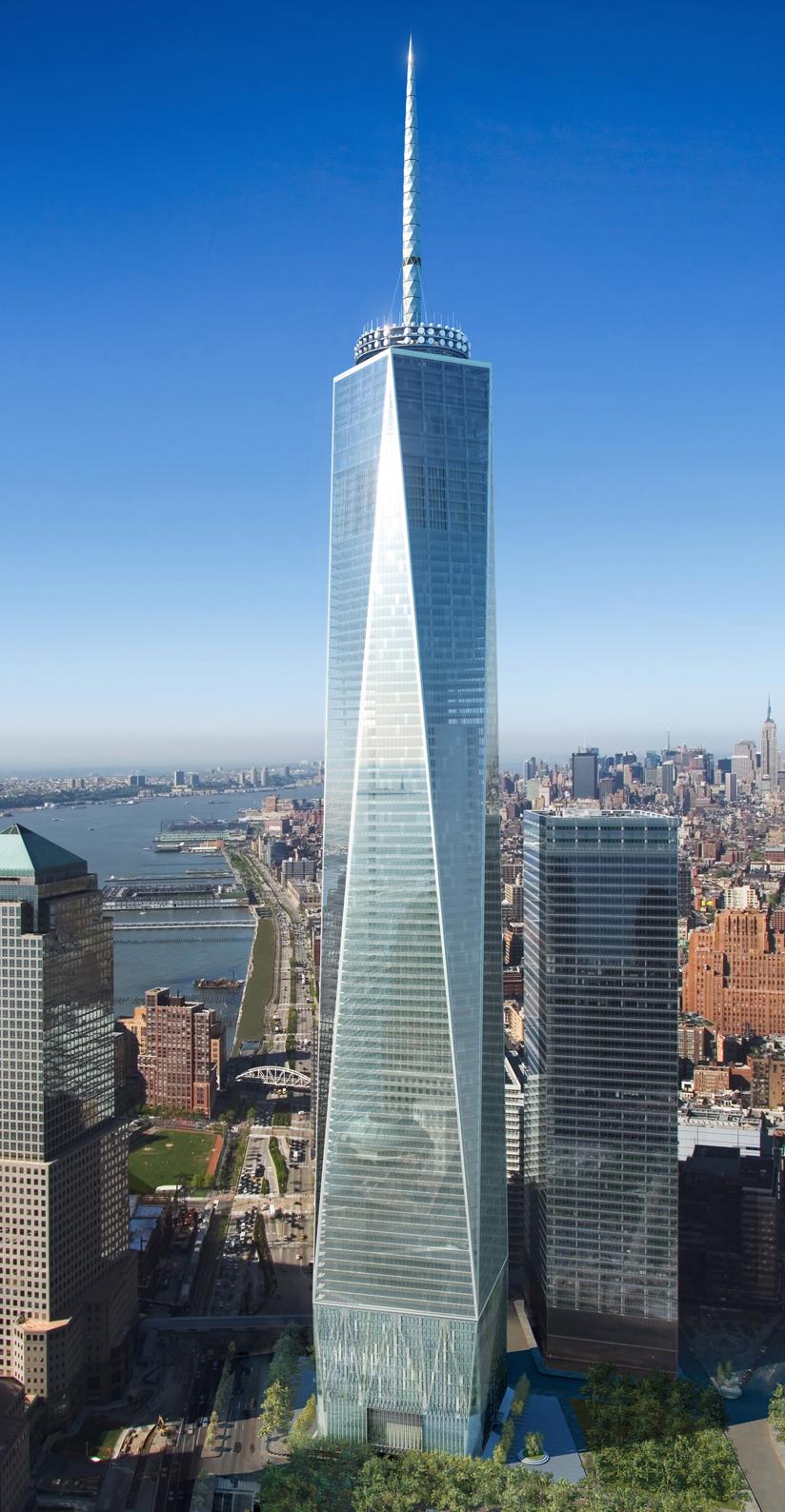
The first step was to do research. I had five-and-a-half rectangular silhouettes, and needed to make each building as distinct and interesting as possible. The first building from the left was inspired by a computer-animated video showing the construction of the replacement World Trade Center tower in New York. I took advantage of the transparent design to incorporate an elevator at each corner, adding some life to the building.
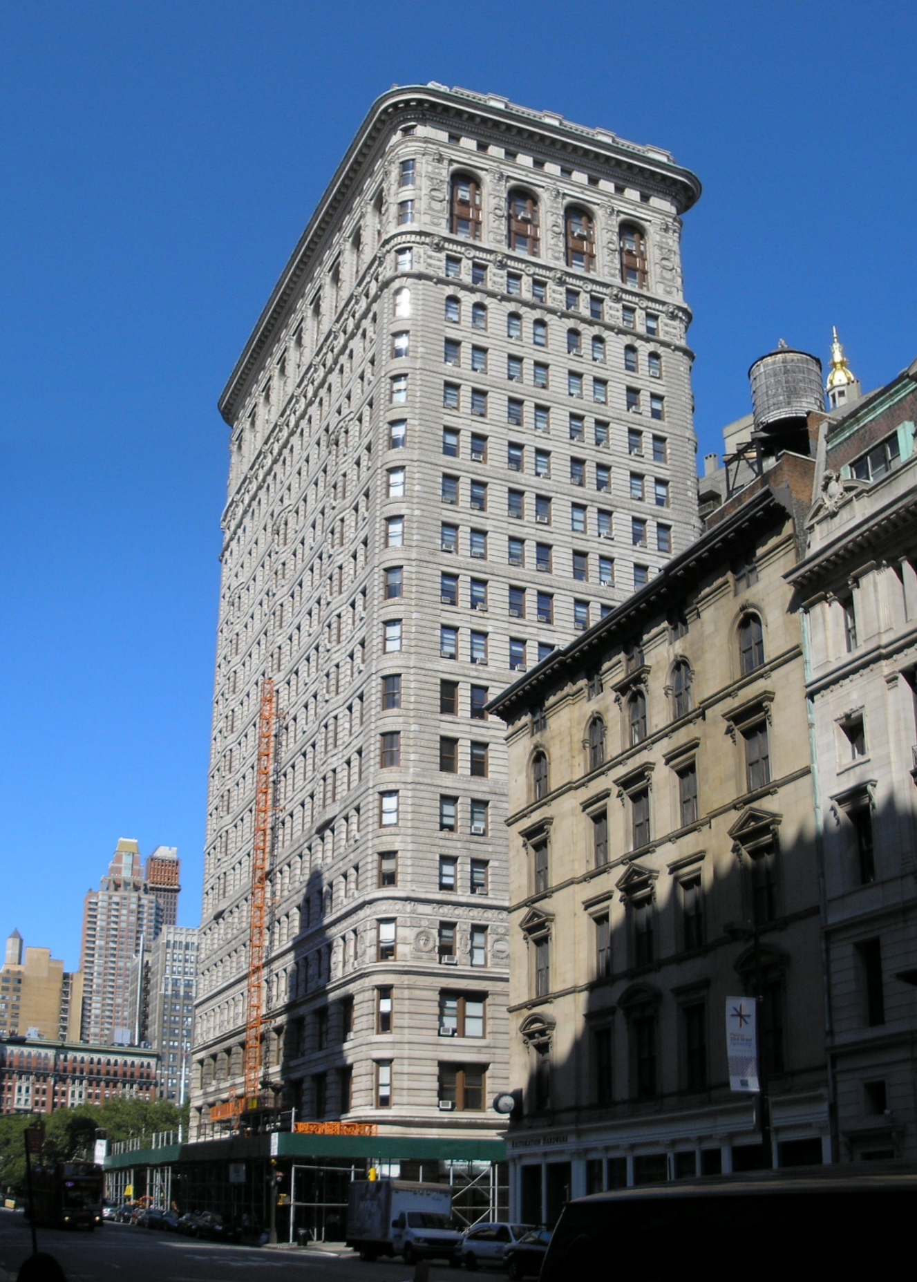
Building two was primarily based on the Flatiron Building, also in New York. It was the last or second-to-last I did, and I felt I was being a bit too modernist with the others, and that “Otron City” (as no one else called it) needed some older architecture. I also wanted to make a small reference to the apartment building which was the setting of my University class’s graduation project, the animated short “Squeaky Business.”
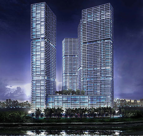
Building three was a lucky break during research, coming from a Google image search. I eventually learned it was a (new? Proposed? I never found a detailed description) building in Miami. I actually decided building four would just be a concrete cube with some fans in it before I found out how the practical boxes would be arranged, since it was the only thing I could think of for something so small. It ended up fitting perfectly on top of number three as if it were a machine room. The inclusion of the fans added some more animation to buildings.
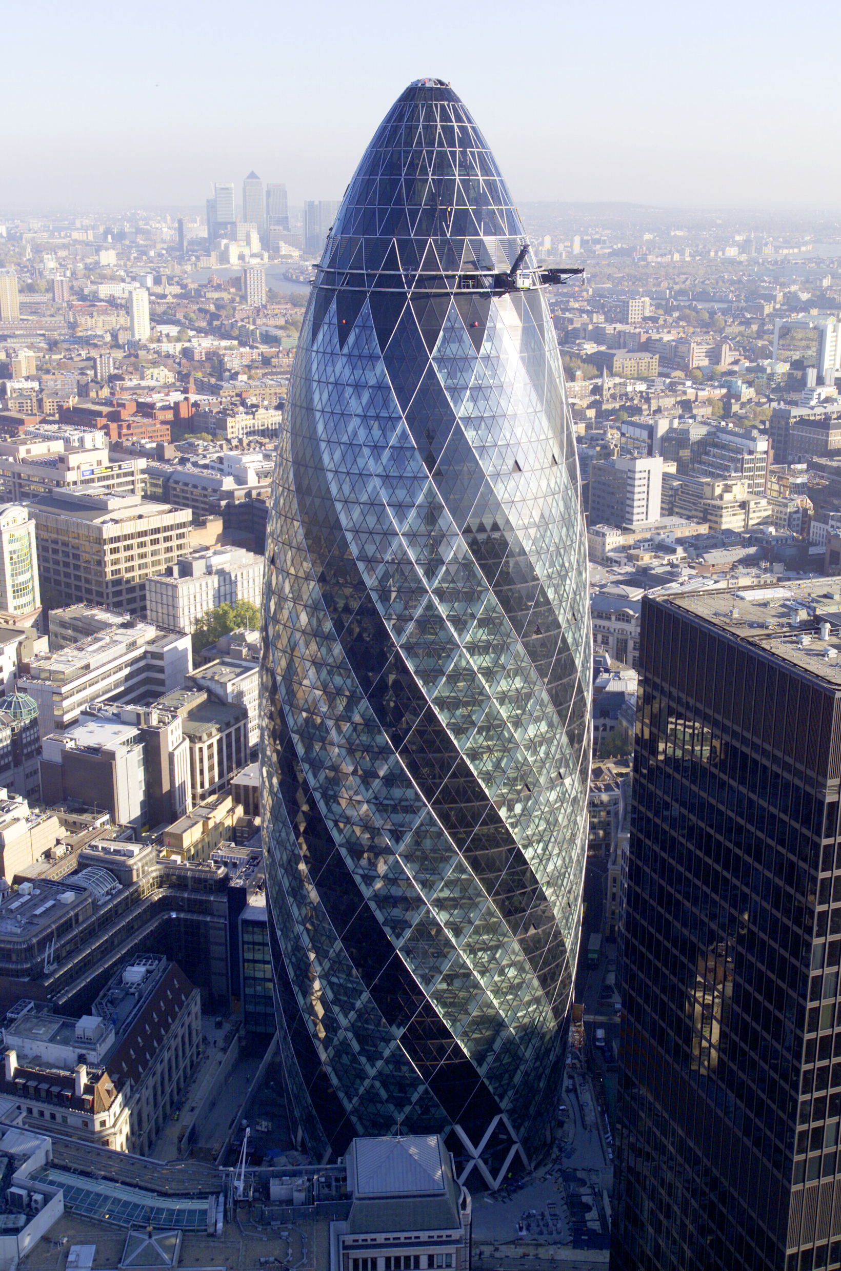
Building five was loosely based on the Swiss Re building in London (which I had never actually noticed before the most recent season finale of “Doctor Who,” where I briefly thought it was a special effect because it was so aggressively modern).
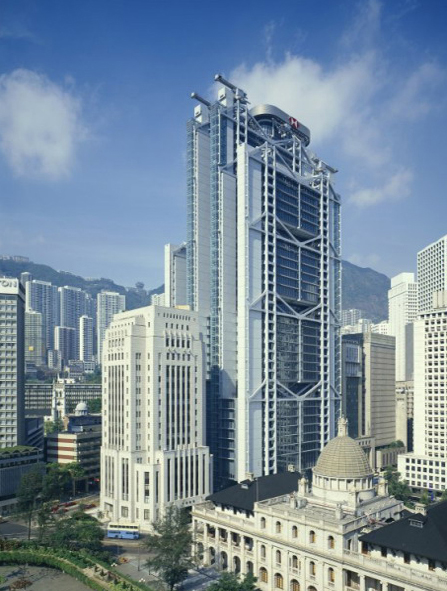
Building six is my personal favorite, and is based on the HSBC Building in Hong Kong. I became aware of it during the research process, while I was looking through a coffee table book I got on clearance some years ago in case something like this happened, Masterpieces of Modern Architecture.

Our template 3D set
I exported the Maya template scene for the show’s setup as a Collada file, and brought it into LightWave Modeler. I modeled the six buildings and sent them back to Maya using LightWave’s FBX exporter, since I wanted to try all the interoperability. Due to time constraints and the way the fact that fine detail wouldn’t be very apparent in the final output, the Maya versions had just simple values set for the shading. I set up a basic scene with duplicate buildings filling out the background and a skydome rotating around the scene to give the illusion that the time of day was changing and really sell the simulated depth of the projection, as well as animating the fans on building four and the elevators on building one in a cycle so the whole thing could be looped.

The Maya version of the cityscape being projected
During the course of Otronicon, there were periods of downtime where I returned to the LightWave version of the city. I added texture maps to the window boxes of the buildings, gave the rest of the buildings more complicated procedural textures, and added basic lighting setups. Once I was done, I rendered the “sweetened” version of the city as a still in day and night versions, to be used on our idle screen in between shows.

The LightWave daytime version of the city being projected

The LightWave night version of the city being projected
A version of this post appeared on the official Ninjaneer Studios blog.